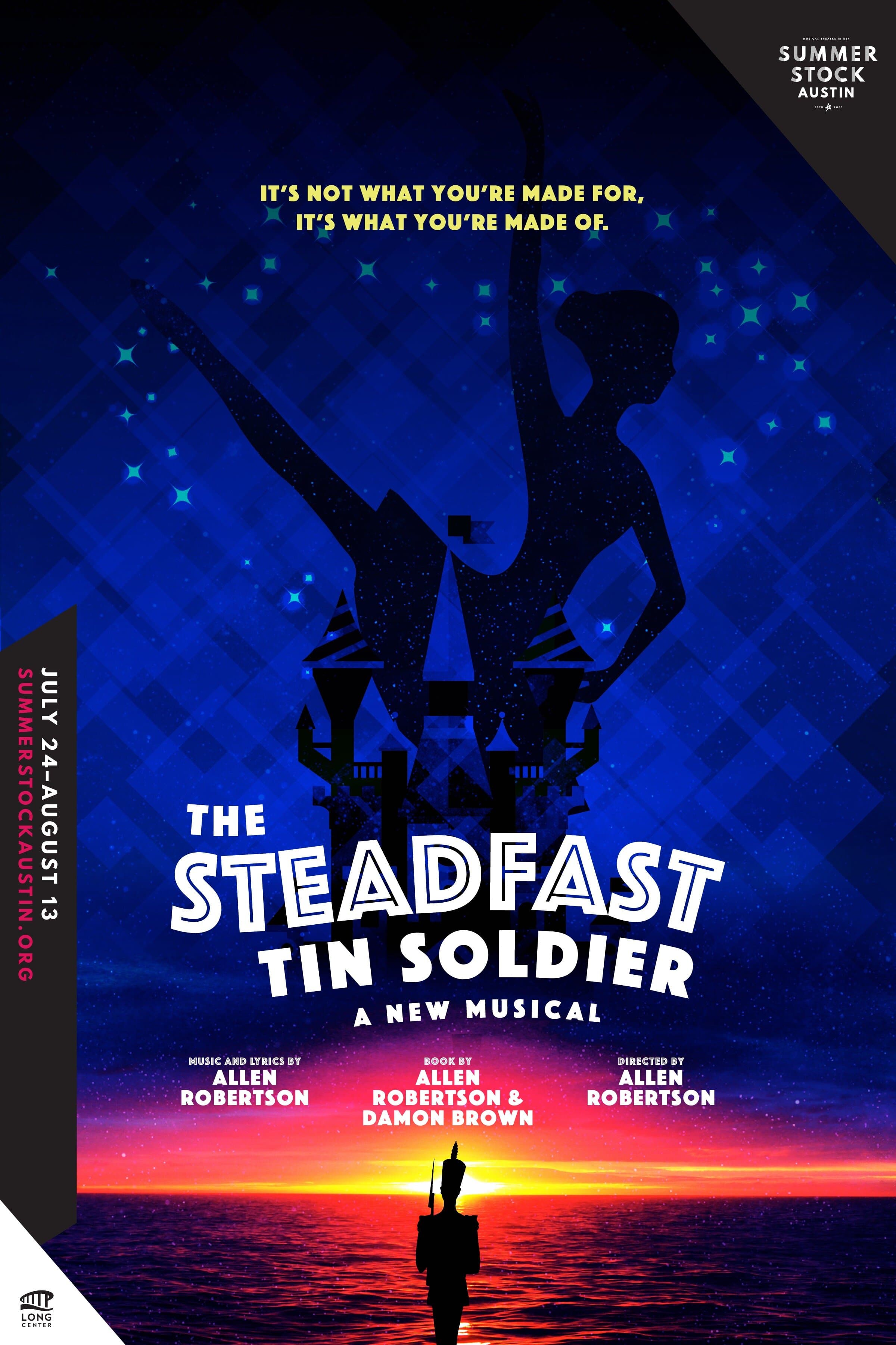
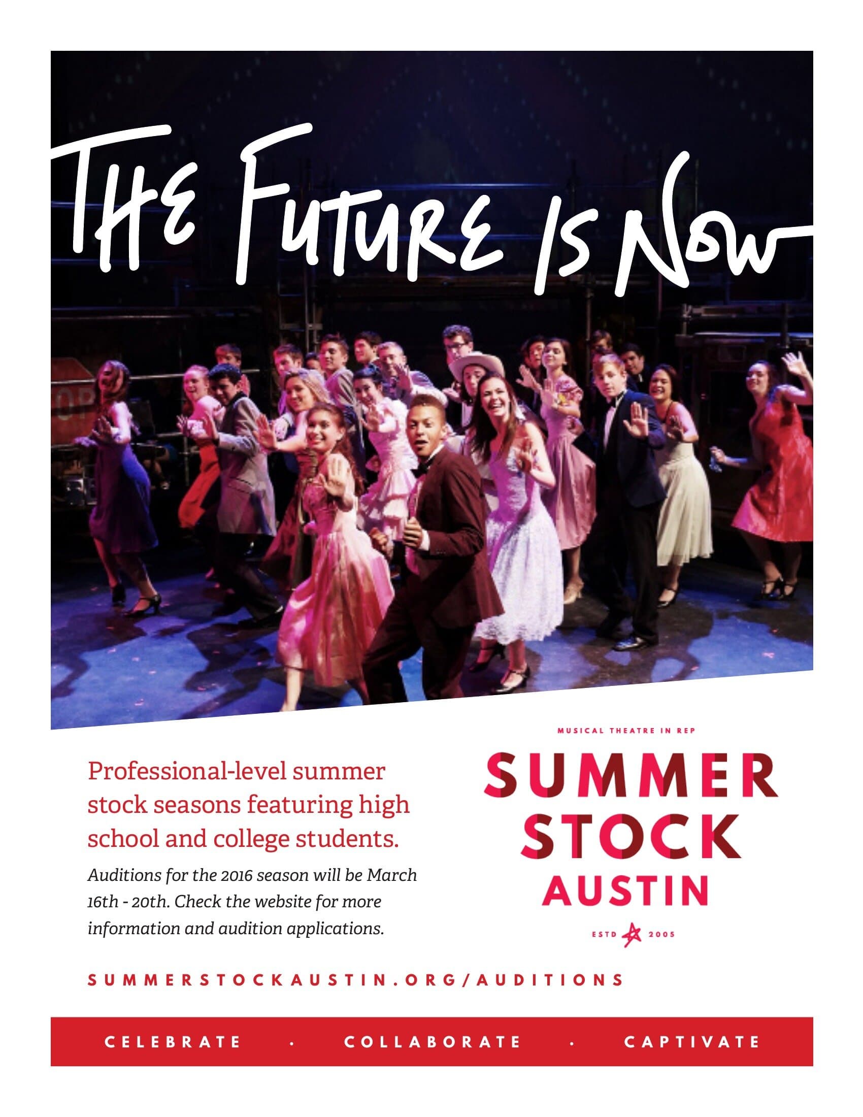
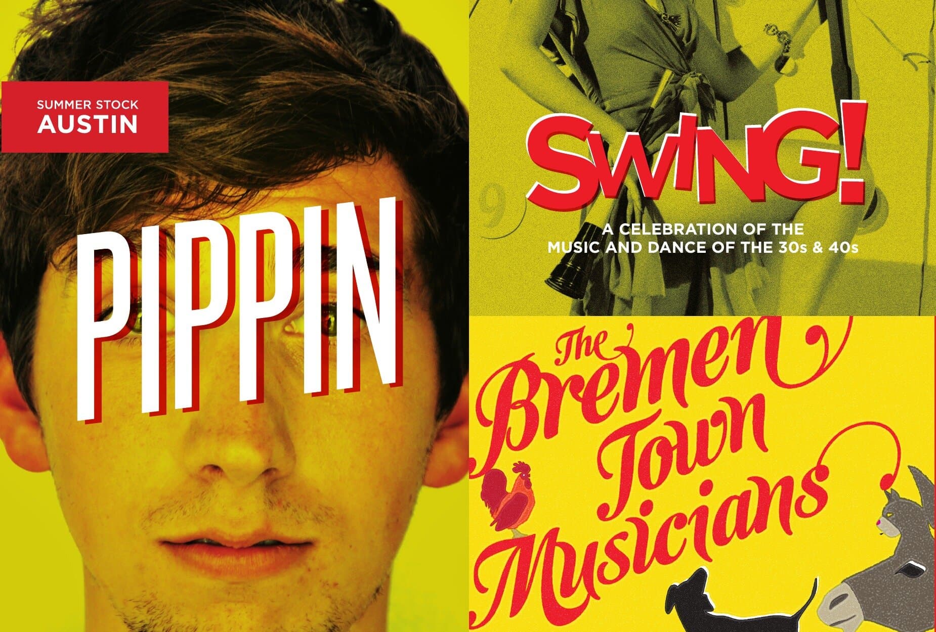
Summer Stock Austin
Fourteen years of poster art for the Long Center's professional summer rep season
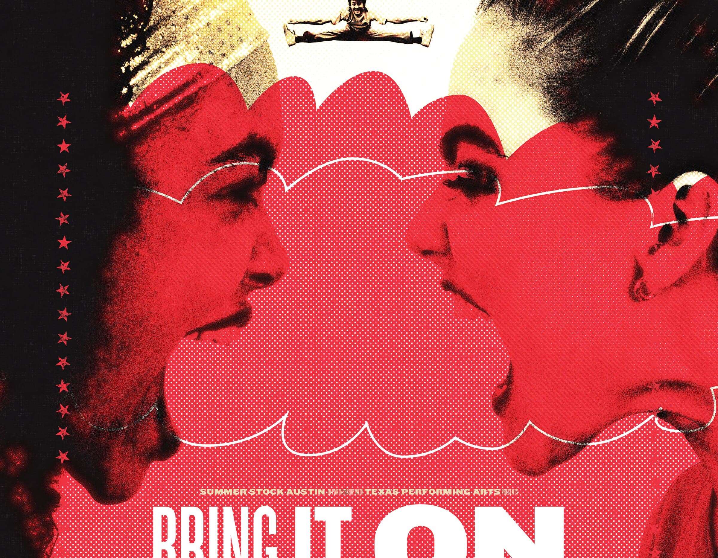
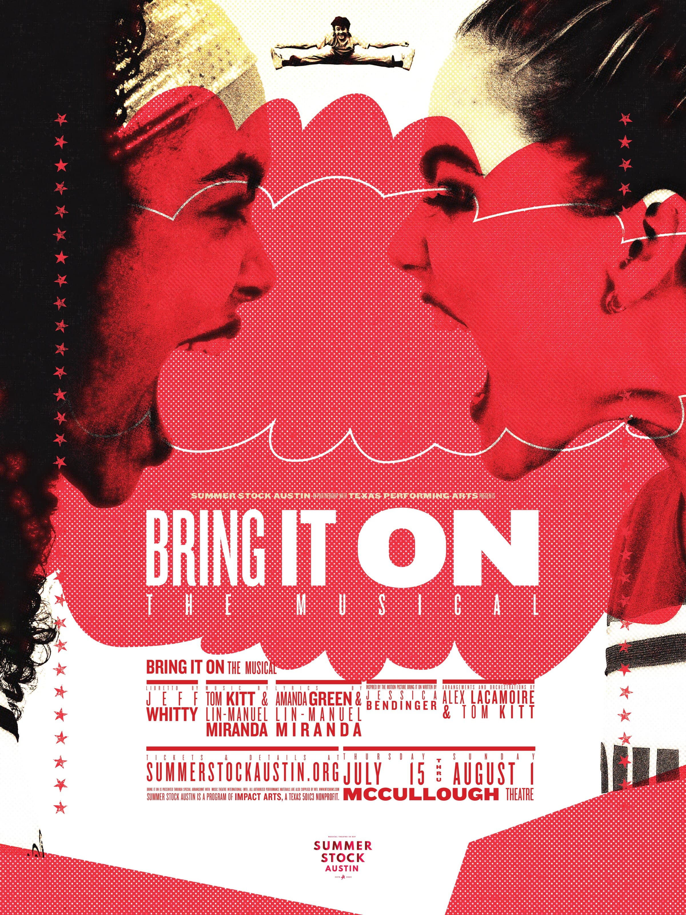
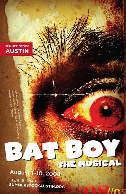
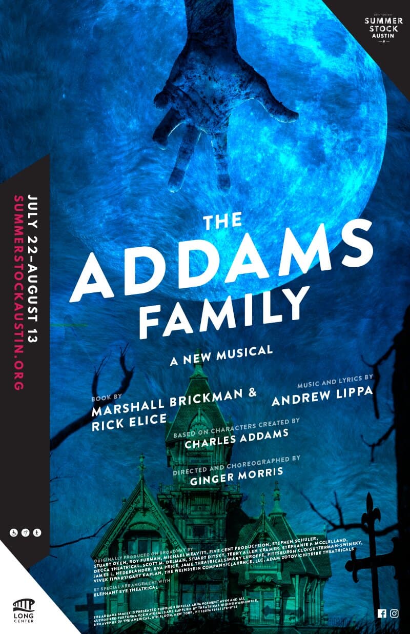
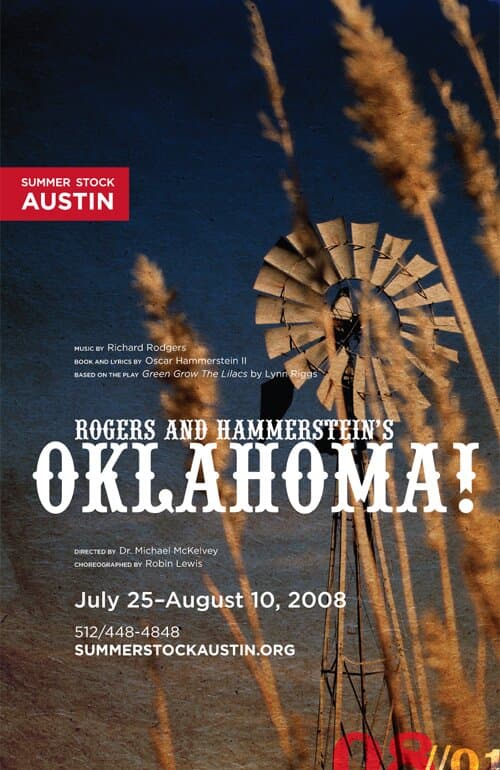
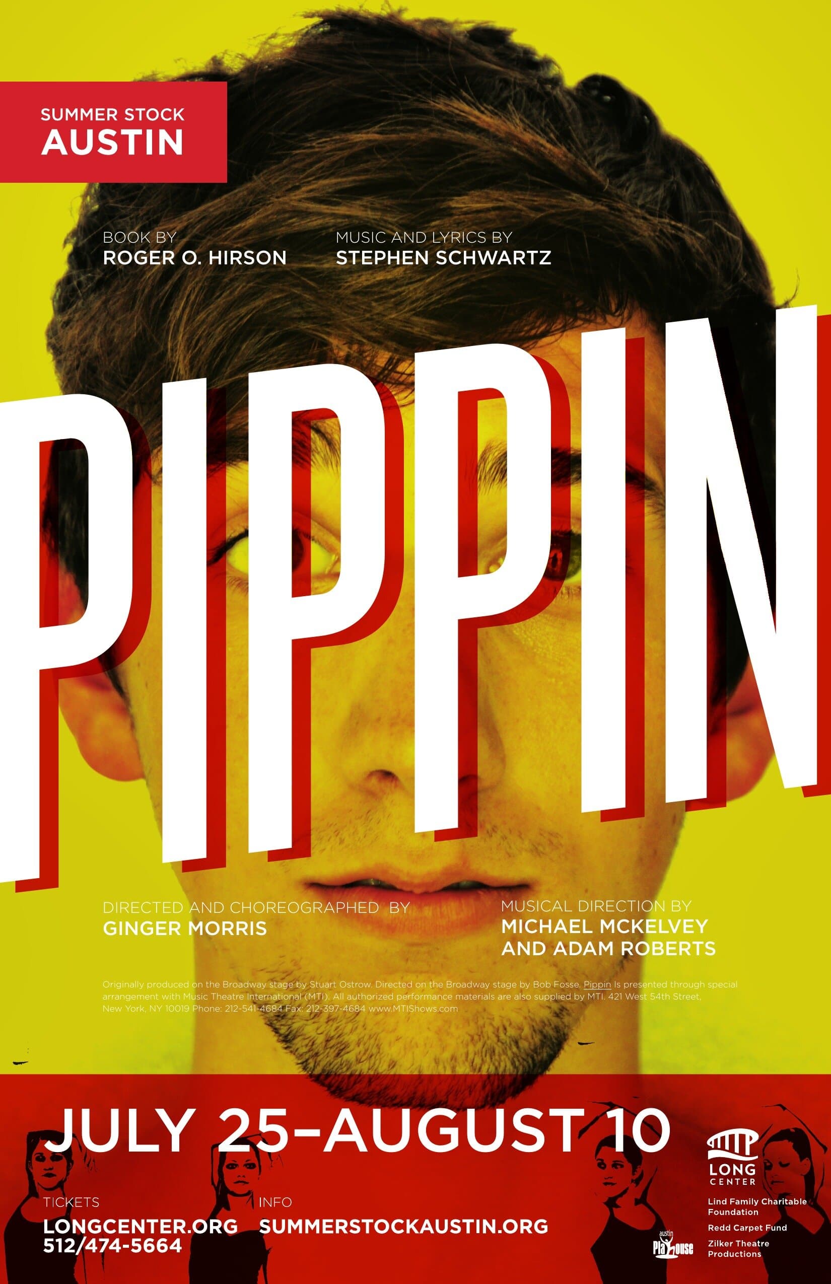
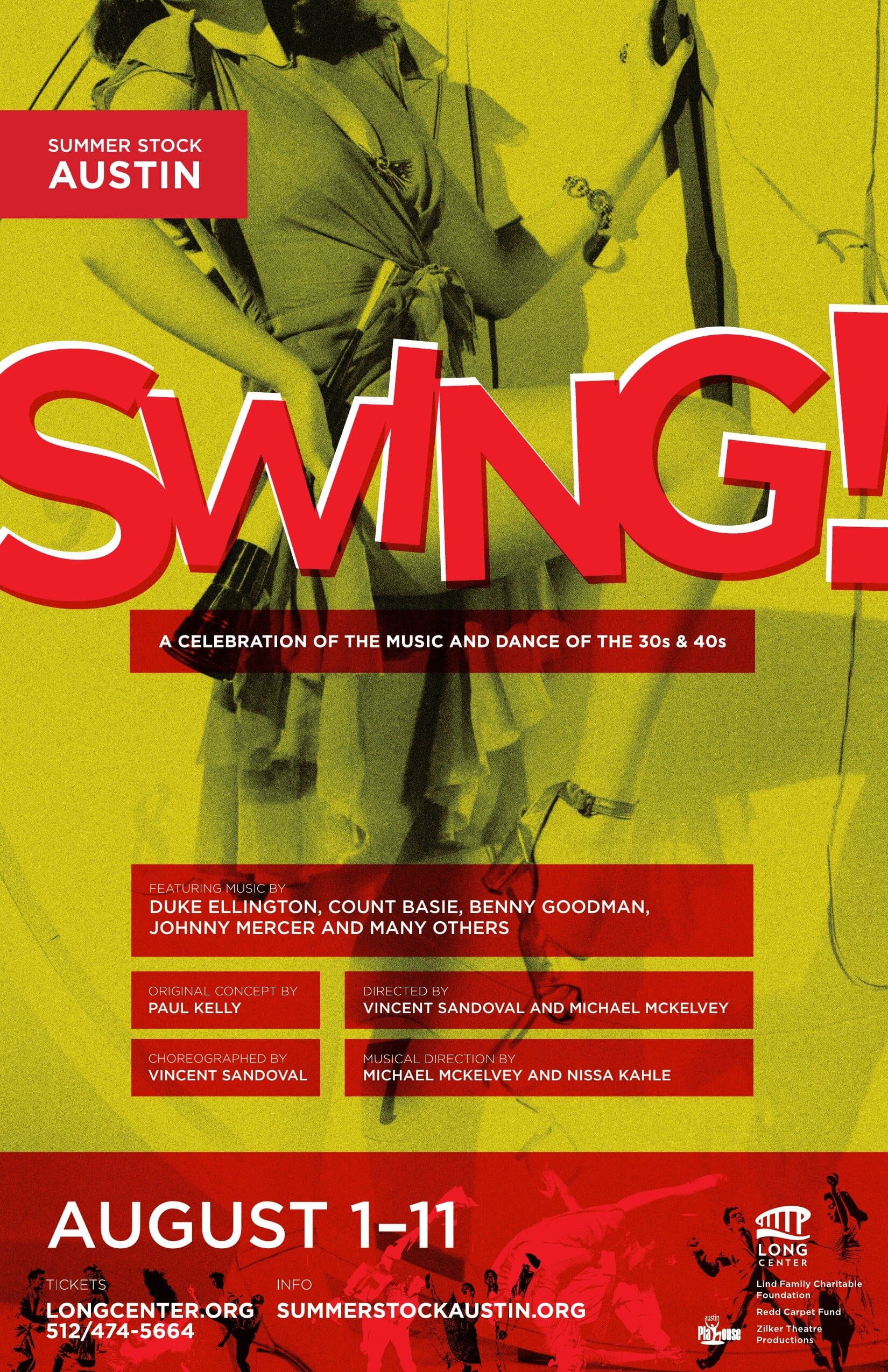
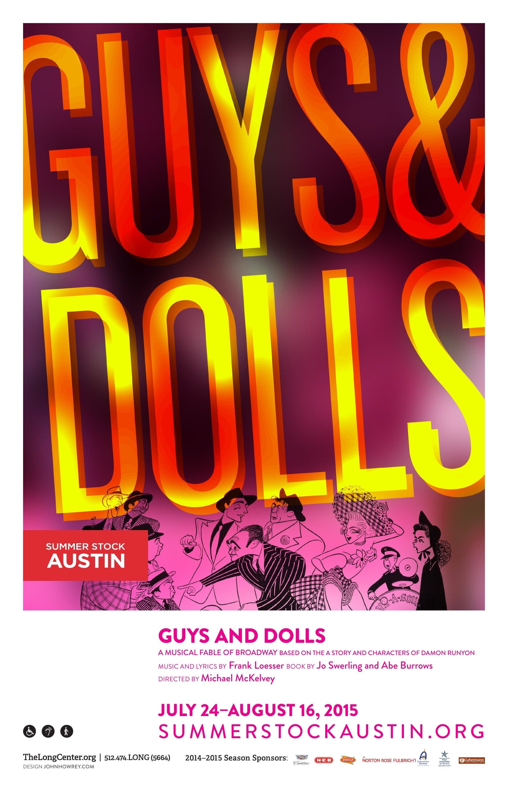
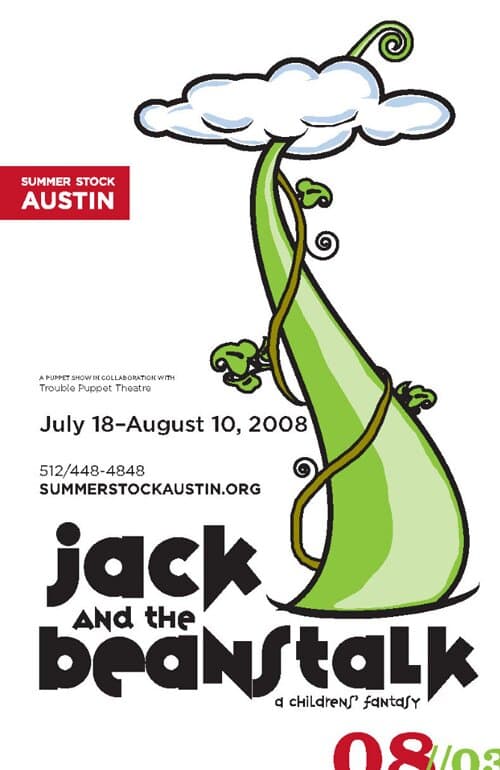
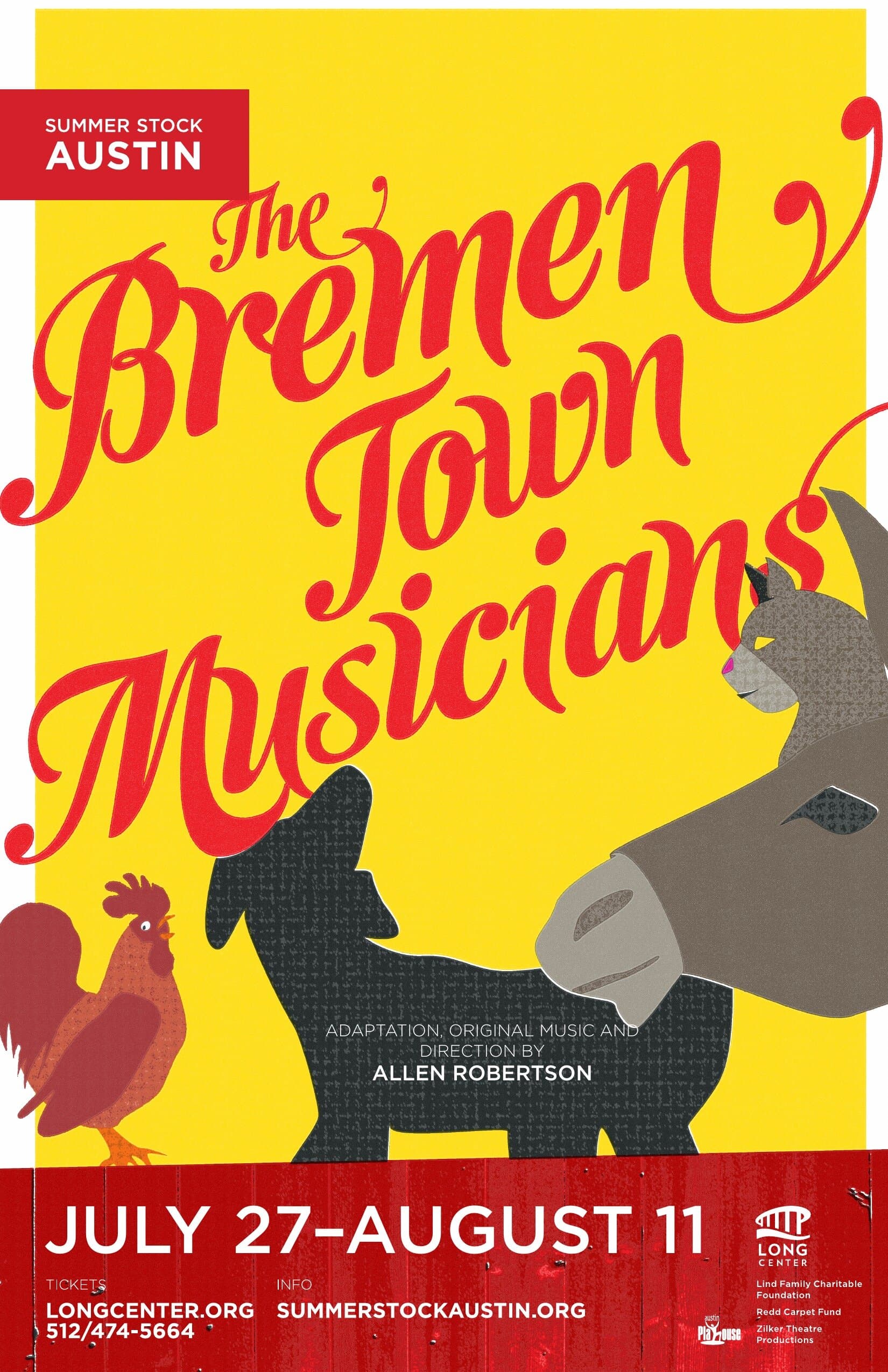
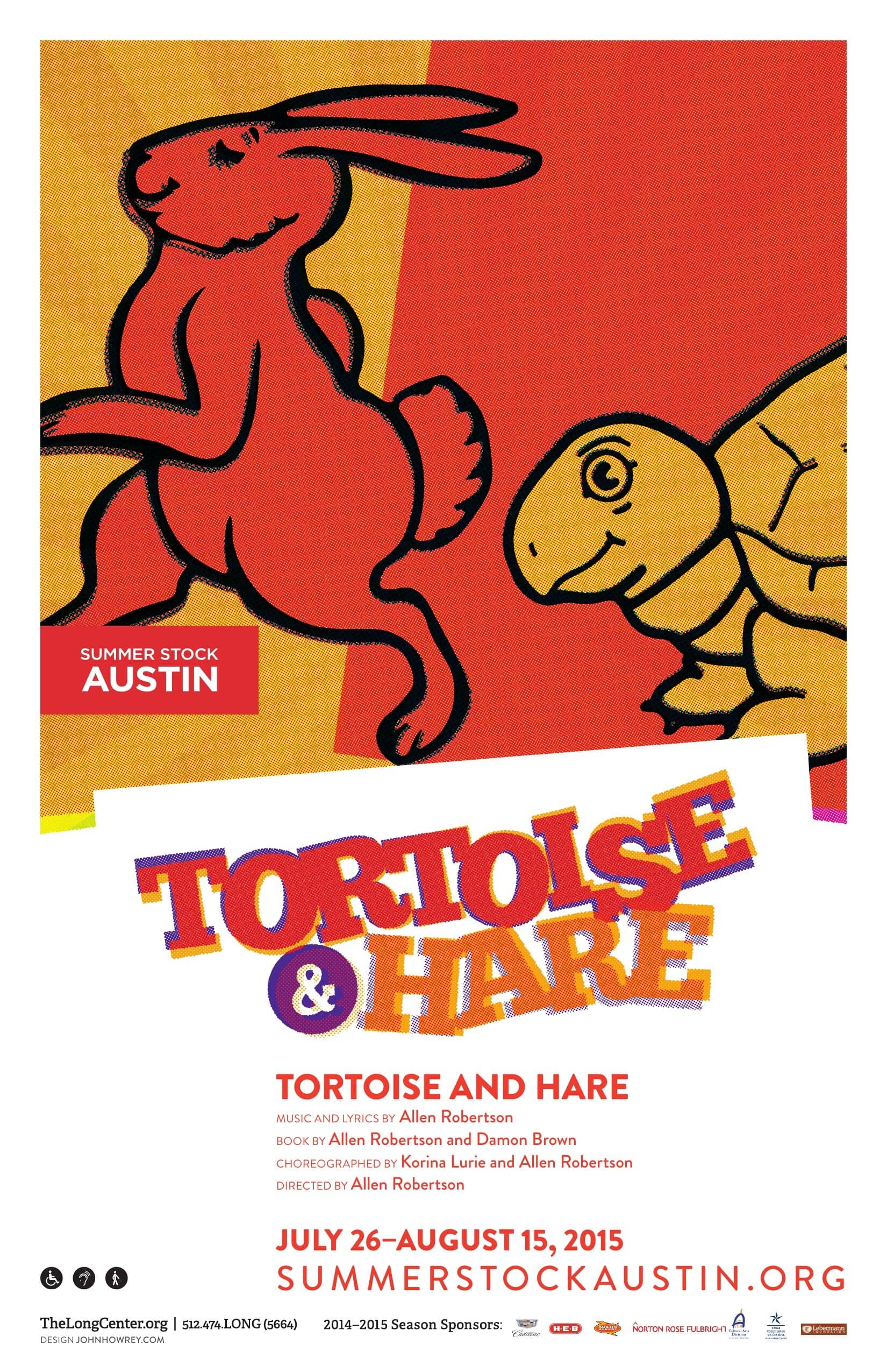
A professional summer rep company performing three shows in repertory across one Texas summer, run by the Long Center as a teaching company that ships at equity quality. I designed the seasonal print across more than a decade, long enough to watch the kids in the headshots grow up. The brand stays fixed (the red corner block, the Long Center mark, the date strip, the URL); each show poster is its own composition tuned to the production. Some better than others. Below is a gallery.
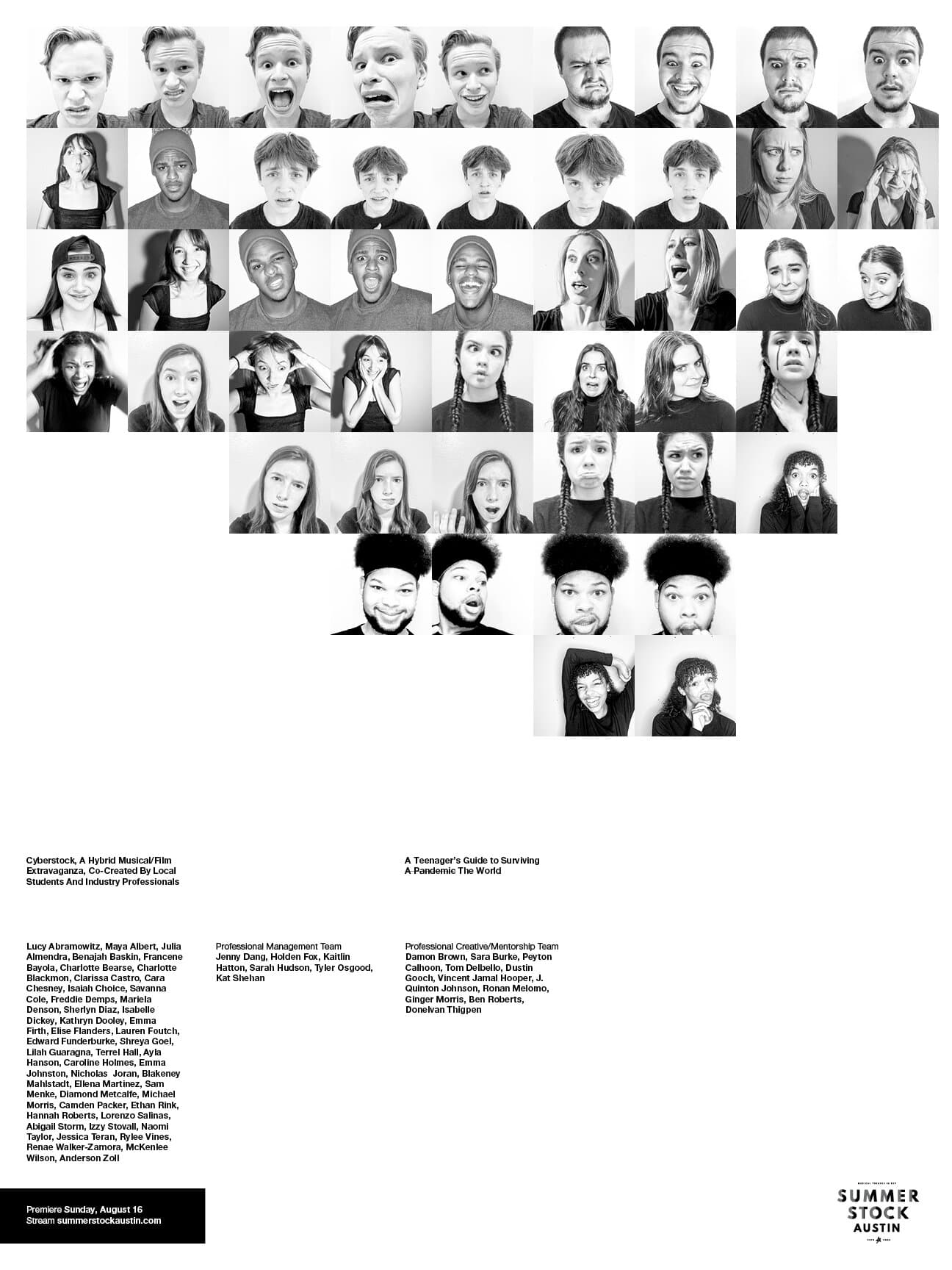
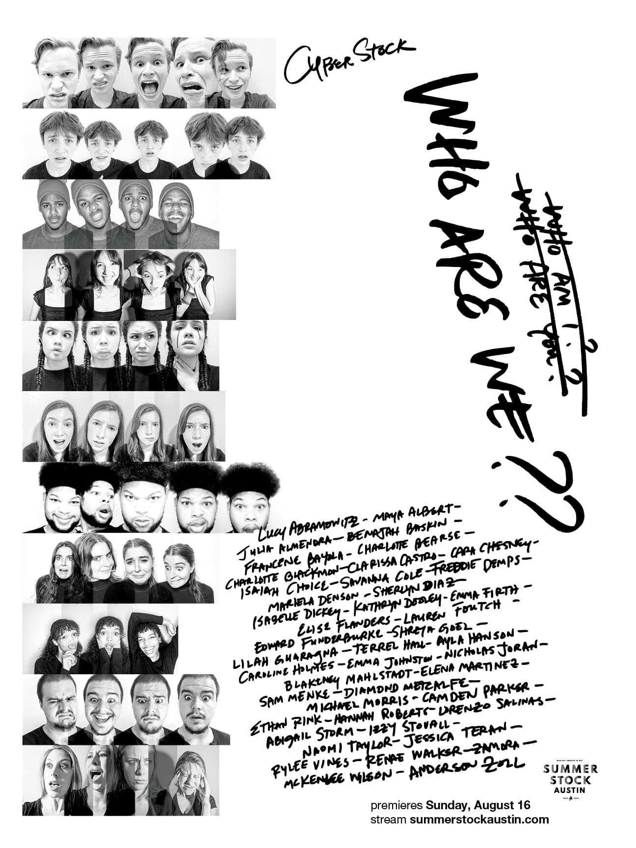
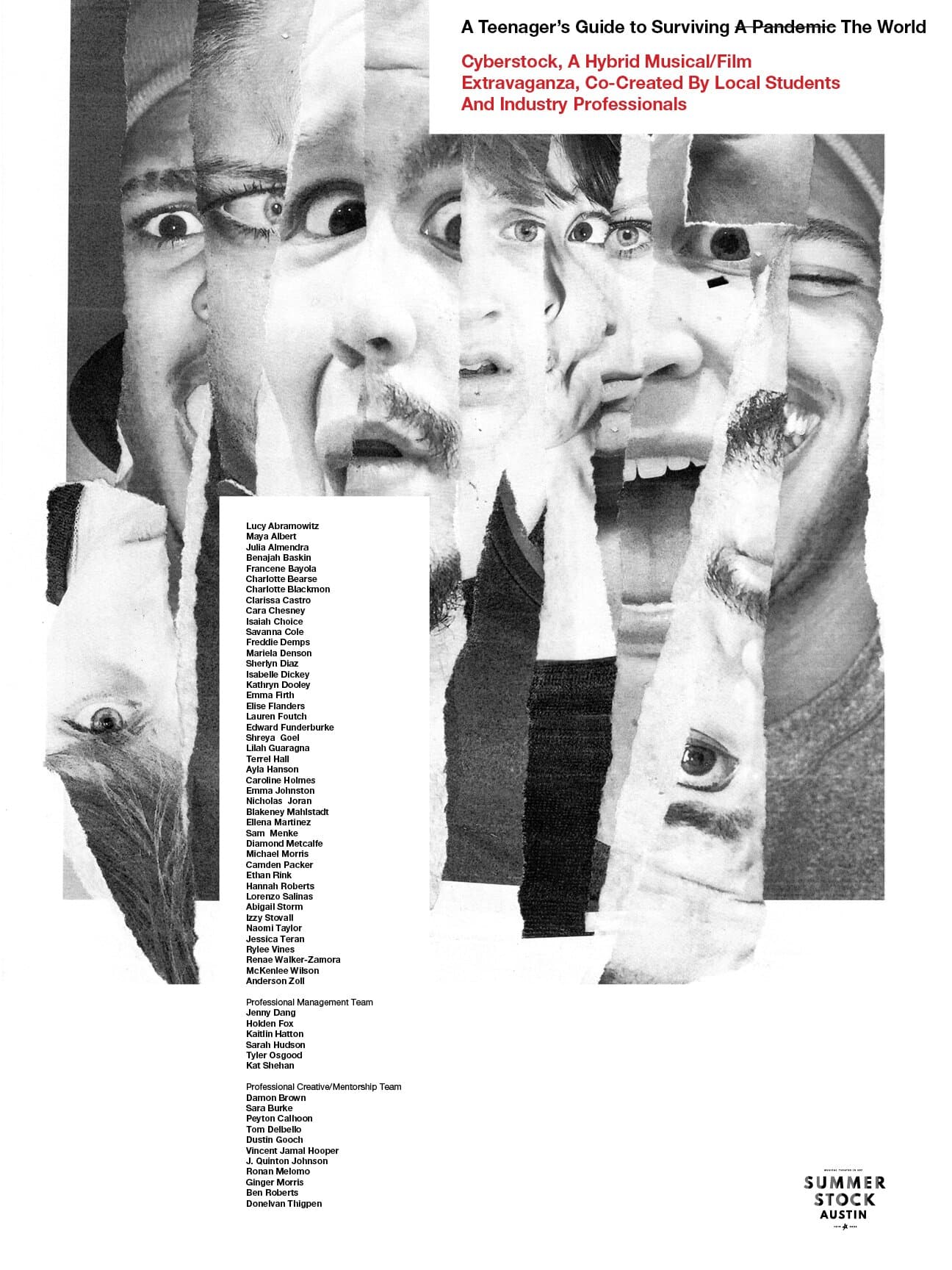
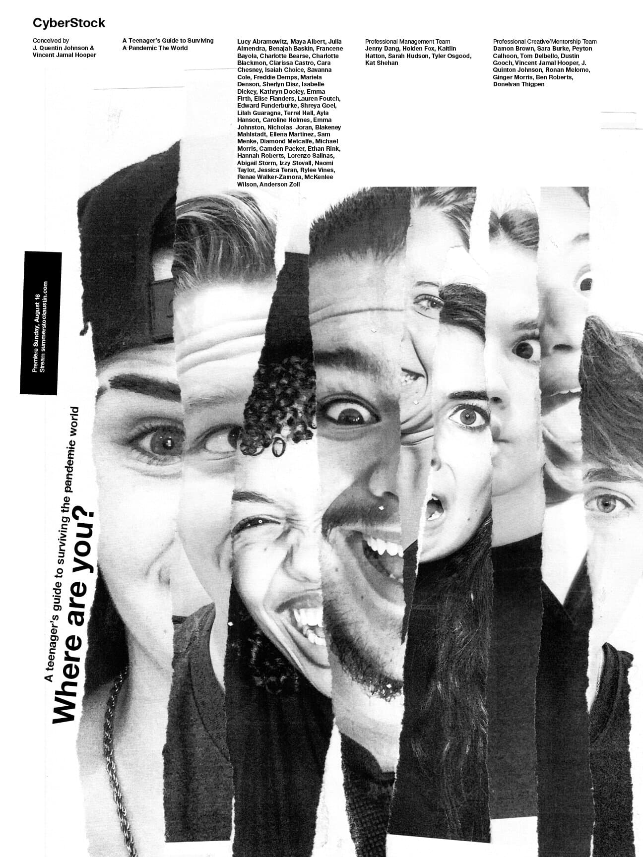
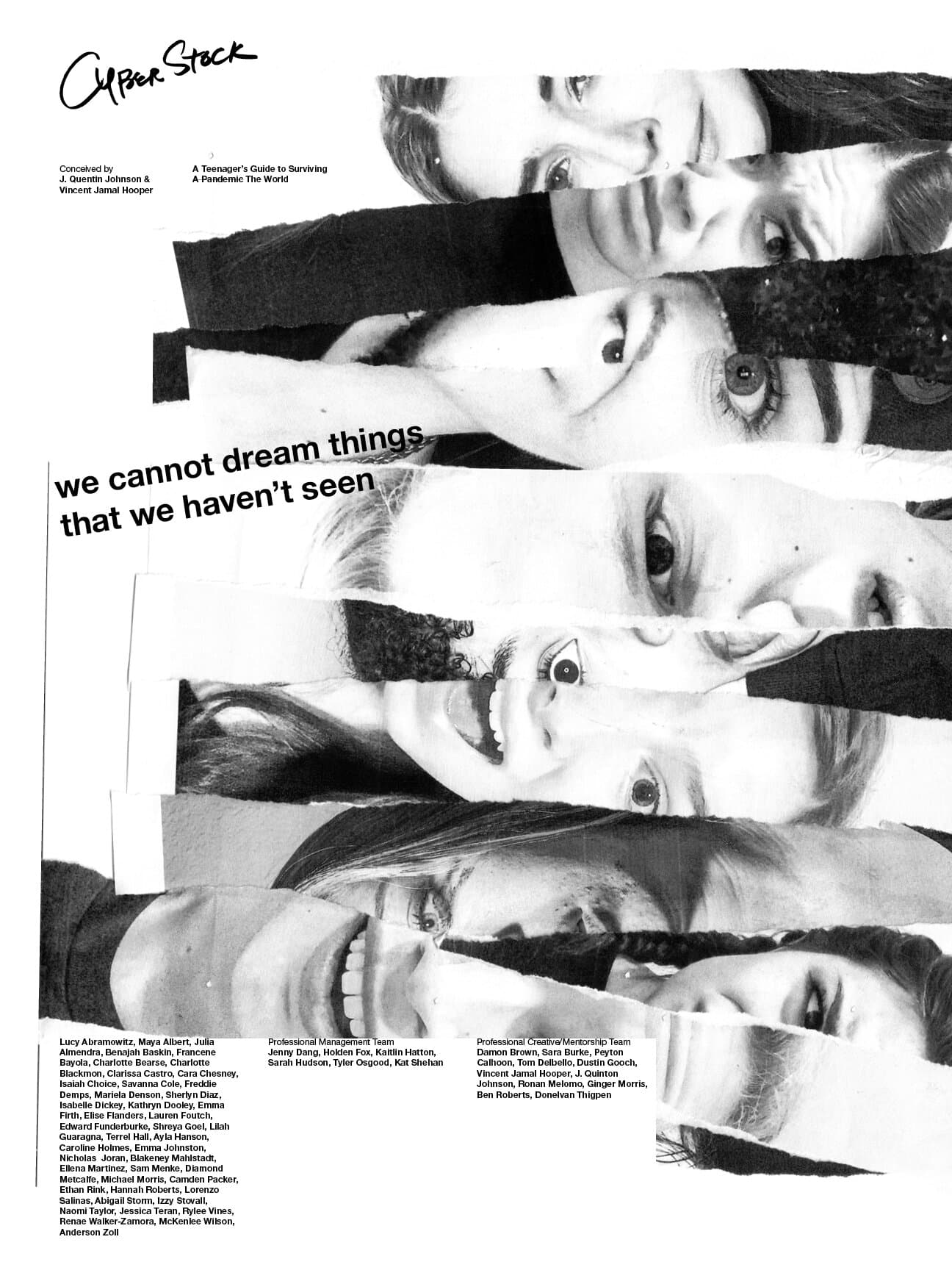
Cyberstock
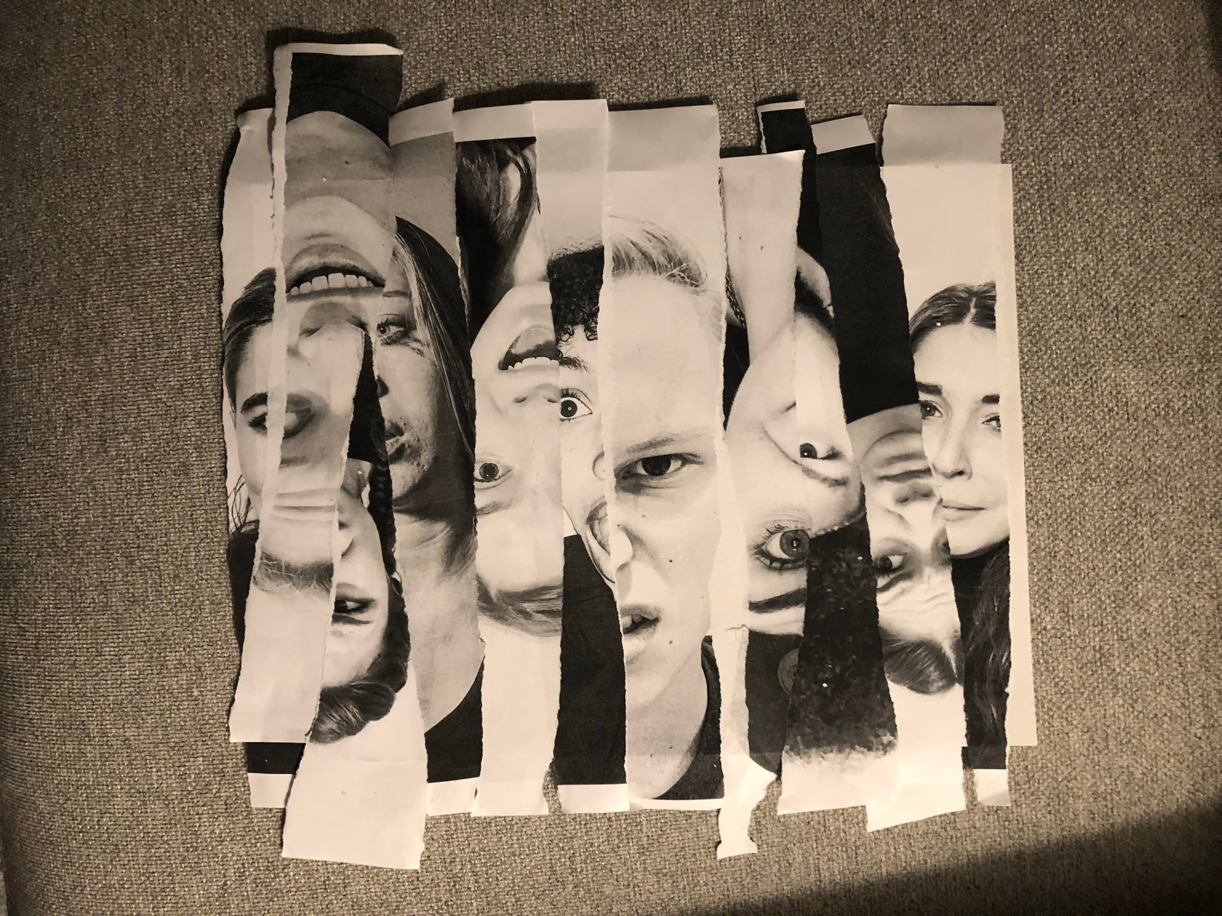
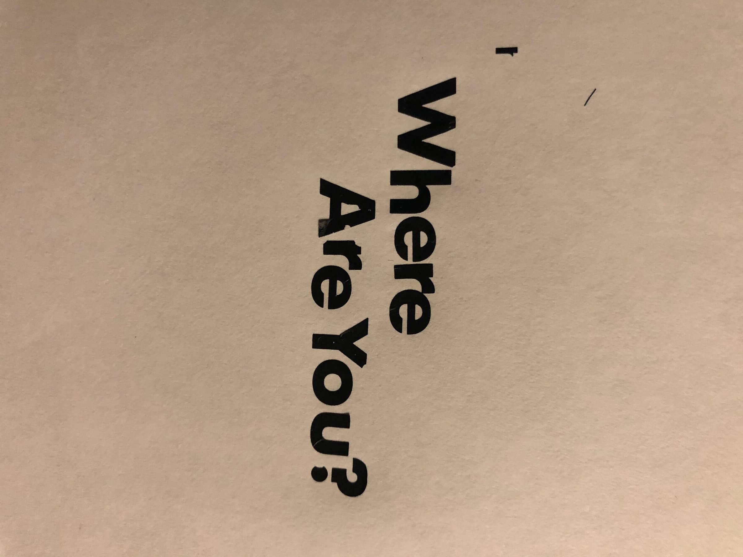
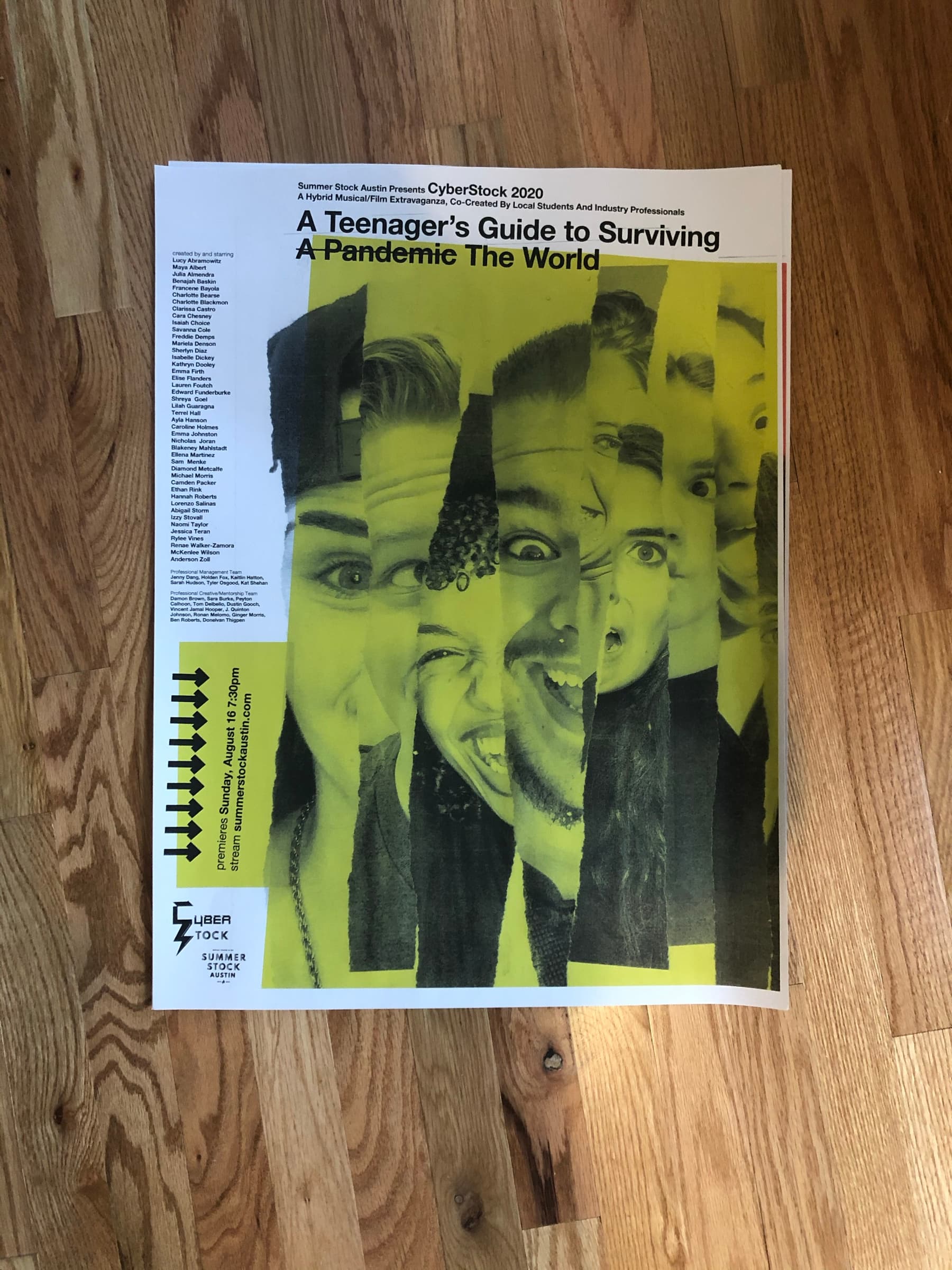
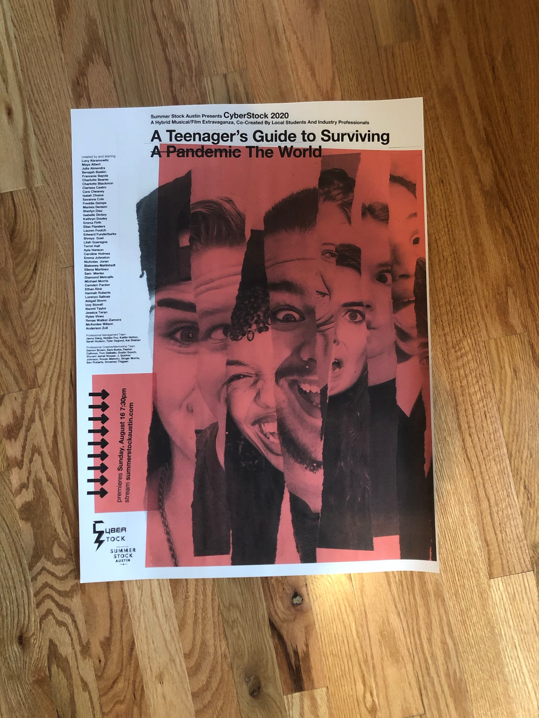
The pandemic season couldn't run in a theatre. Cyberstock was the alternative: a hybrid musical/film extravaganza recorded over Zoom and released as a streamed event. The season that couldn't gather a cast made a poster out of how scattered everyone was. A series of poster explorations on a single brief: torn faces, taped headshots, handwritten provocations.
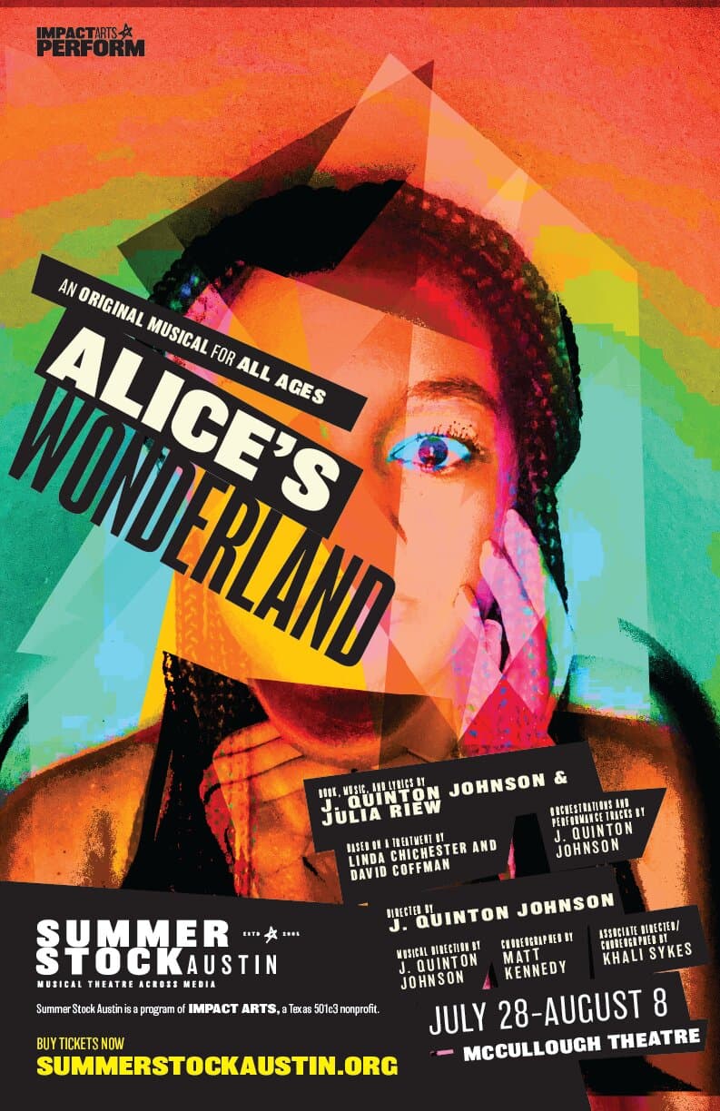
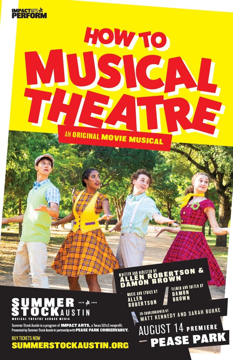
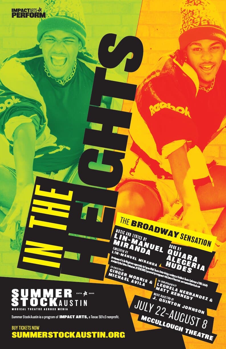
The Impact Arts rebrand
A new parent identity called Impact Arts arrived alongside a refreshed Summer Stock lockup: Musical Theatre Across Media. Three shows under the new system: Alice's Wonderland, How To Musical Theatre, In The Heights. Black-tape labels carry the credits, every line on its own slab.
- The Long Center for the Performing Arts (Austin) / Impact Arts
- Performing Arts
- Theatre
- Arts Education
- Lead Designer
- Editorial Direction
- Production
- Editorial Design
- Apparel
- Ginger Morris (Founder, Impact Arts)
Up next