Hollow Core
Packaging system and process book for an Arm & Hammer fabric care concept
Church & Dwight came to the Collective with a fabric-care R&D track that needed two things at once: a packaging system that could carry a new generation of laundry products, and a process book that could pitch the whole vision back to the leadership team in a single binding.
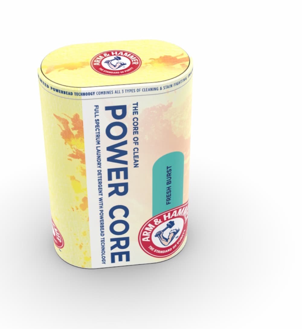
I led the visual design and brand application. I pulled the Arm & Hammer mark into a fresher lockup, set up a watercolor system so each variant feels distinct without breaking the family, and built the type system across cans, sleeves, and inserts so shoppers read the shelf at a glance.
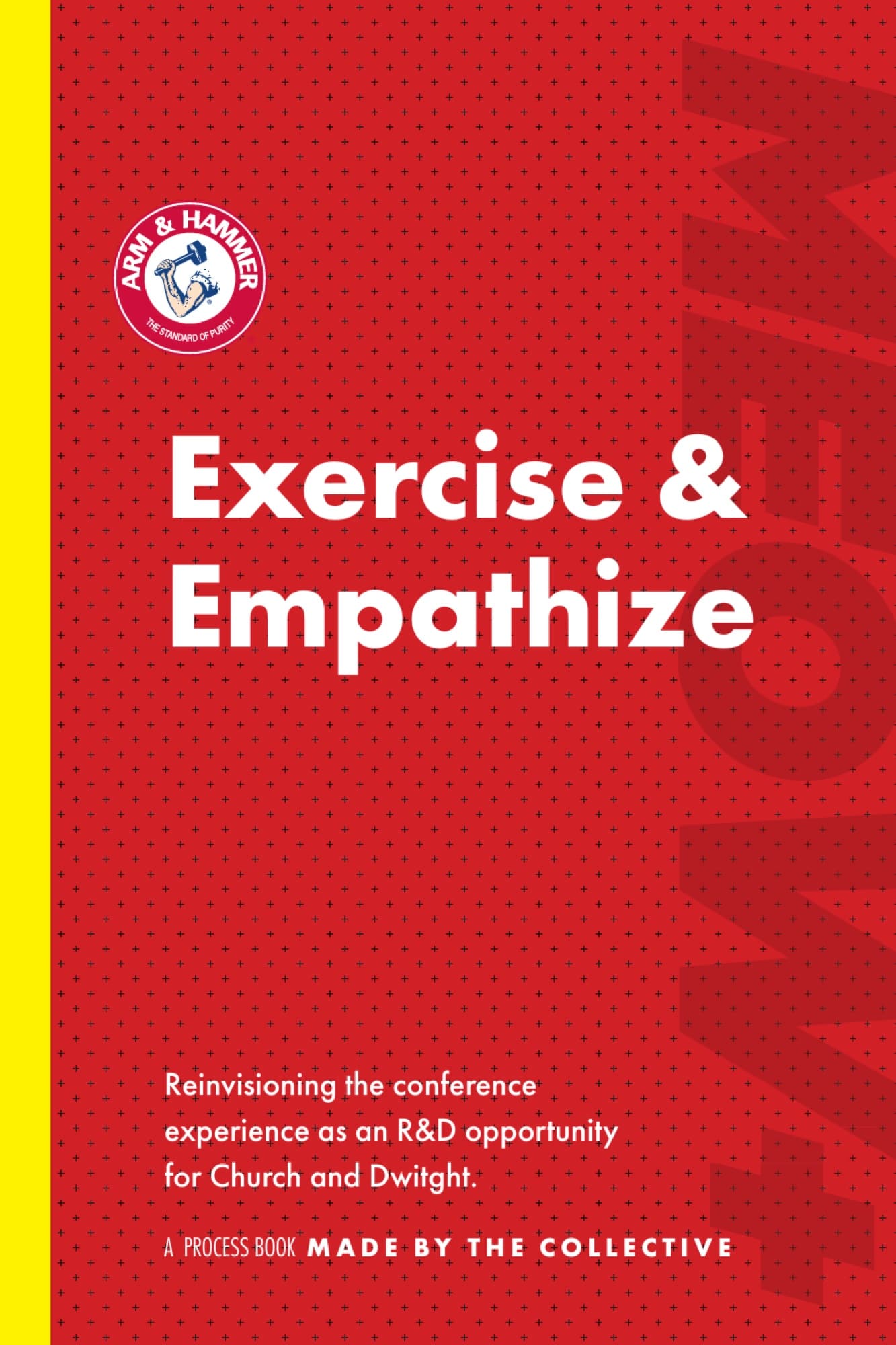
I designed the book that walked leadership through the work: cover, structure, dividers, type, rhythm between sketches and finished work. It had to read like the Sunday Times, something you sit with. Leadership read it instead of skimming.
The package
Each can is a piece of editorial.
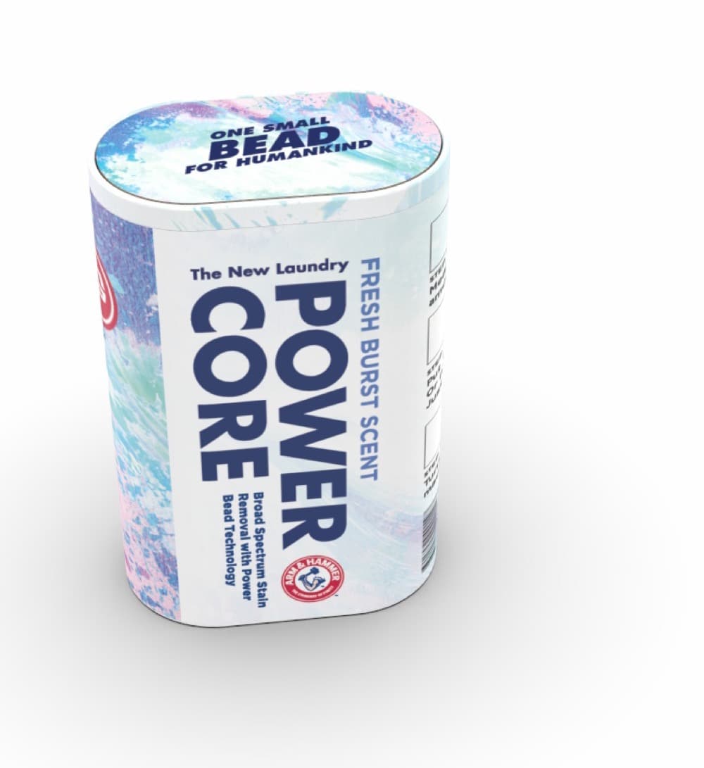
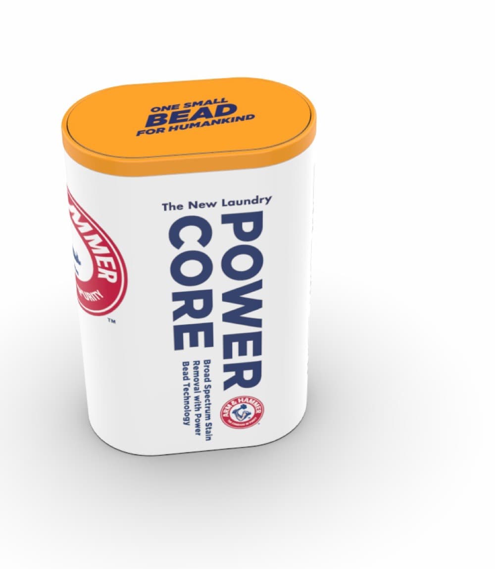
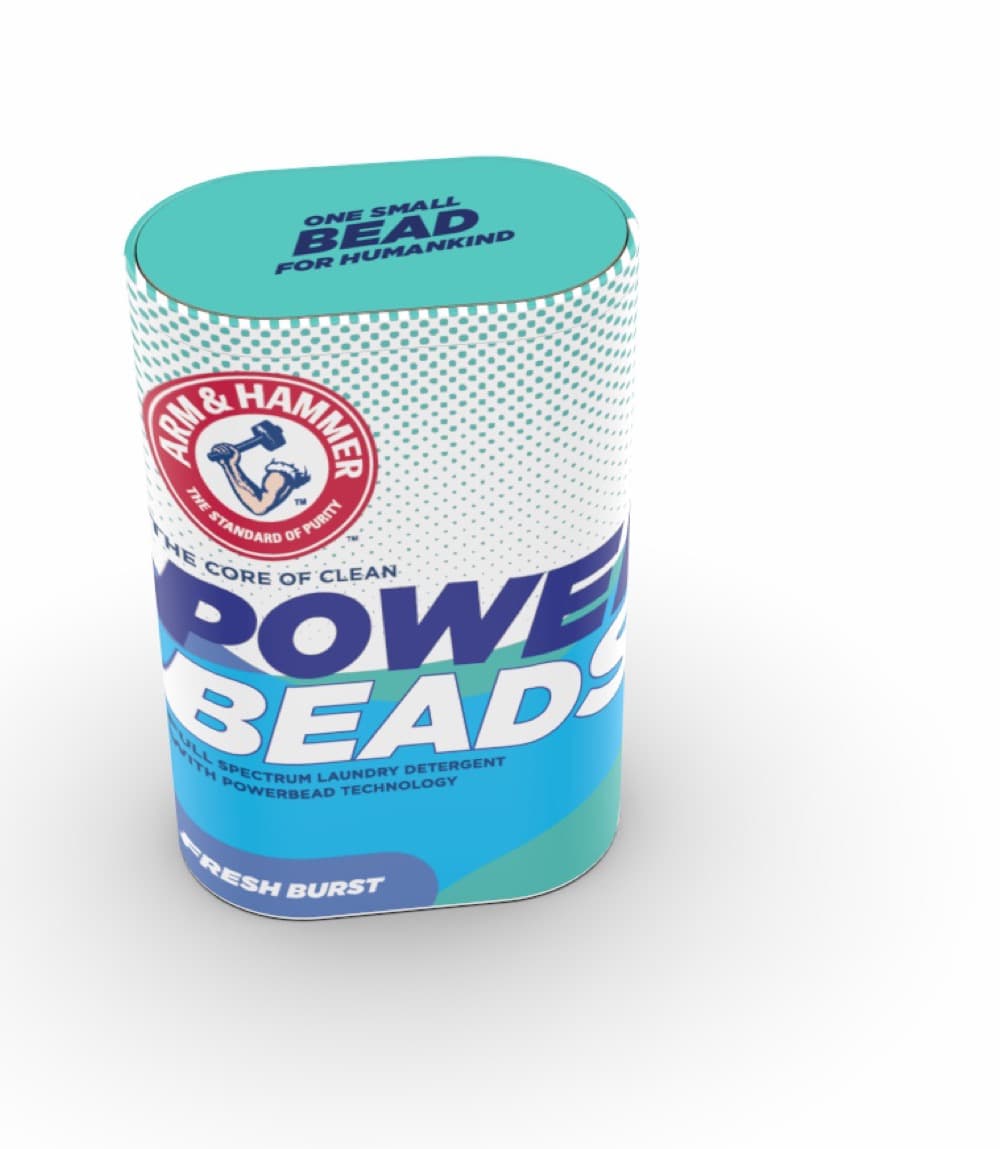
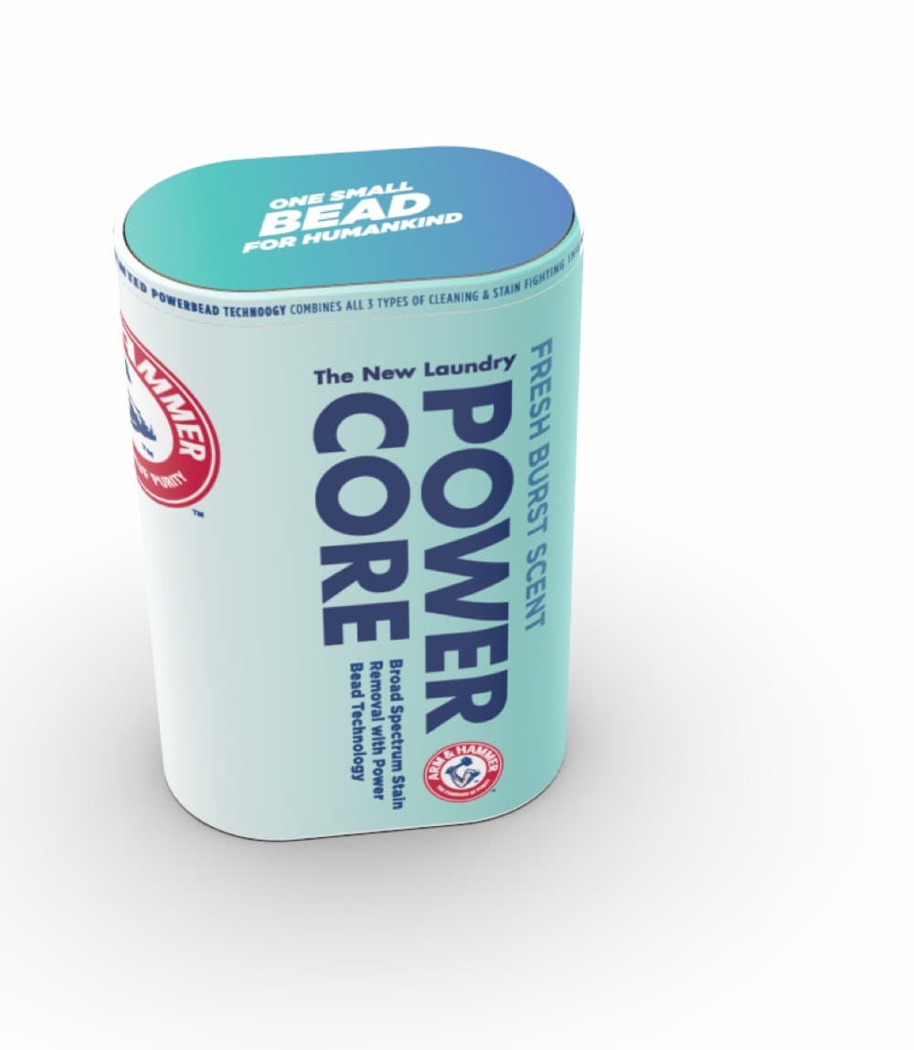
The packaging concept treats each can as a piece of editorial. POWER CORE on the front, a single variant pill on the body, the Arm & Hammer mark held at consistent scale across the family. The watercolor wash is what carries personality across variants without redrawing the rest of the system.
The detail
Modeled in 3D before we printed it.
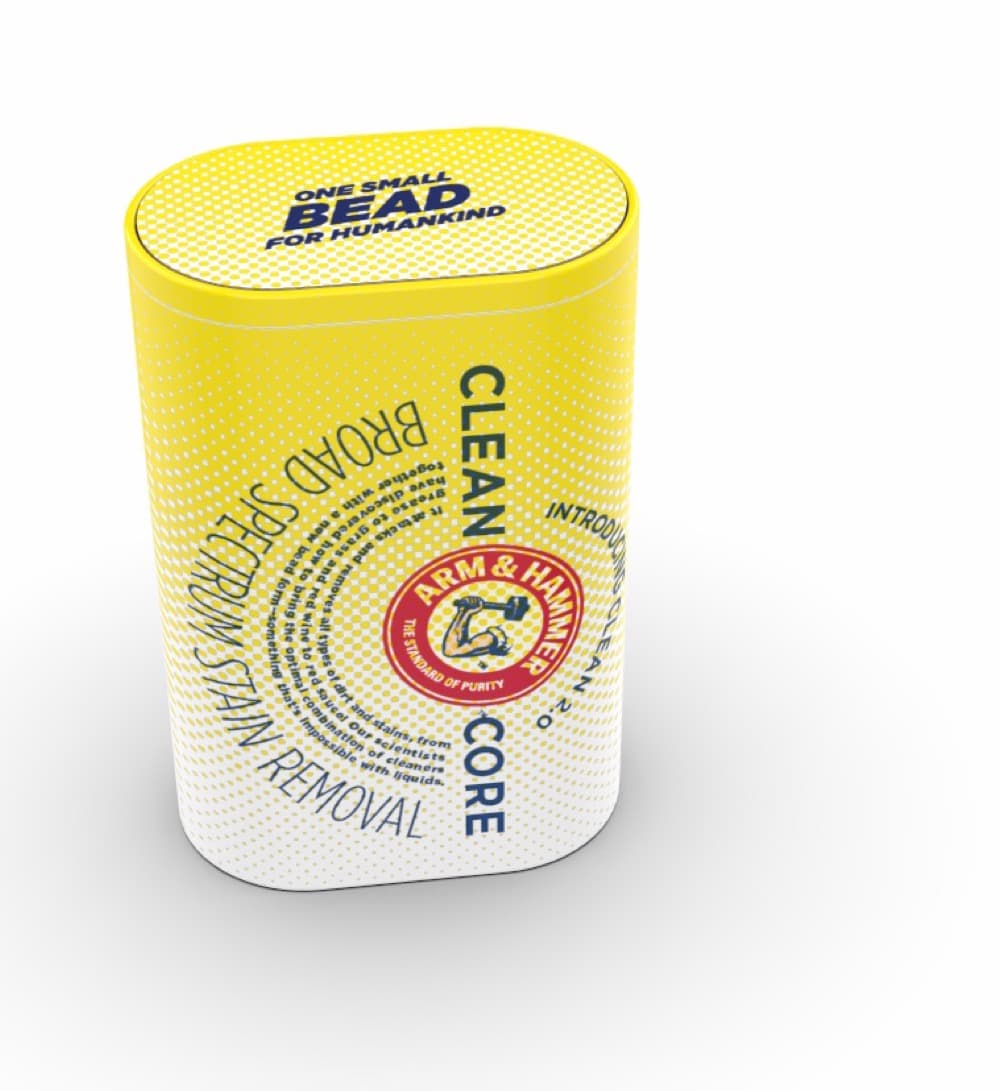
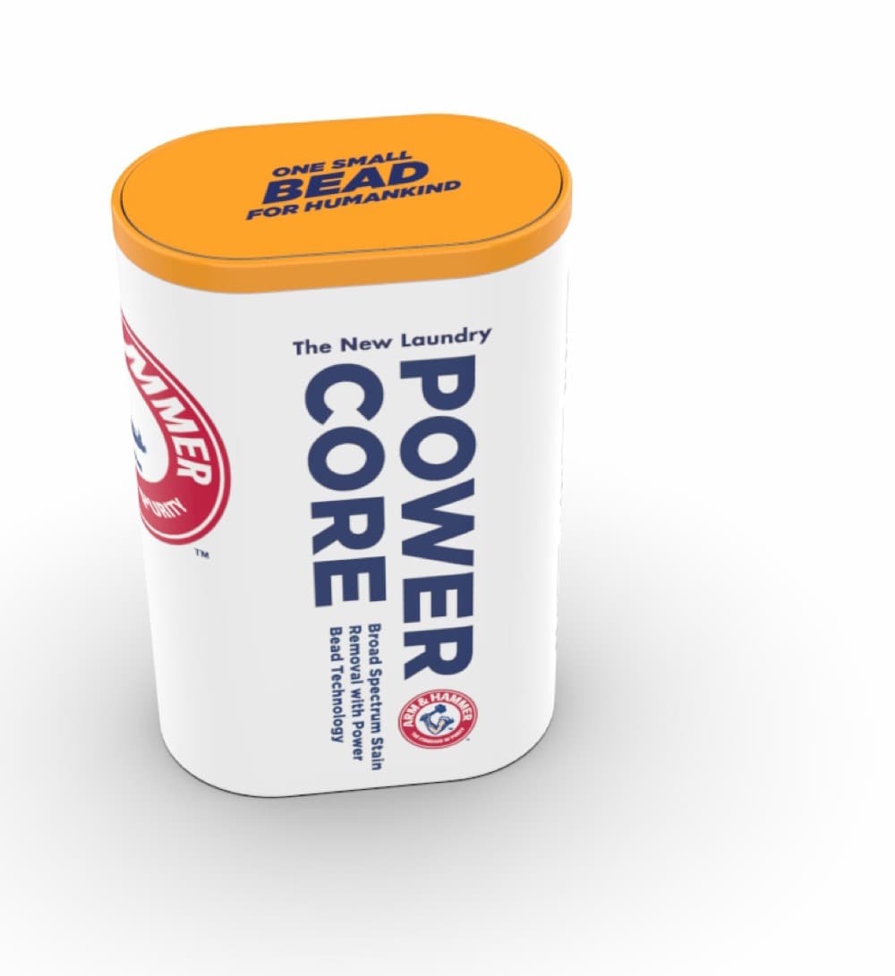
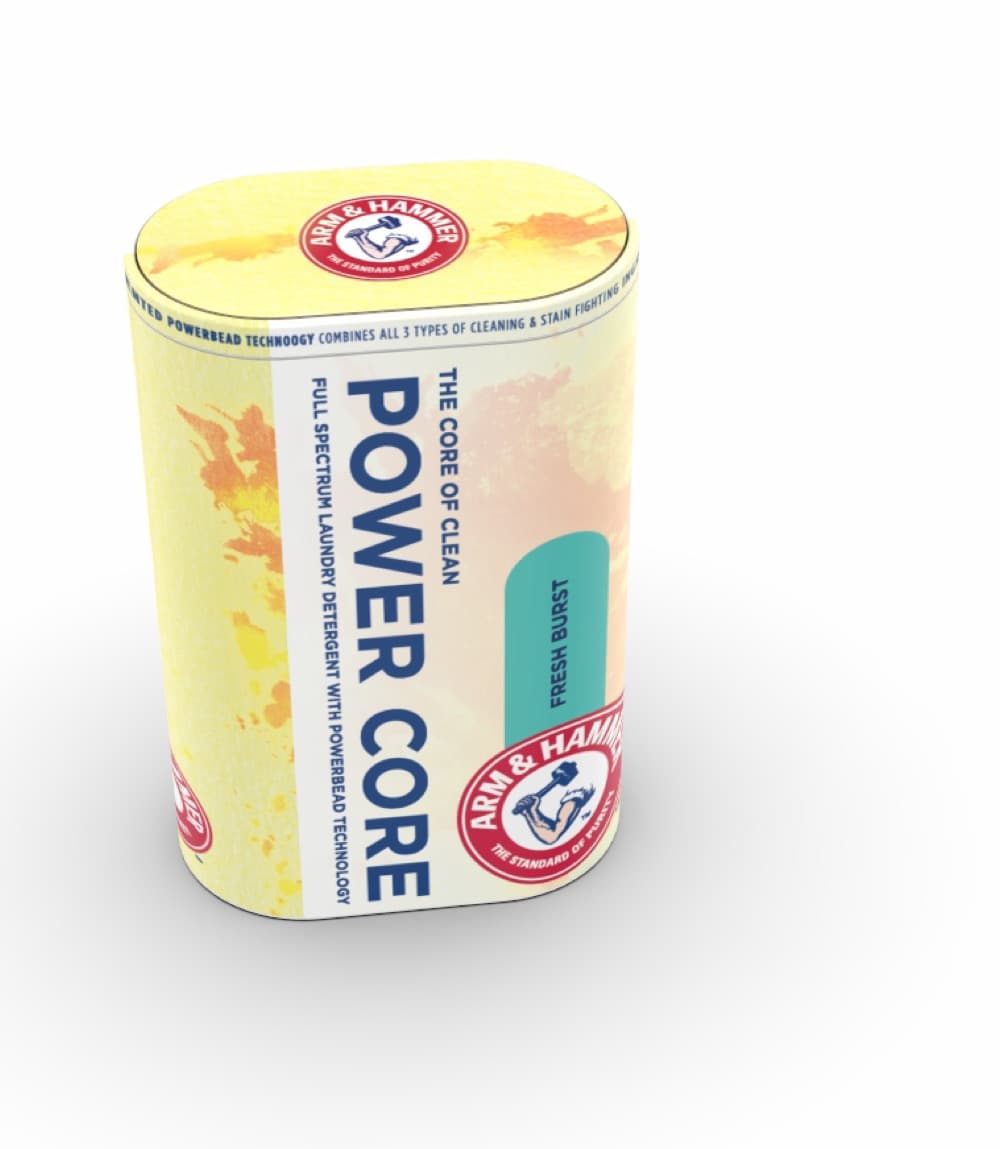
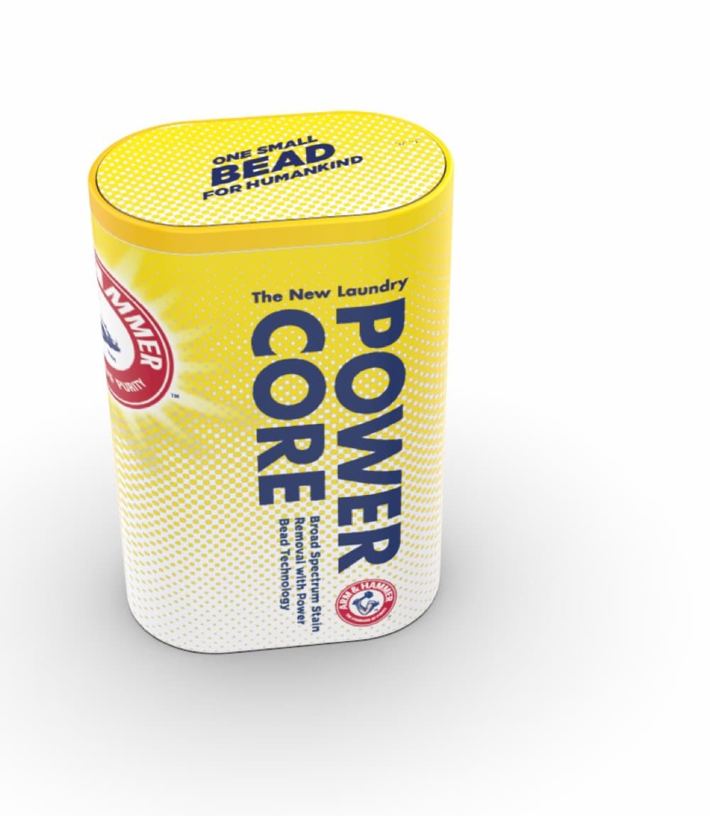
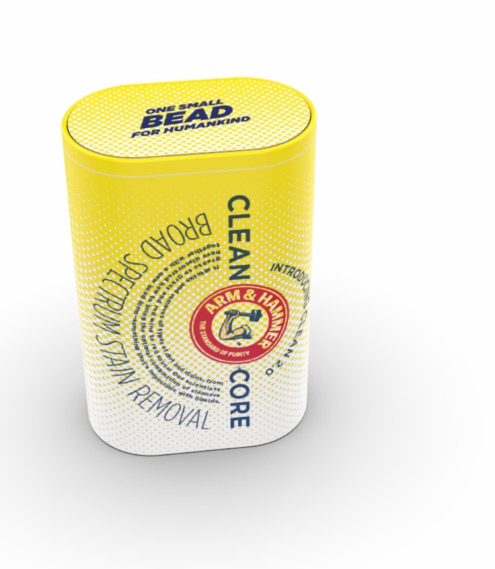
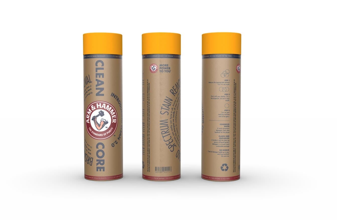
The system was modeled in three dimensions before printing. We built three-quarter renders so leadership could see how sleeves sit on the can, how the variant pill reads on shelf, and how the watercolor works at distance. Renders persuaded. Prints confirmed.
The shipping product
From render to real cardboard.
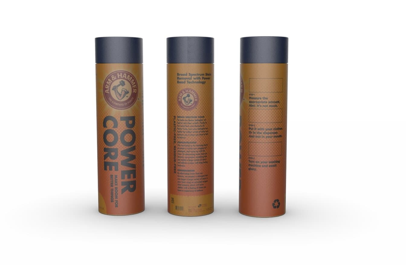
The system shipped on real cardboard. Power Core shipped in terracotta with the navy lid and a "Make Room For Better Things" wraparound. Clean Core 2.0 shipped in kraft with the sunny lid and the rotated "Broad Spectrum Stain Removal" running up the body. The watercolor proofs got tightened down for the printed substrate. Halftone dots stand in for the painted texture once the kraft tube drinks the ink. The result is the same family of objects, sized for a real laundry-aisle shelf instead of a slide.
The book
A 130-page process book.
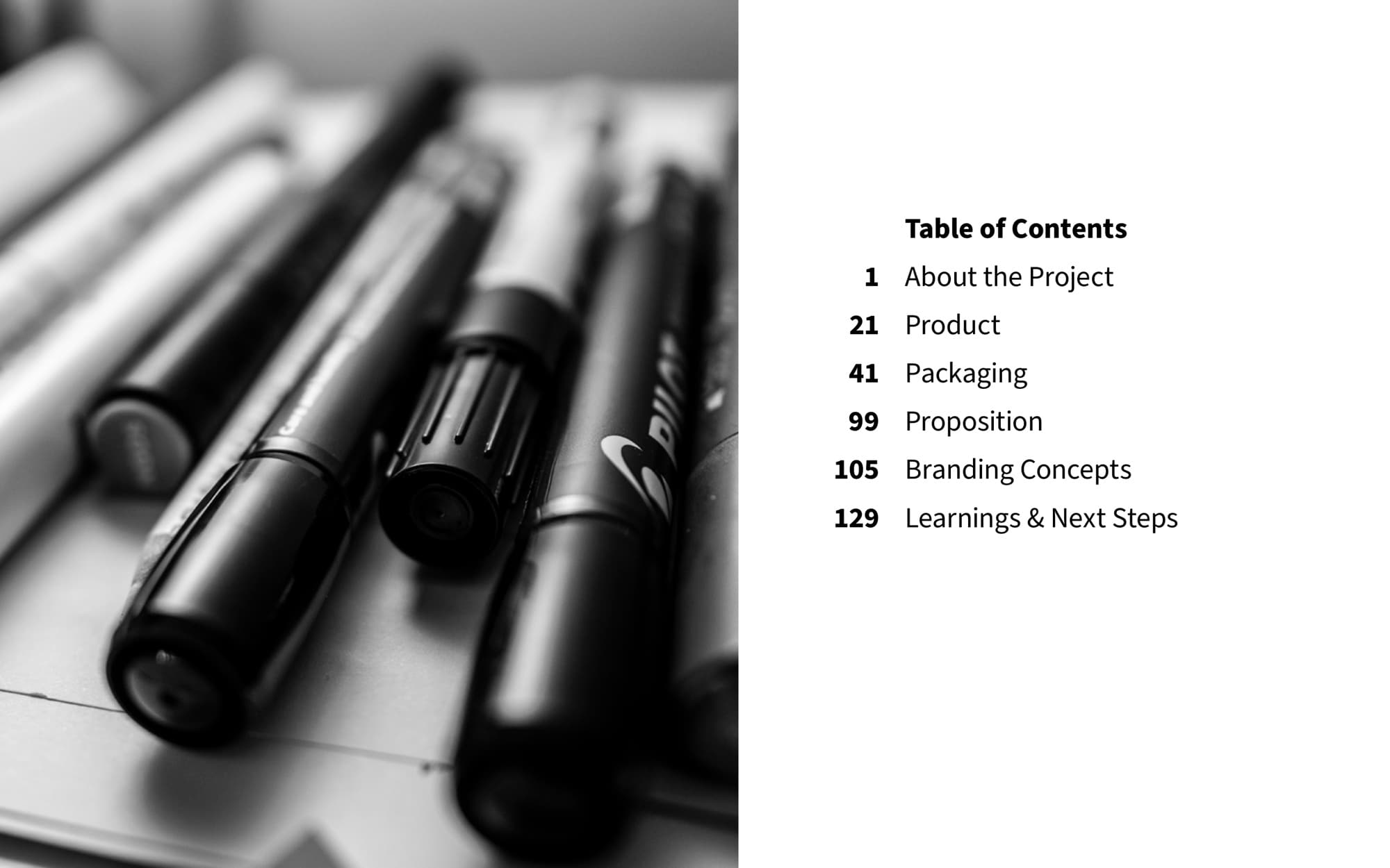
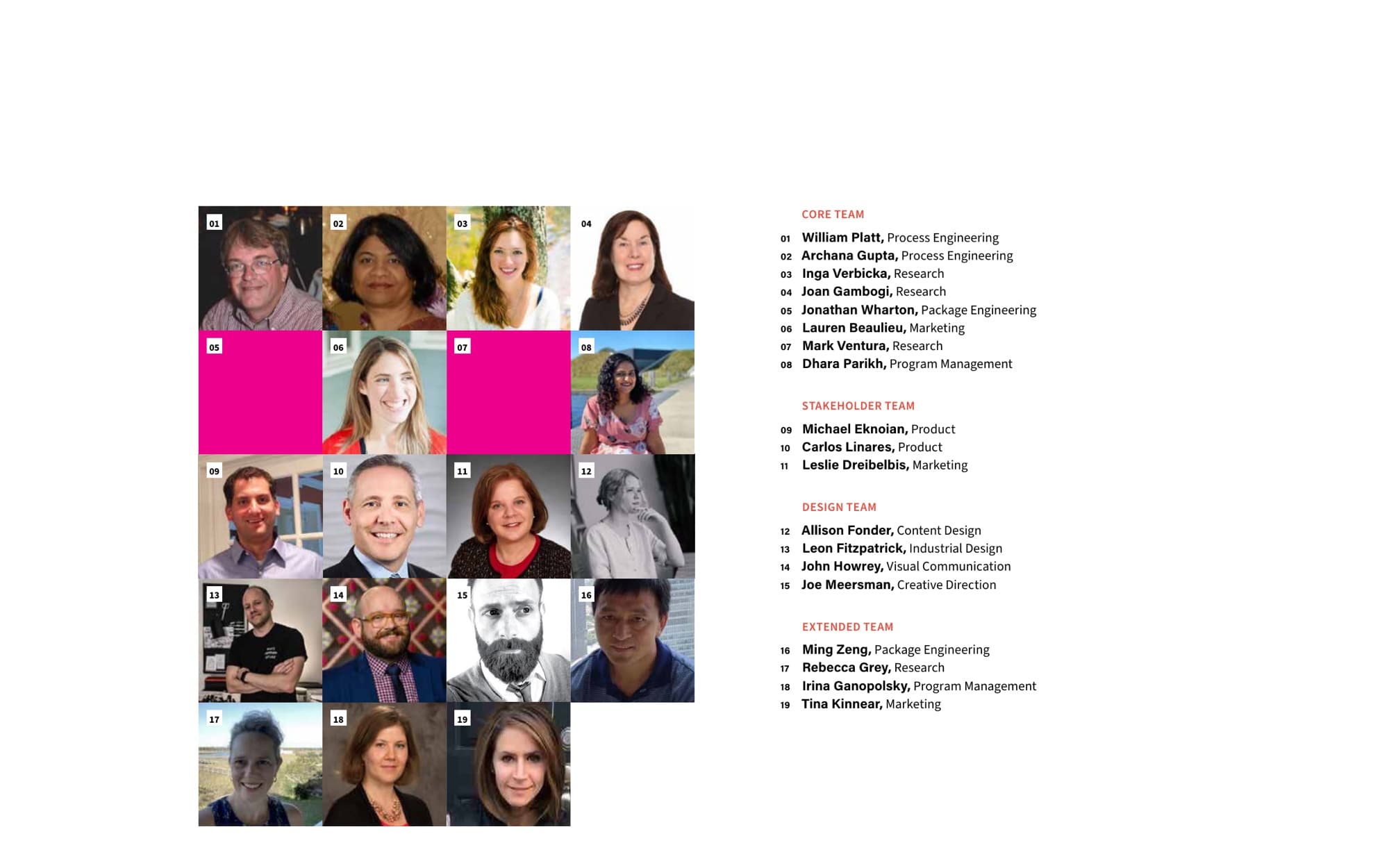
The book ran 130-plus pages and had to do a hard job: explain a product strategy to people who don't usually sit through one. I designed it end to end. Cover, table of contents, section dividers, the team page, the in-progress sketches, the CAD with type column, the variant matrix, and the final packaging mockups all sit on the same grid and read in the same voice.
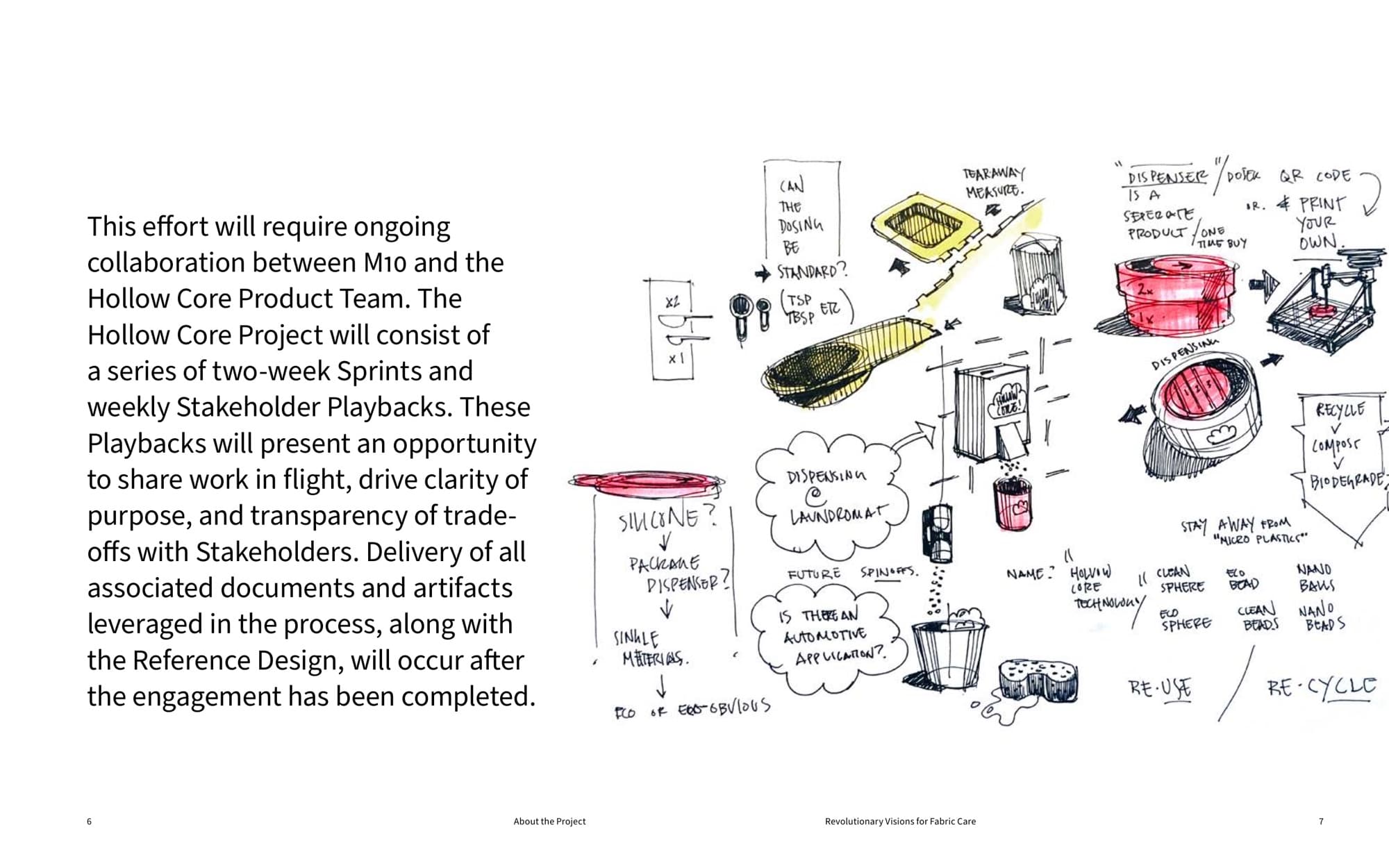
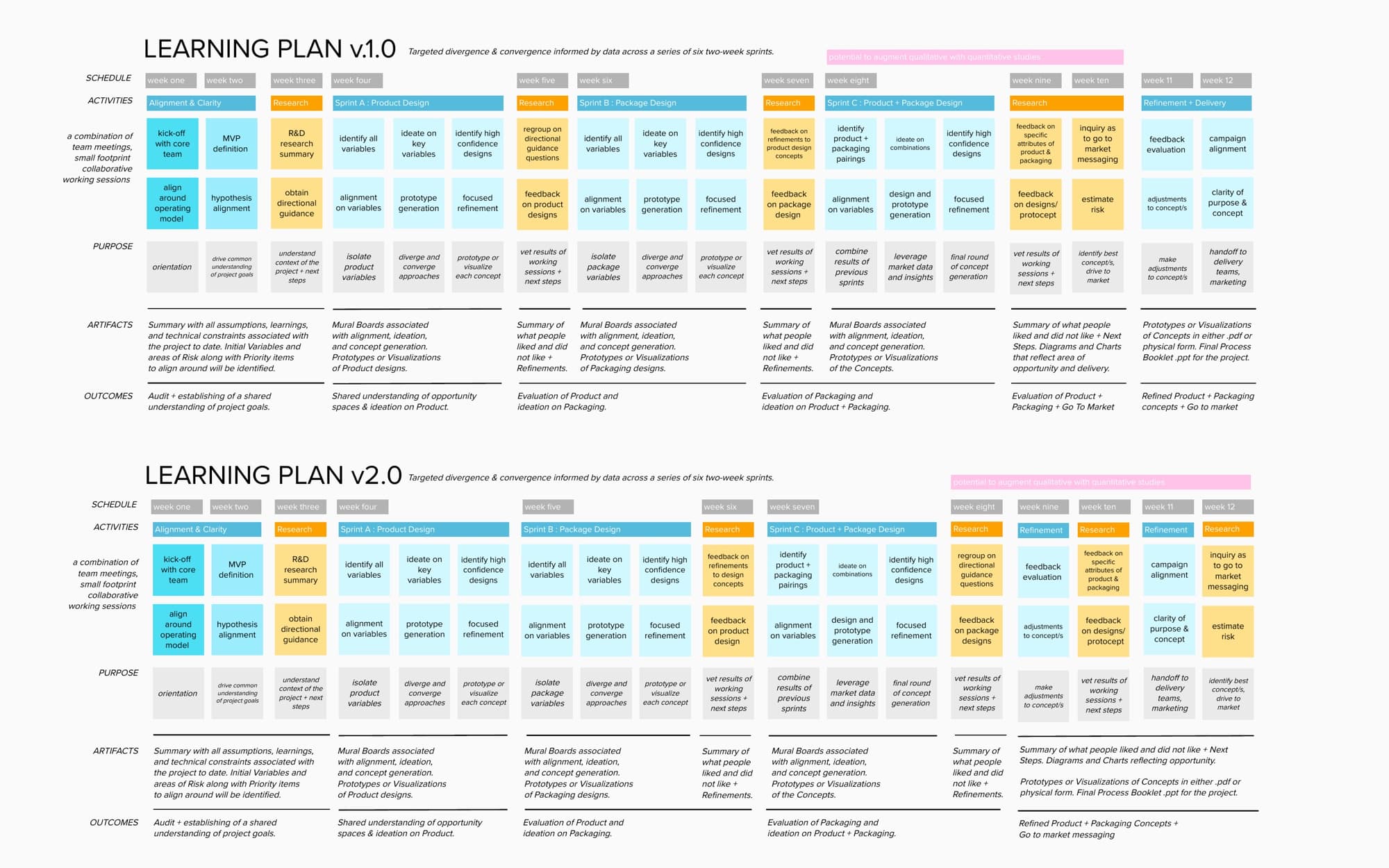

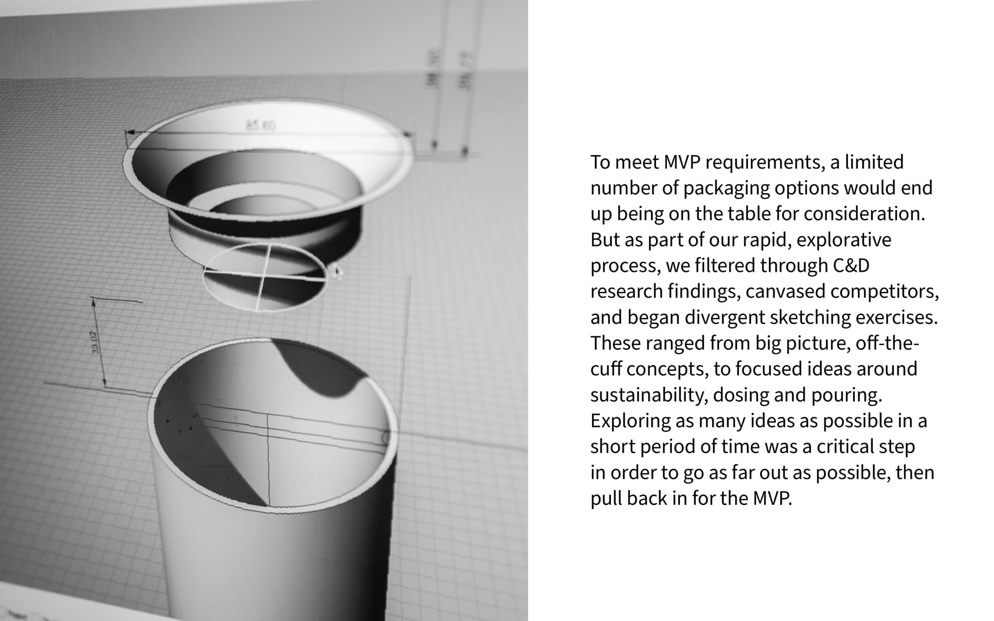
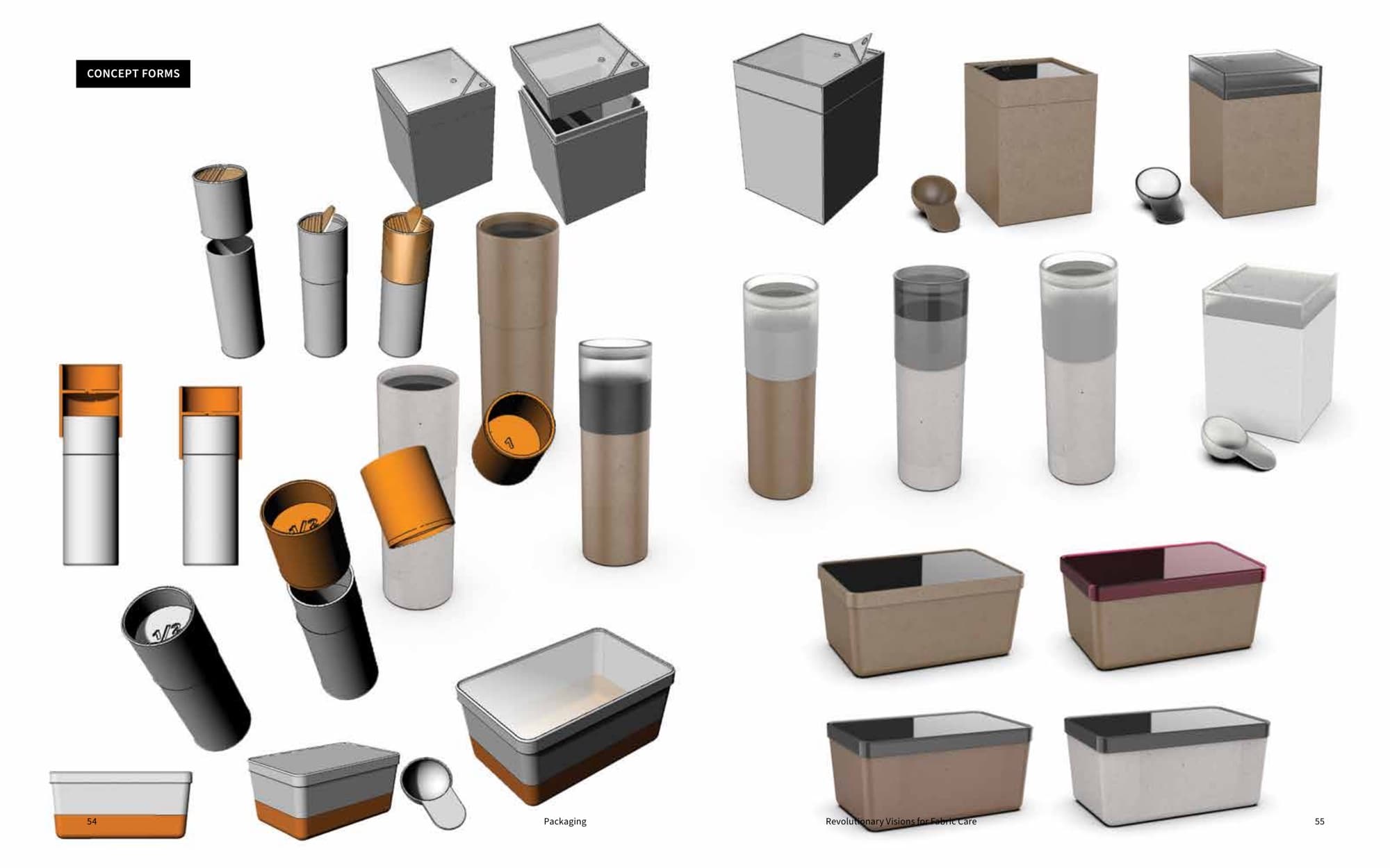
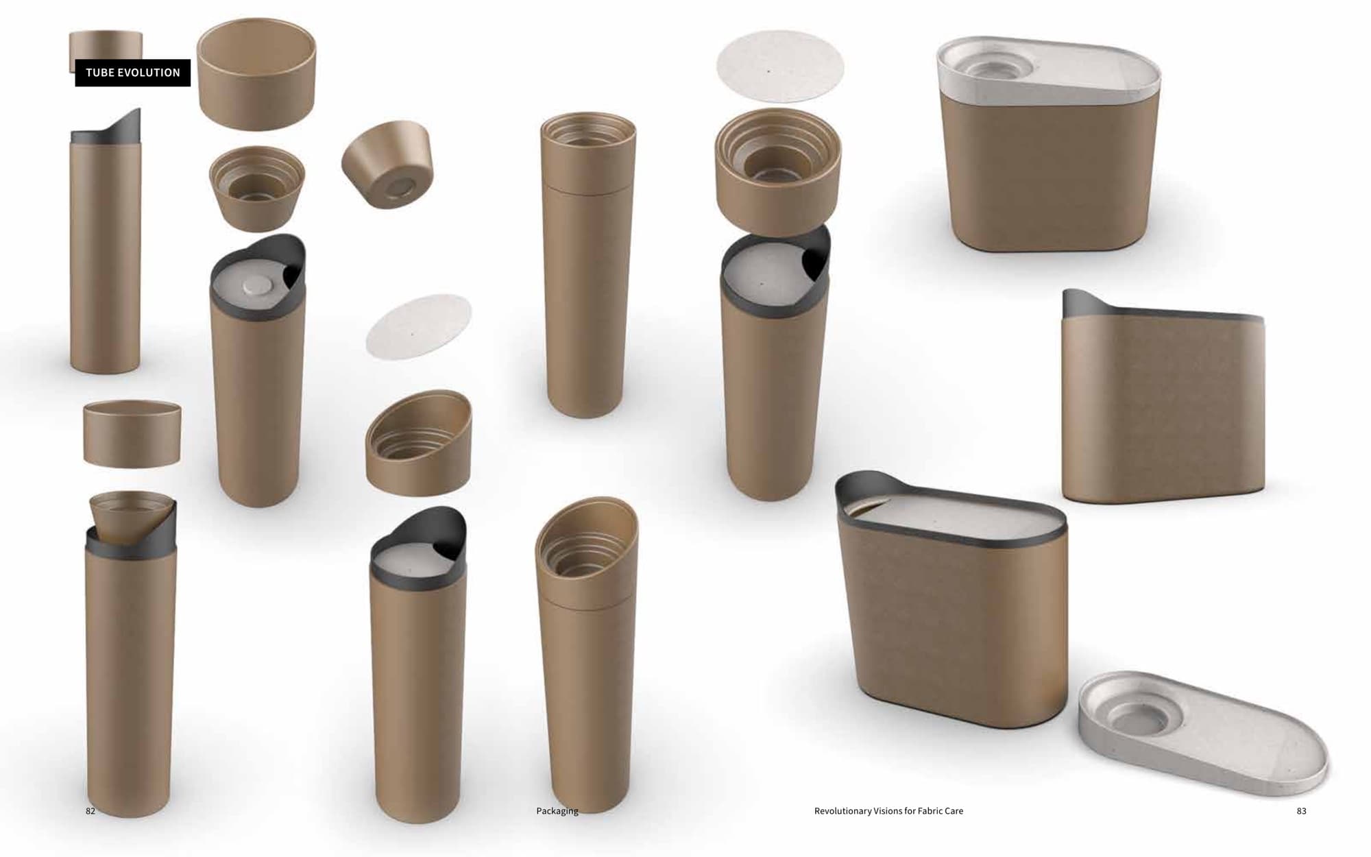
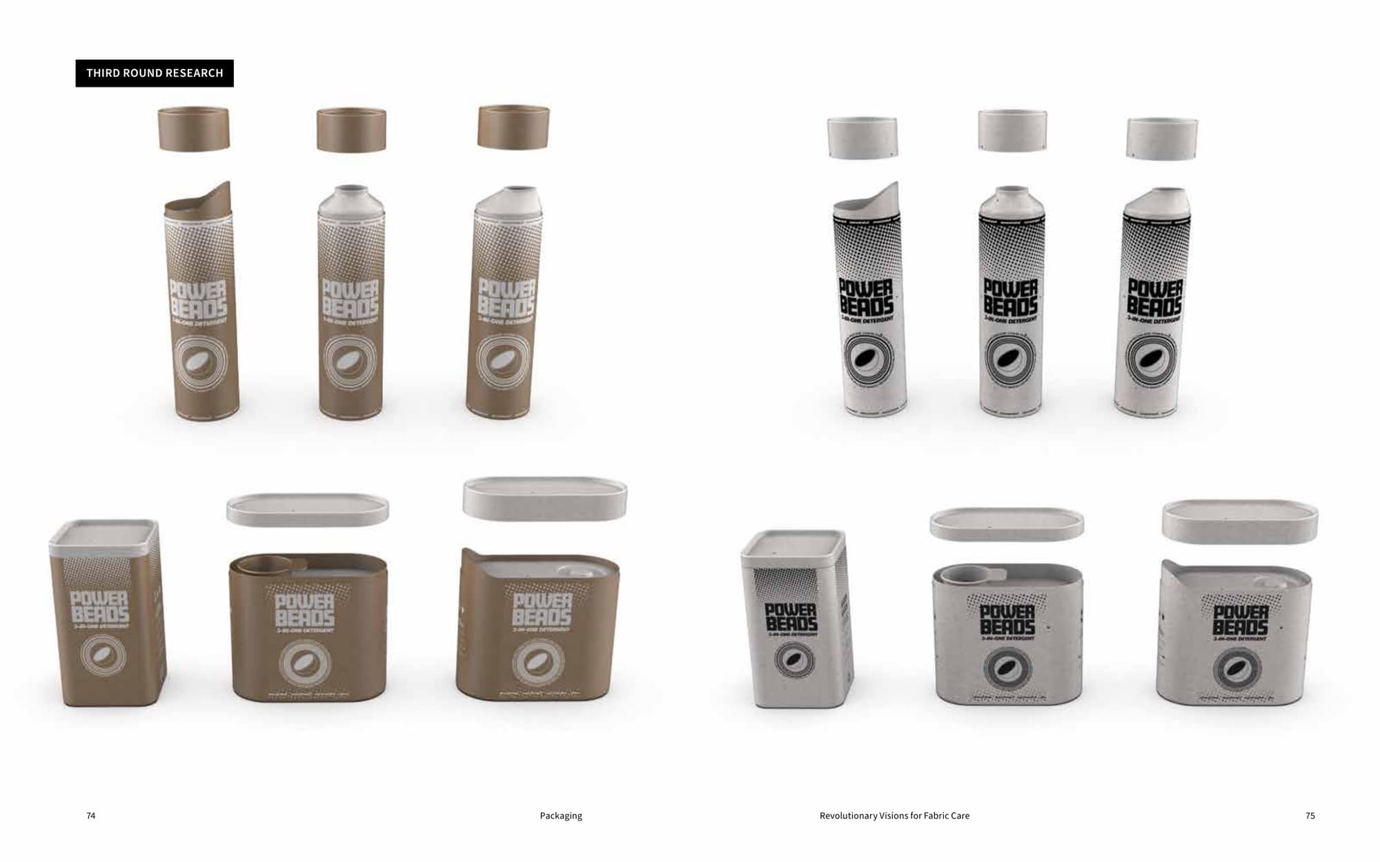
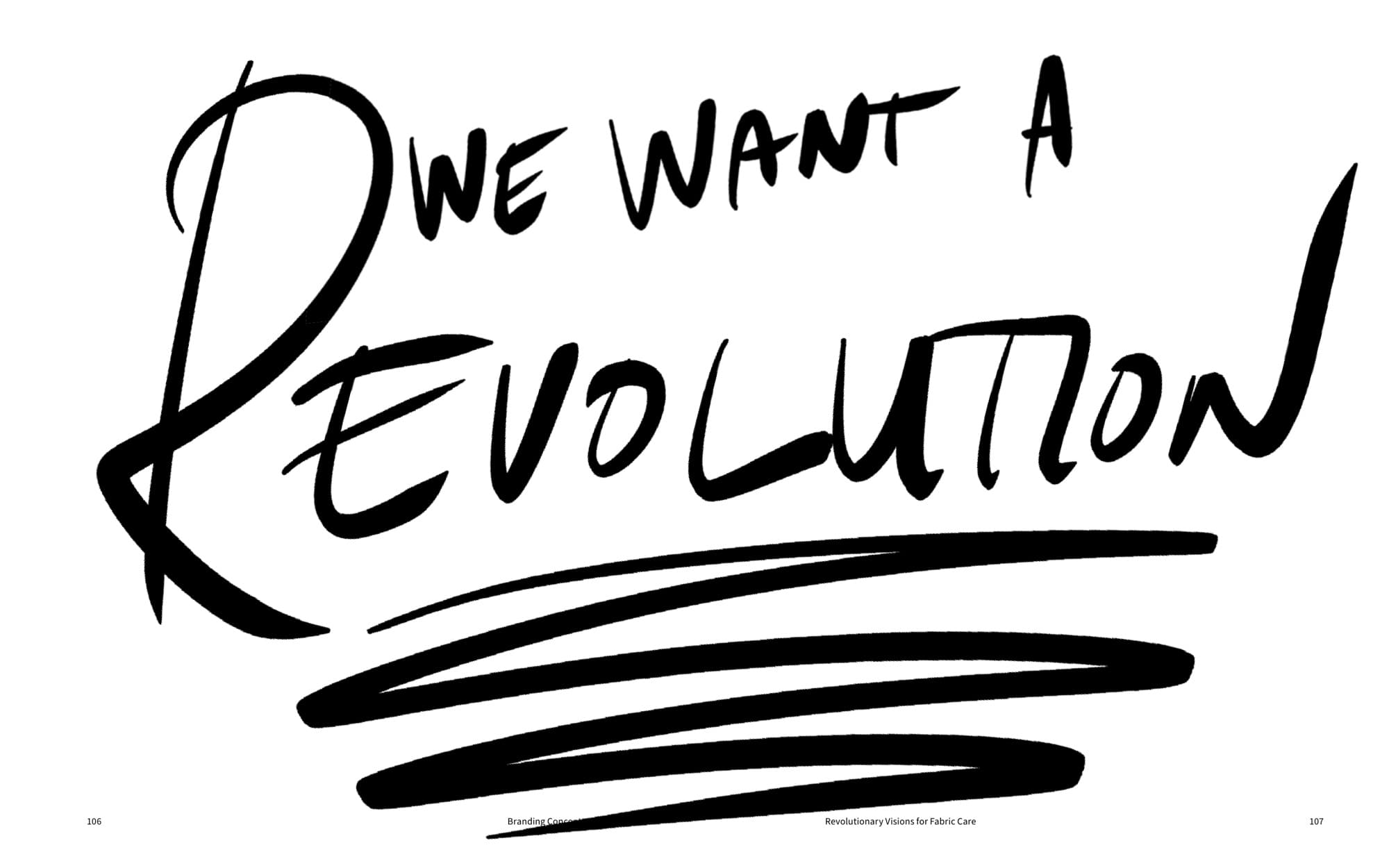
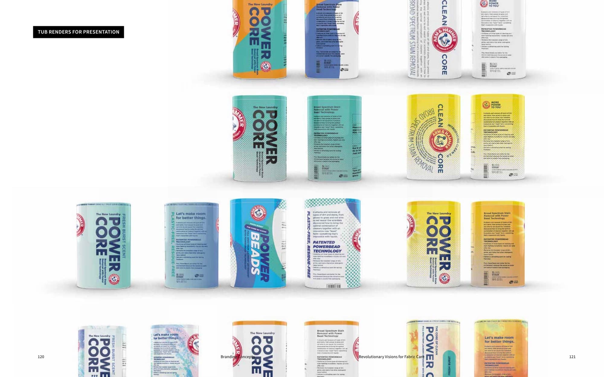
The book is the thing people remembered. It made the work understandable to a room that doesn't usually sit through a product strategy, and that's what let the strategy survive long enough to ship as real packaging.
Takeaways
- Church & Dwight (Arm & Hammer)
- CPG
- Fabric Care
- Packaging
- Visual Communication
- Brand Application
- Editorial Design
- Packaging Design
- Brand Identity
- Book Design
- Made By the Collective
- Arm & Hammer R&D
- Arm & Hammer Marketing
- Princeton Workshop Team
Up next