Signet Education
Renaming and rebranding a Harvard Square tutoring institution for national expansion
Veritas Tutors was an institution in Harvard Square. Smarter-than-average clientele, two decades of word-of-mouth, and a brand that everyone in Cambridge already knew. Then they decided to expand into New York, where the name would conflict with someone else's.
The work was a full rebrand: a new name, a new visual language, a new editorial voice, and a roadmap for migrating customers from the old brand without losing them. I came in as the singular designer on the project. Research, brainstorming, sketches, finals, the master plan that would govern the work for years after launch.
The audit
Whimsy was working. The rest was scrambled.
The legacy work had real strengths. A pleasant, knowing whimsy. Bold images. The Veritas mark visible on every piece. But the call-to-action got lost behind the cleverness as often as not, and the visual hierarchy shifted from poster to postcard to brochure. Strong cohesion at a glance; on closer reading, the system was held together by personality, not by rules.
The competitive set was worse. Tutoring brands tended to look half-assed or too corporate. Editorial polish was rare. A lot of telling, not much showing. Nobody in the category was treating these students like the smart kids they were. There was a clear opening for a brand that took itself, and its students, seriously.
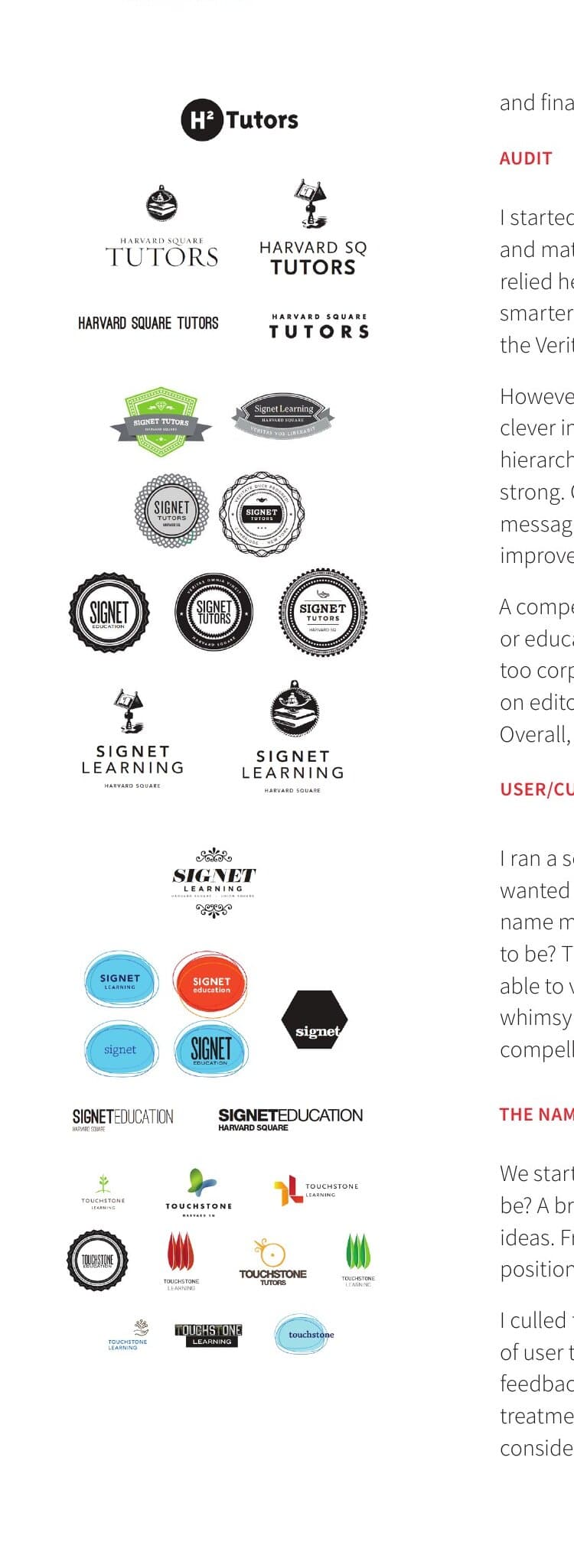
The name
Tested the full picture.
Focus groups with current customers did most of the work the audit could not. The whimsy mattered more than I expected. The bold imagery mattered more than I expected. The Veritas name itself mattered less.
A staff brainstorm produced a long list. Concierge service, elite positions, collaboration metaphors, learning metaphors. I shortlisted candidates and put them in front of the same clientele who had given the audit feedback. But not as words on a screen. As full visual treatments. People react to a name very differently when they can see what it could feel like, so I gave them the feeling and let them tell me which one read as Signet.
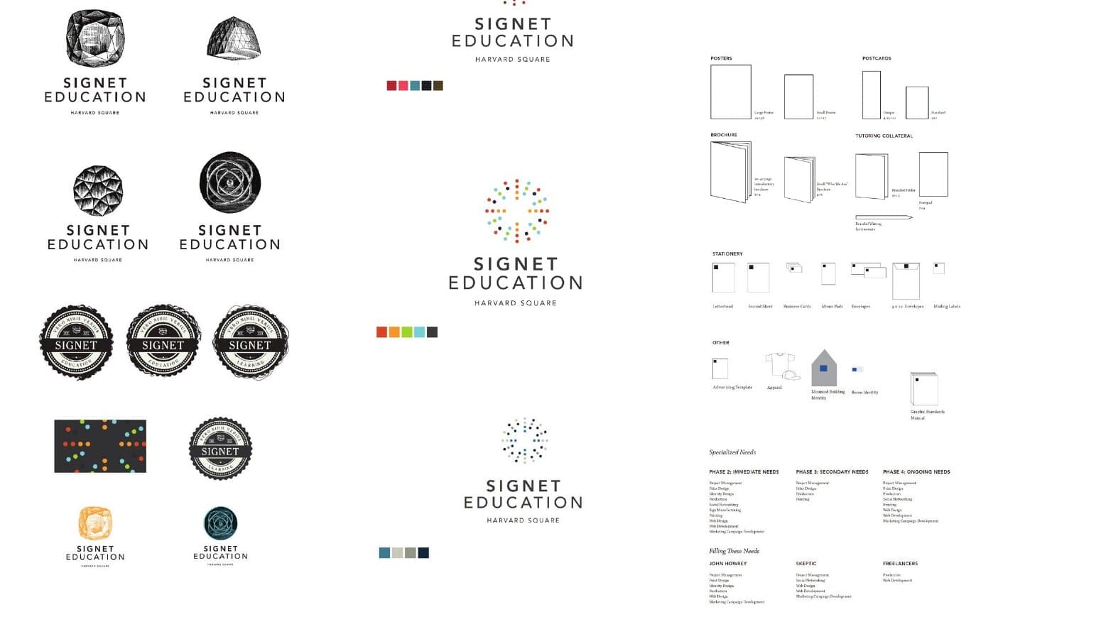
The mark
A modern signet. A star. Or rays.
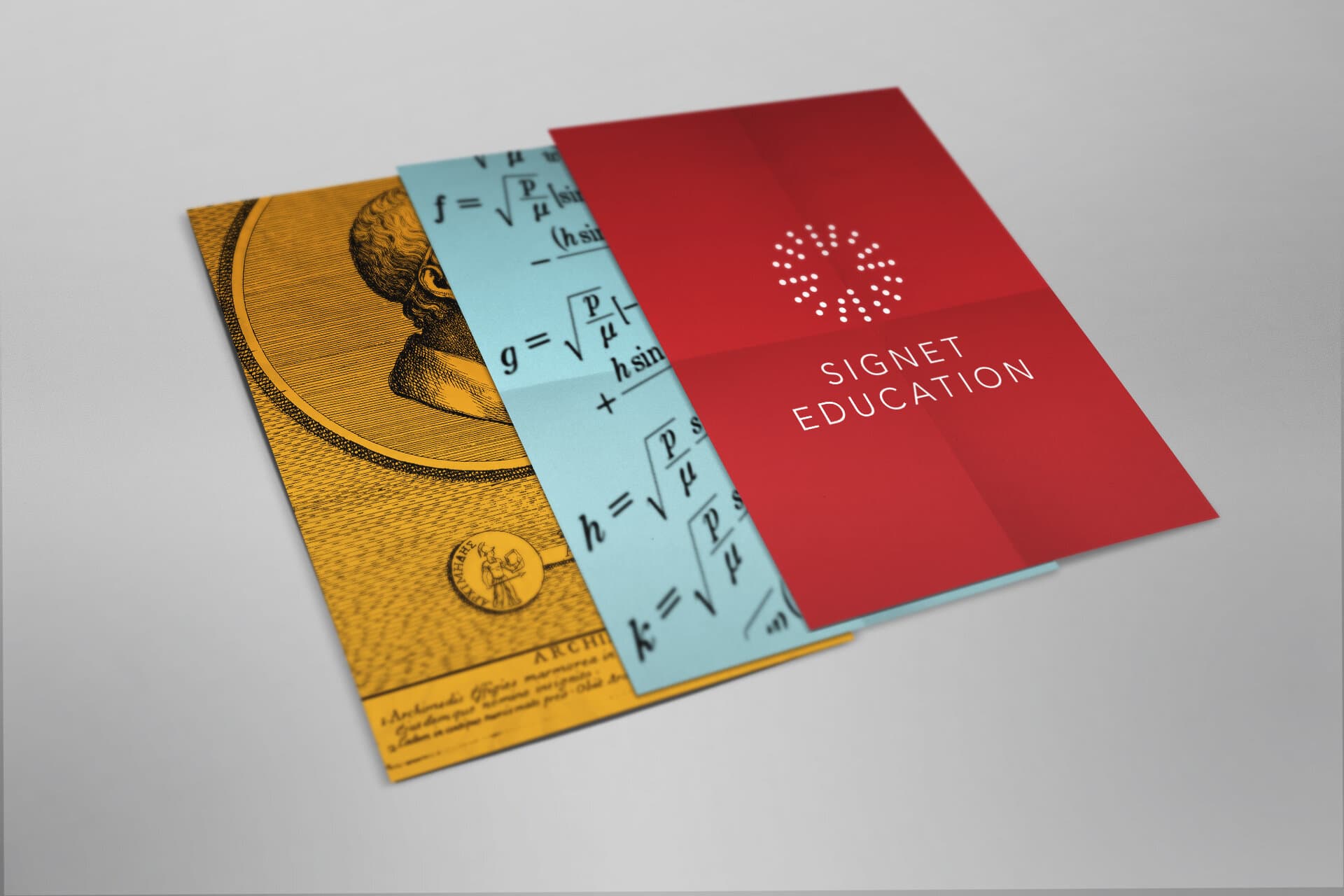
The chosen mark is a circle of dots in red, navy, teal, and sand. Read it as the impression of a signet ring. Read it as a star. Read it as rays of light radiating from a single point. Each reading is true, and each reading is one the audience is allowed to find on their own. The mark stays small and confident on every piece. It does not announce itself. It signs the work.
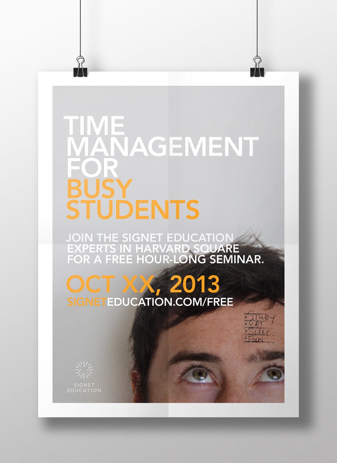
The poster system
Big type. Real photography. One hierarchy, every time.
The editorial system is one rule. Headline at the top in chunky white sans, accent line set in Signet orange, a documentary photograph that earns the right half of the sheet, the date and CTA below, the dotted mark small at the bottom. Every poster in the campaign reads the same way before you read a word of it.


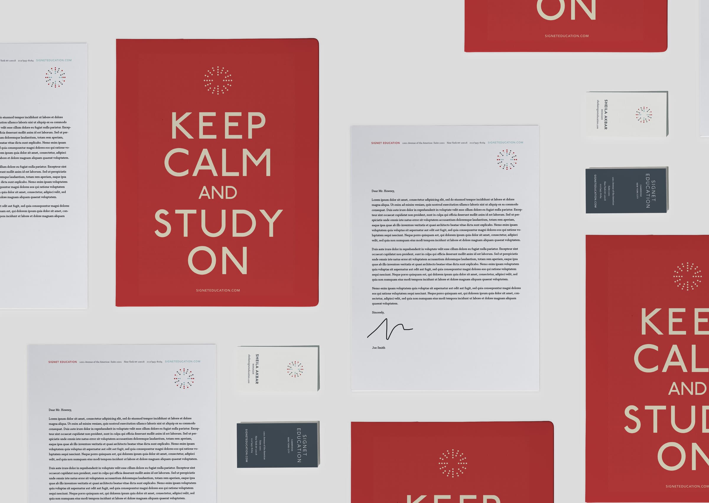
Stationery
Keep calm. Study on.
The stationery package was the workhorse. Letterhead, second sheet, business cards, memo pads, three sizes of envelope, mailing labels. The folio cover doubled as morale poster. The letterhead used the dotted mark restrained at the top so the signature could carry the personality.
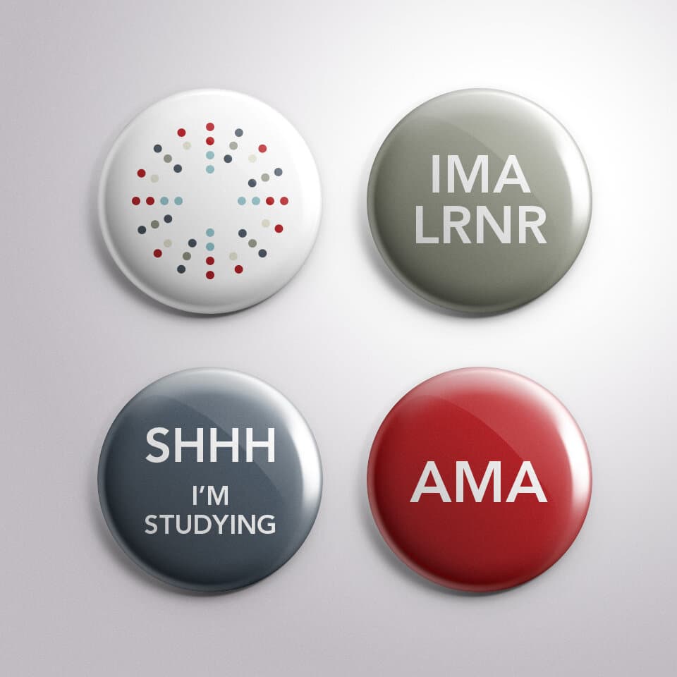
Pins
The brand, worn casually.
Pins were the quiet brand ambassadors. The mark on white. IMA LRNR in olive. SHHH I'M STUDYING in slate. AMA in Signet red. Internal tone for an internal audience, with enough wit to escape into the wild.
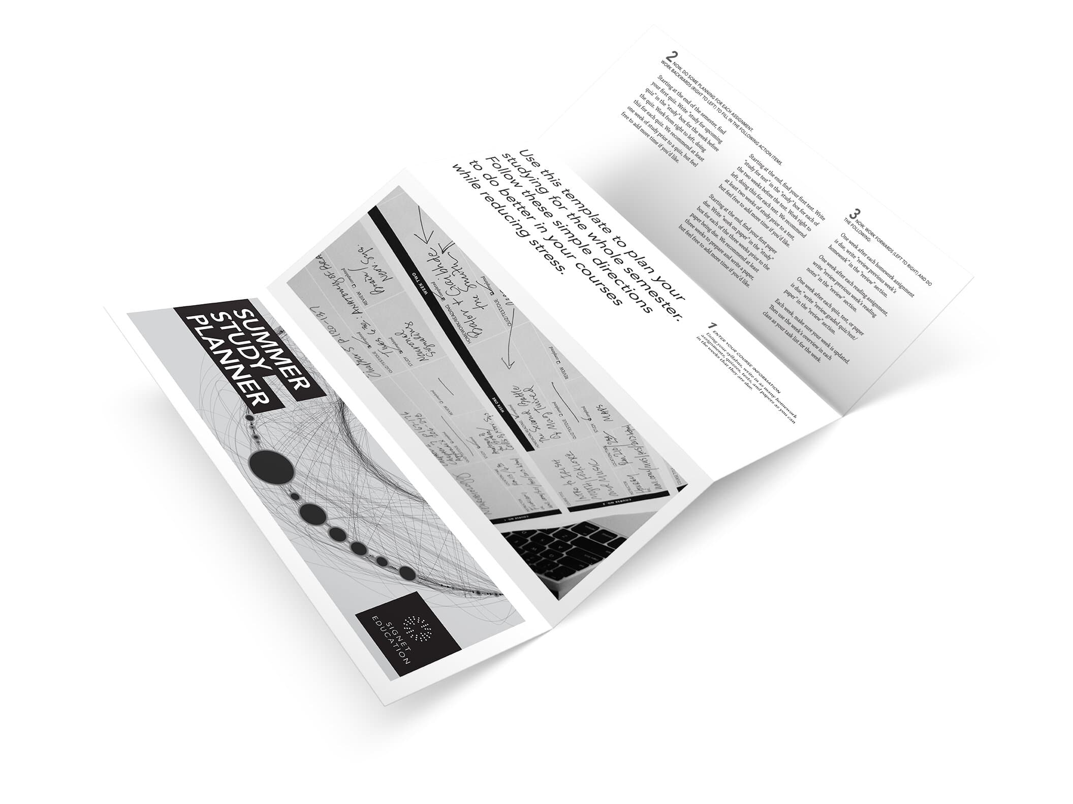
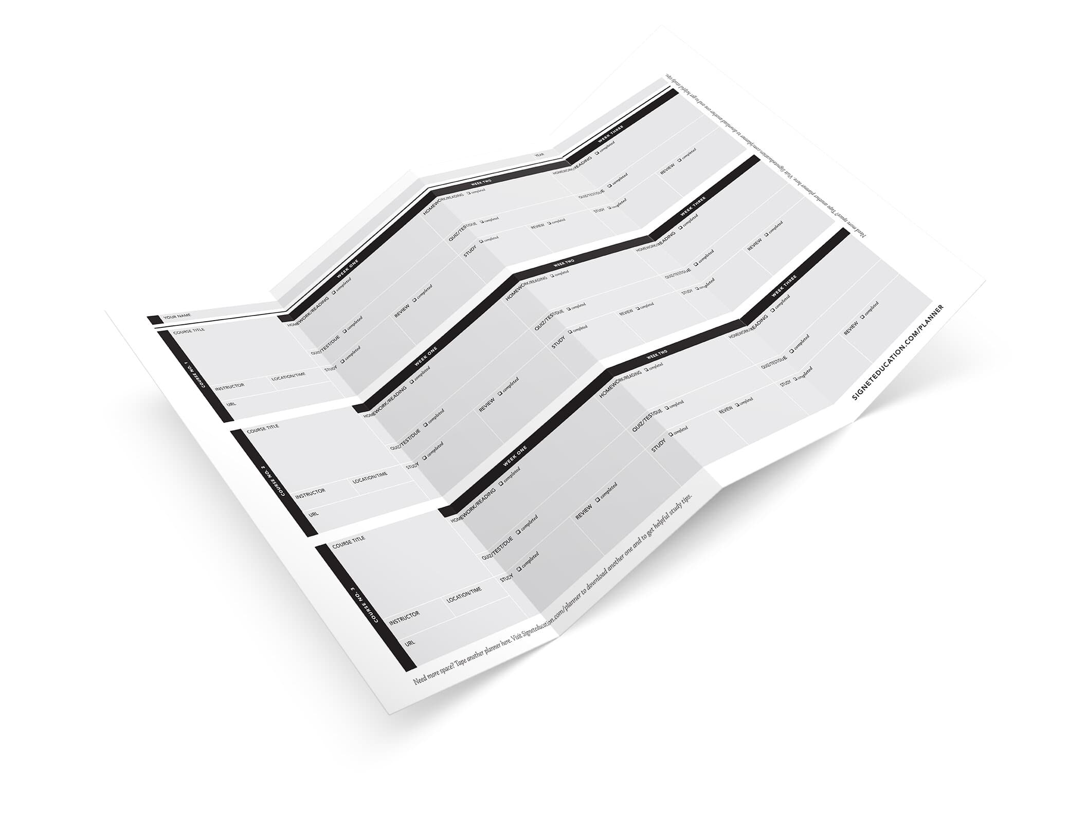
The Summer Study Planner
Long-form brand utility.
The Summer Study Planner gave students something useful to keep on their desks. A trifold with directions on one side, and a fold-out grid for plotting weeks, courses, and review on the other. It earned its place on a desk by being useful first and branded second.
The Master Plan
A rule book and a paper trail.
The deliverable that outlasted the launch was the Master Plan: every artifact in the system, scoped across three phases, with the staffing and freelance plan to produce them. Part rule book, part production schedule, part record of the decisions we made and why. The work this document protected was every poster, brochure, and email that anyone at Signet would ship for years afterwards.
A new name is permission to start over. Done well, it leaves the audience the part of the old brand they actually loved (the whimsy, the bold images, the signature mark on every piece) and quietly retires the part that wasn't working. The mark signs the work. The work is the brand.
Closing
- Signet Education (formerly Veritas Tutors)
- Education
- Test Prep
- Tutoring
- Lead Designer
- Brand Strategy
- Editorial Design
- Production
- Brand Identity
- Naming
- Editorial Design
- Signet Education leadership
- Signet Education staff (research + brainstorm)
Up next