LongCenter.EDU
A master brand and three pillars for the Long Center for the Performing Arts' education and outreach
The Long Center is the performing arts venue in Austin. The building is the one with the arched bridge silhouette on Lady Bird Lake. What was less visible was everything the Center did for arts education in the city: a summer rep theatre season, a high school musical theatre awards program, a working summer camp, college audition coaching, ticket-access initiatives. Each one had grown up on its own. None of them shared a brand.
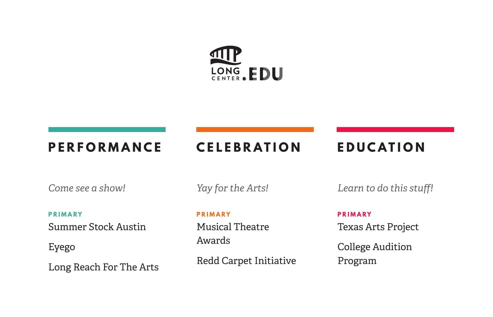
The work was the architecture for that. One master mark, LongCenter.EDU, with three pillars underneath: Performance, Celebration, Education. Each pillar was a color and a tone. Each program inside a pillar got a typographic mark of its own that obeyed the same rules. Programs that already existed had their identities rebuilt. New programs could plug into the system without negotiating from scratch.
Three pillars
Performance. Celebration. Education.
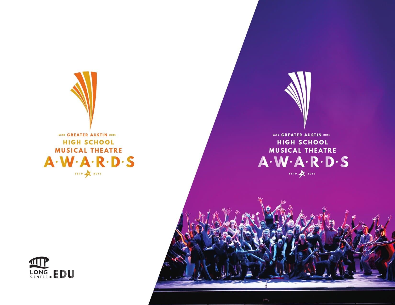
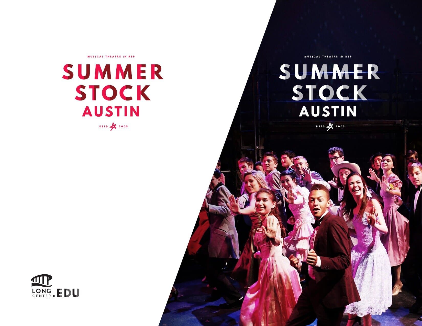
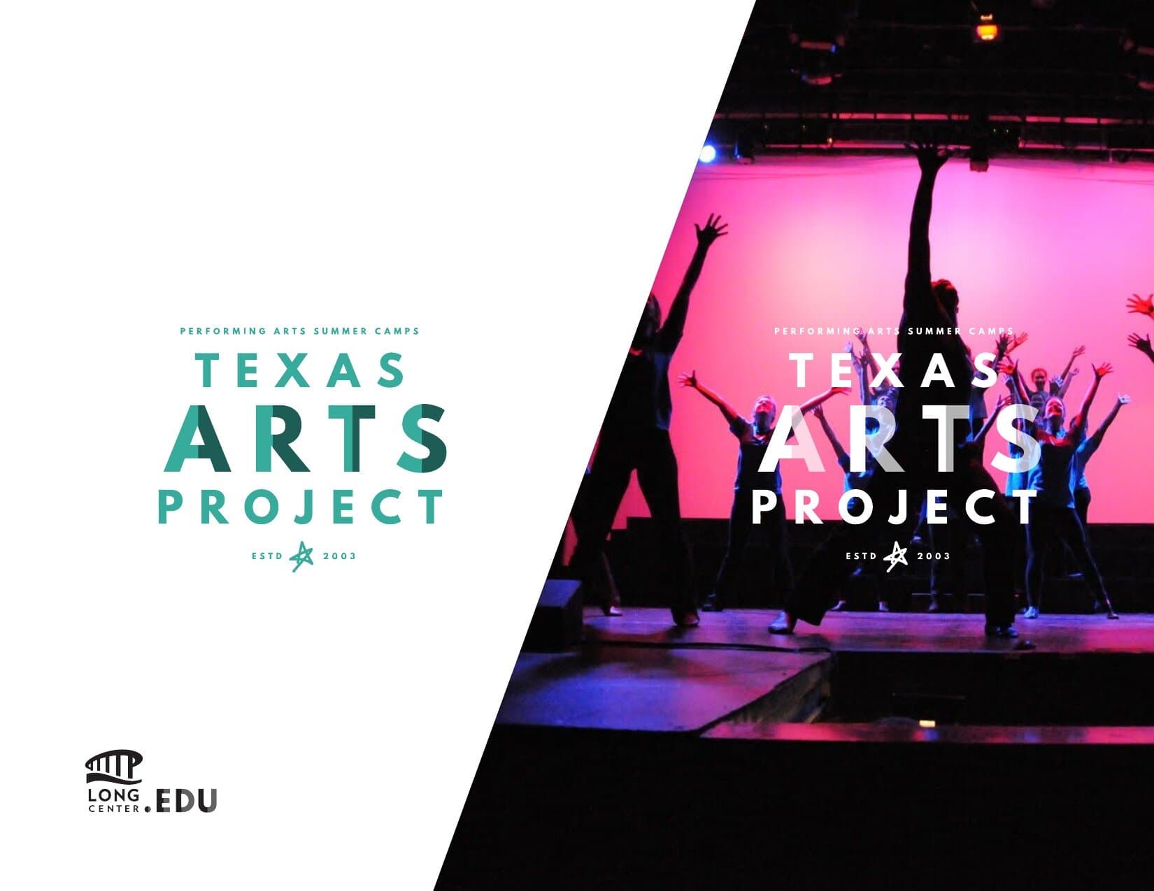
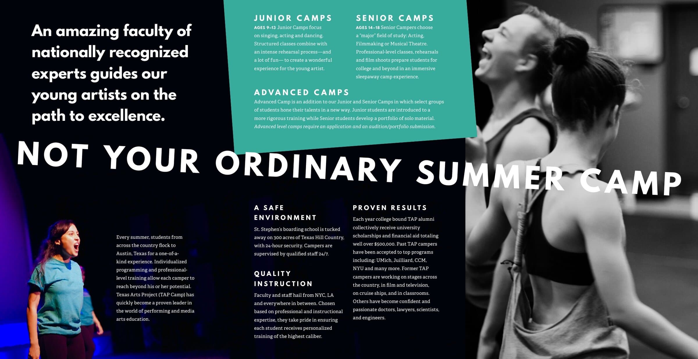
Performance is "Come see a show." Celebration is "Yay for the Arts." Education is "Learn to do this stuff." Each pillar runs in its own color (teal, orange, pink, each one a mood before it's a label) and groups its programs underneath. Summer Stock and Long Reach For The Arts live in Performance. Musical Theatre Awards and Redd Carpet Initiative live in Celebration. Texas Arts Project and the College Audition Program live in Education. The pillar tells you what flavor of arts experience you're walking into before you read a word about the program.
The program marks
One typographic logic. Three distinct voices.
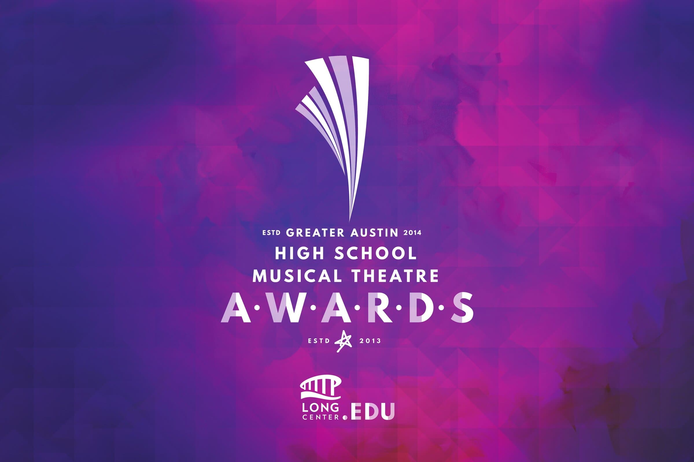
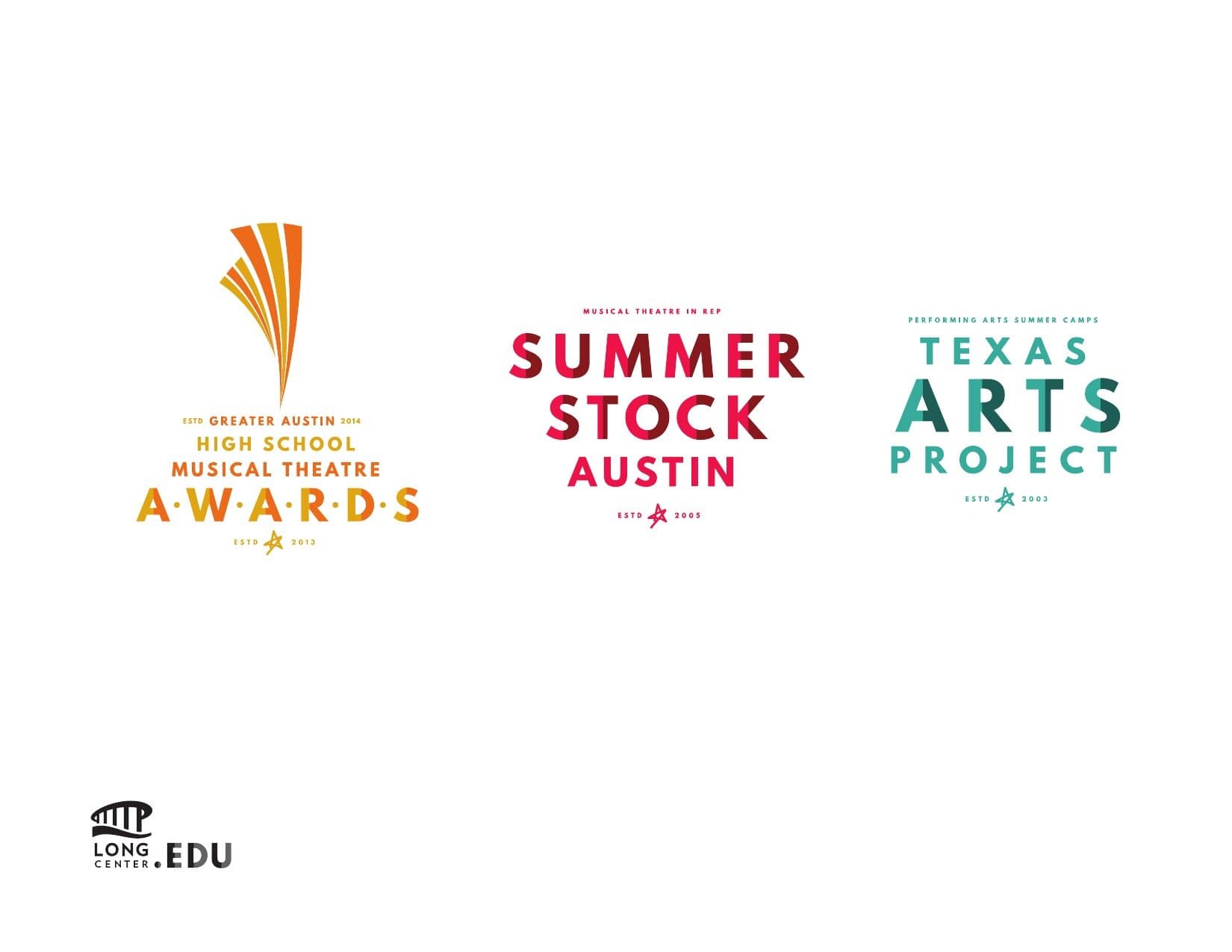
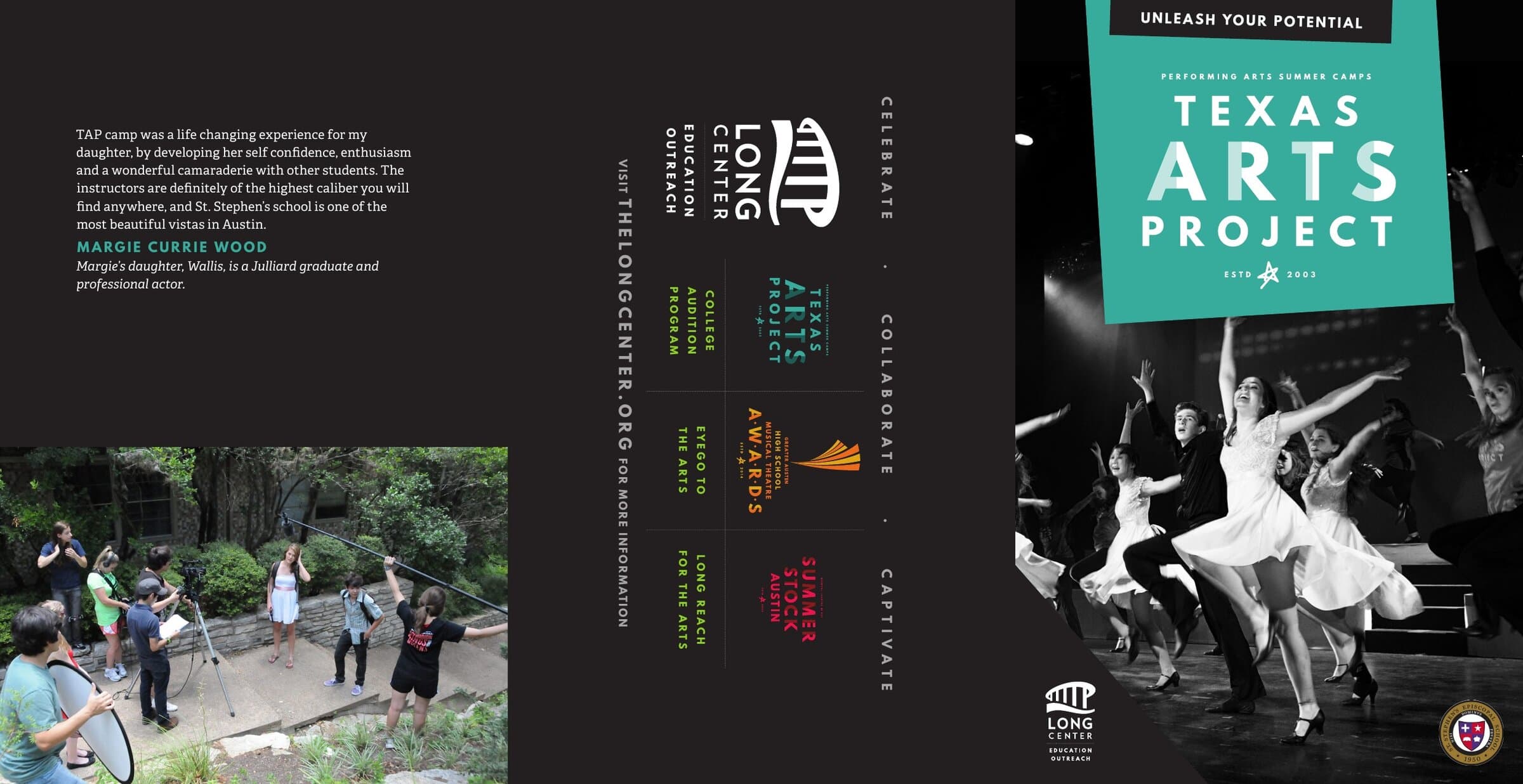
Each program lockup is the same idea, voiced differently. A modifier in small caps above the program name, the program name set big in the brand sans, an "ESTD [year]" date with a small star mark below, the LongCenter.EDU bridge mark applied as a sign-off when the application calls for it. The Awards get a fanned beam icon that doubles as a curtain reveal. Summer Stock and Texas Arts Project run with the typographic mark alone.
The pattern
Color block. Torn into a moment.
The application pattern is the same shape every time. A color panel on the left in the program's signature hue, with the lockup centered. A diagonal tear across the canvas reveals a black-and-white photograph of the program in action behind it: students cheering, dancers mid-leap, a cast held at a curtain call the second before the applause. The mark survives the reveal, visible in both halves so the brand reads at any zoom level.
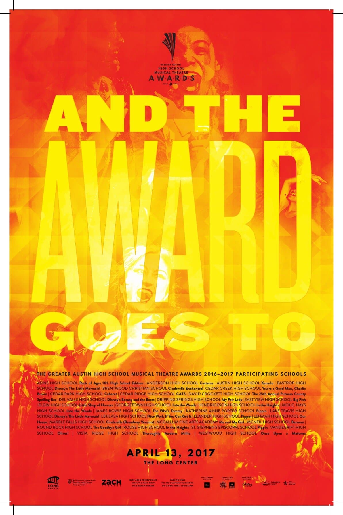
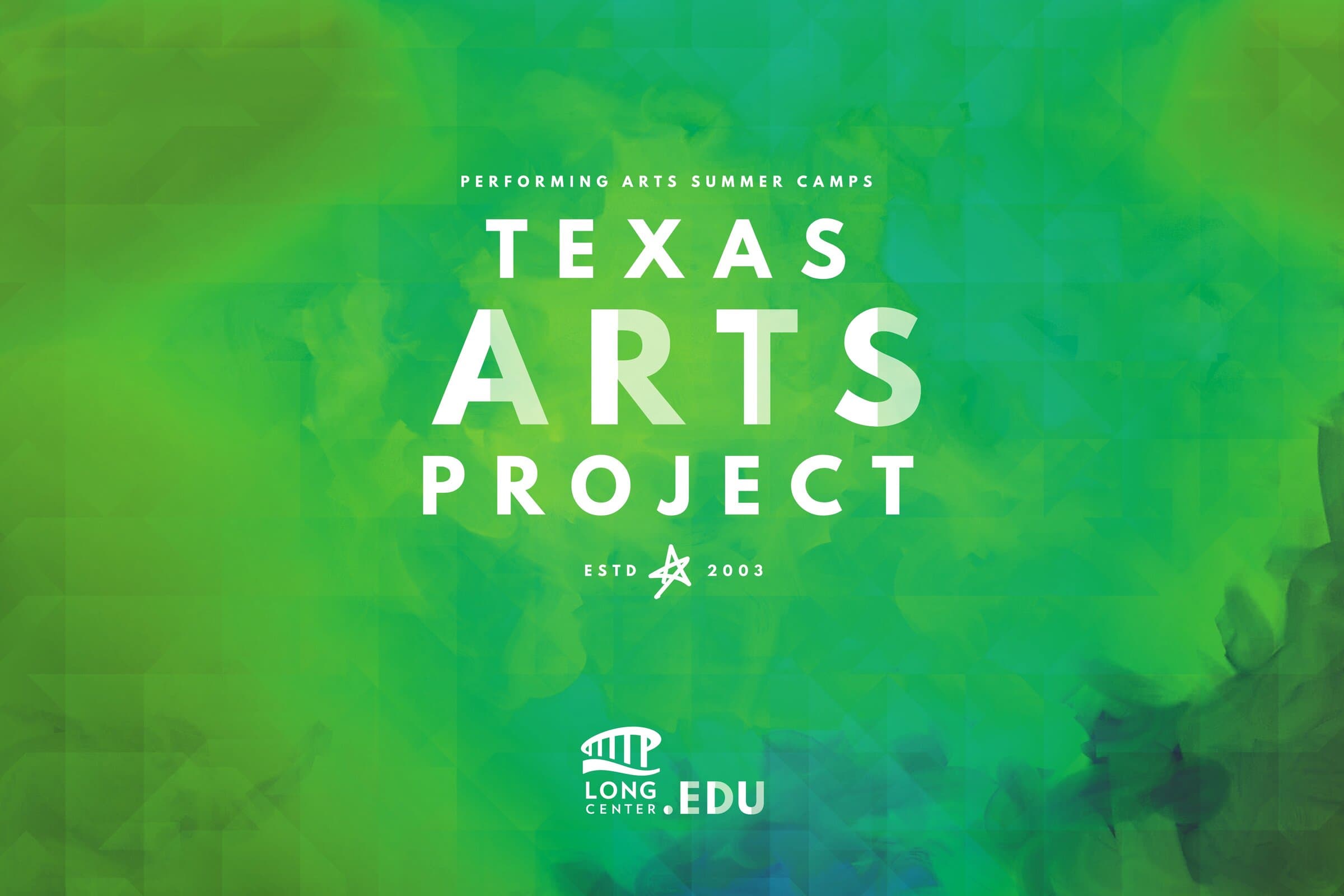
The poster system
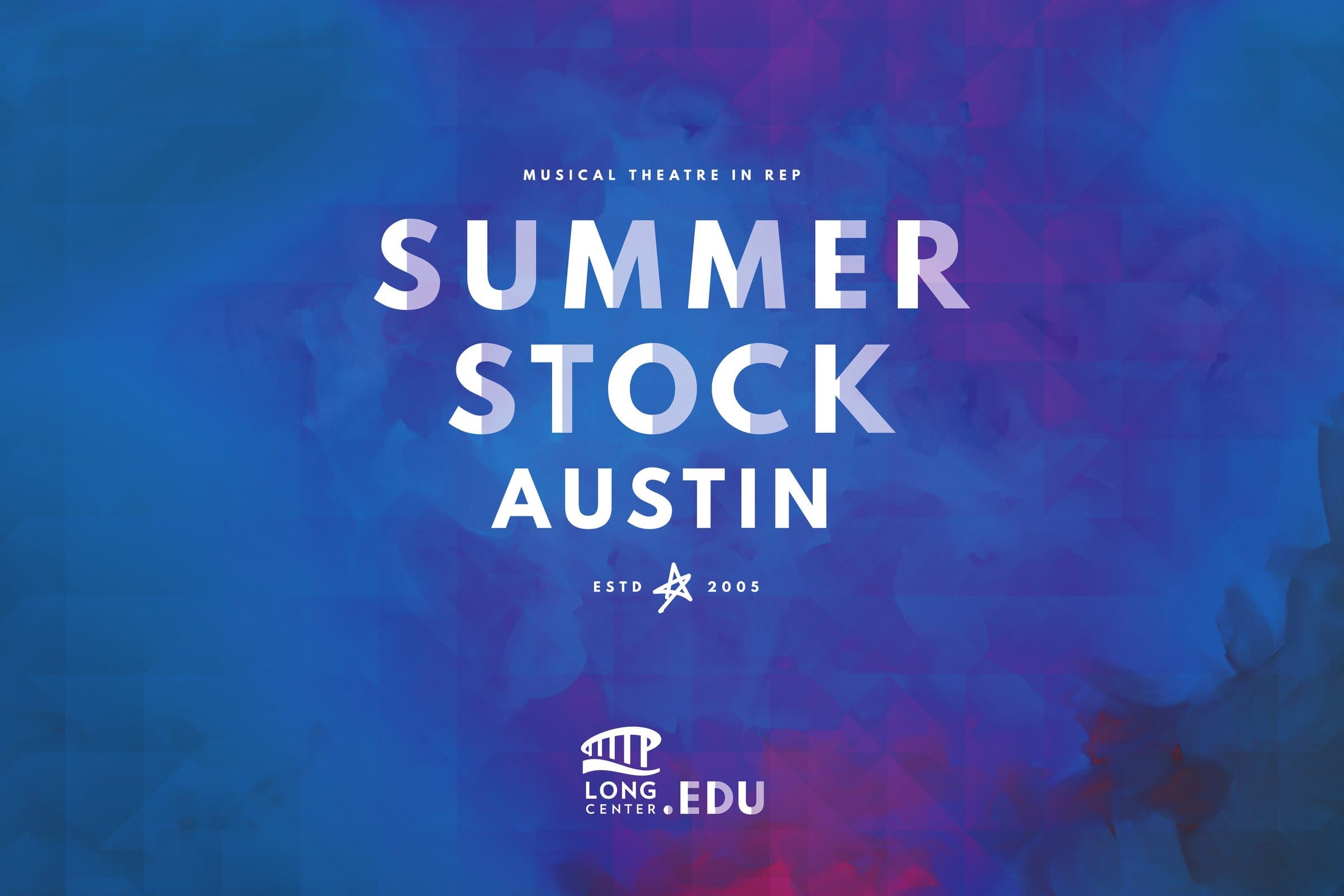
One mark, three watercolor weathers.
The full-bleed posters used the same lockup against an ink-and-watercolor ground tuned to each program's color. Awards in purple-into-magenta. Summer Stock in cobalt-into-magenta. Texas Arts Project in green-into-teal. Each poster is its own room; the master mark at the bottom signs all of them.
The cross-promo
Programs visible in each other's rooms.
An Awards-show banner does double duty as a recruiting moment for every other program under the LongCenter.EDU roof. The standing banner format ends with three pillar callouts (Celebrate · Collaborate · Captivate) and a row of sub-brand chips so a parent or student leaving the awards show already knows which program to enroll in next year.

The .EDU trifold
The whole catalog, in one fold.
The big-picture marketing piece was a single tri-fold that opened to introduce every program in the system at once. Front cover features one program in the watercolor poster format. Inside spread runs the catalog: each program with its mark, its tagline, a parent testimonial, a documentary photograph from the program, and the LongCenter.EDU spine running down the middle gutter.
The bumpers
Five seconds of brand on stage.
Each program got a short motion bumper for the lobby screens at the actual events. The Awards bumper assembles the fanned-beam mark from a tumble of orange and yellow shapes. The Summer Stock bumper resolves a constellation of red fragments into the wordmark. The Texas Arts Project bumper builds the green watercolor wash and lands the lockup. Five seconds, no audio, designed to live on a screen behind a person who is on stage talking.
The system kept growing after launch. New programs slotted in. The trifold reprinted with a new chip in the row. The pillar logic gave the Long Center a way to add and retire programs without rebranding the whole house each time. A master brand done well buys you exactly that kind of room to move.
Closing
- The Long Center for the Performing Arts (Austin)
- Performing Arts
- Arts Education
- Cultural Institution
- Lead Designer
- Brand Architecture
- Editorial Design
- Motion Direction
- Brand Identity
- Brand System
- Motion Graphics
- Long Center education + outreach team
- Sub-brand program leads (Awards, Summer Stock, TAP)
Up next