Musical Theatre Awards
The annual print system for Greater Austin's high school musical theatre awards
The Greater Austin High School Musical Theatre Awards is the Long Center's annual recognition program for the high school musical theatre season. Each spring it picks up roughly forty schools across Central Texas, runs an adjudication tour through every production, and ends with a single ceremony at the Long Center where the season's nominees and winners get celebrated on stage.
I designed the print system that runs the program. Sign, posters, certificates, banners, lobby flyers, program ads, t-shirts, the envelope card the host opens on stage to read the name. Same brand year after year, with the season's photography rotated in and the participating-school list reset.
The headline piece
One sign, one idea, one room.
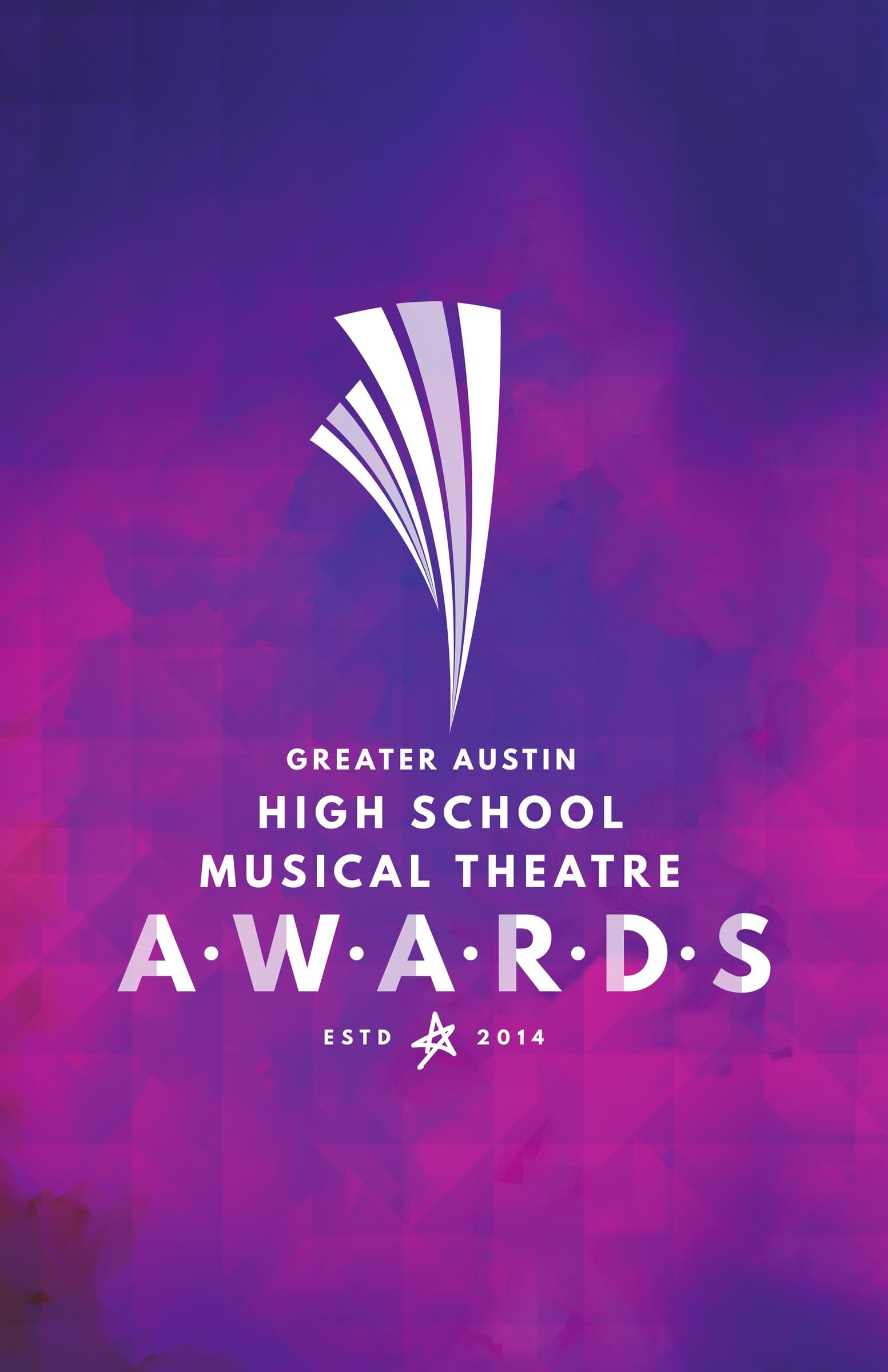
The 22×34 lobby sign is the brand at full strength. The Awards mark, a fanned beam of white stripes that reads as a curtain reveal and a stage spotlight at the same time, sits centered against a violet-to-magenta watercolor wash. The full lockup grounds it. ESTD 2014 dates it. It's the same sign every year. Audience members walking in already know the year's program.
The standing banner
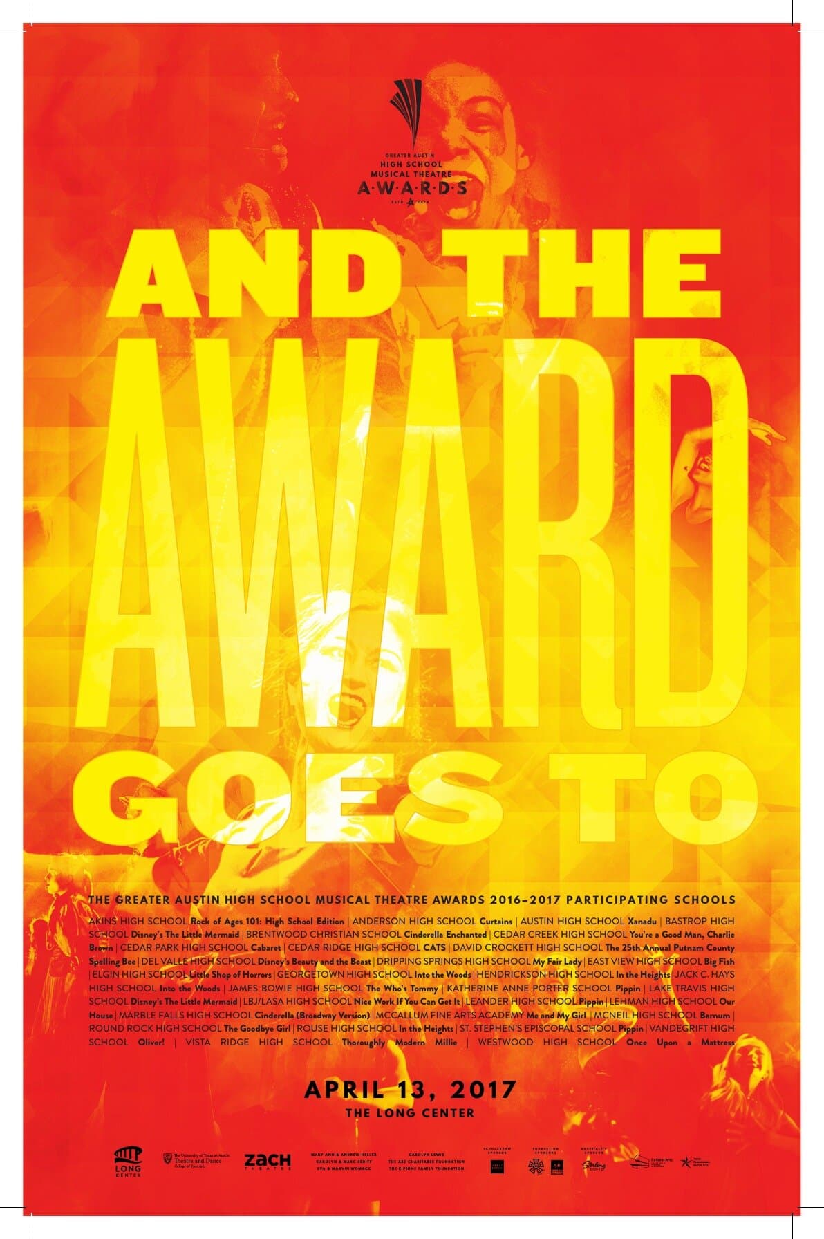
And the award goes to.
The standing banner takes the headline of the participant poster and runs it tall. Same red-and-yellow duotone of cast members onstage, same chunky AND THE AWARD GOES TO overprint, with the Awards lockup and the date slotted in below on a black footer panel. Reused at every step of the year's events: the regional adjudication nights, the nominee announcement, and the lobby of the awards itself.

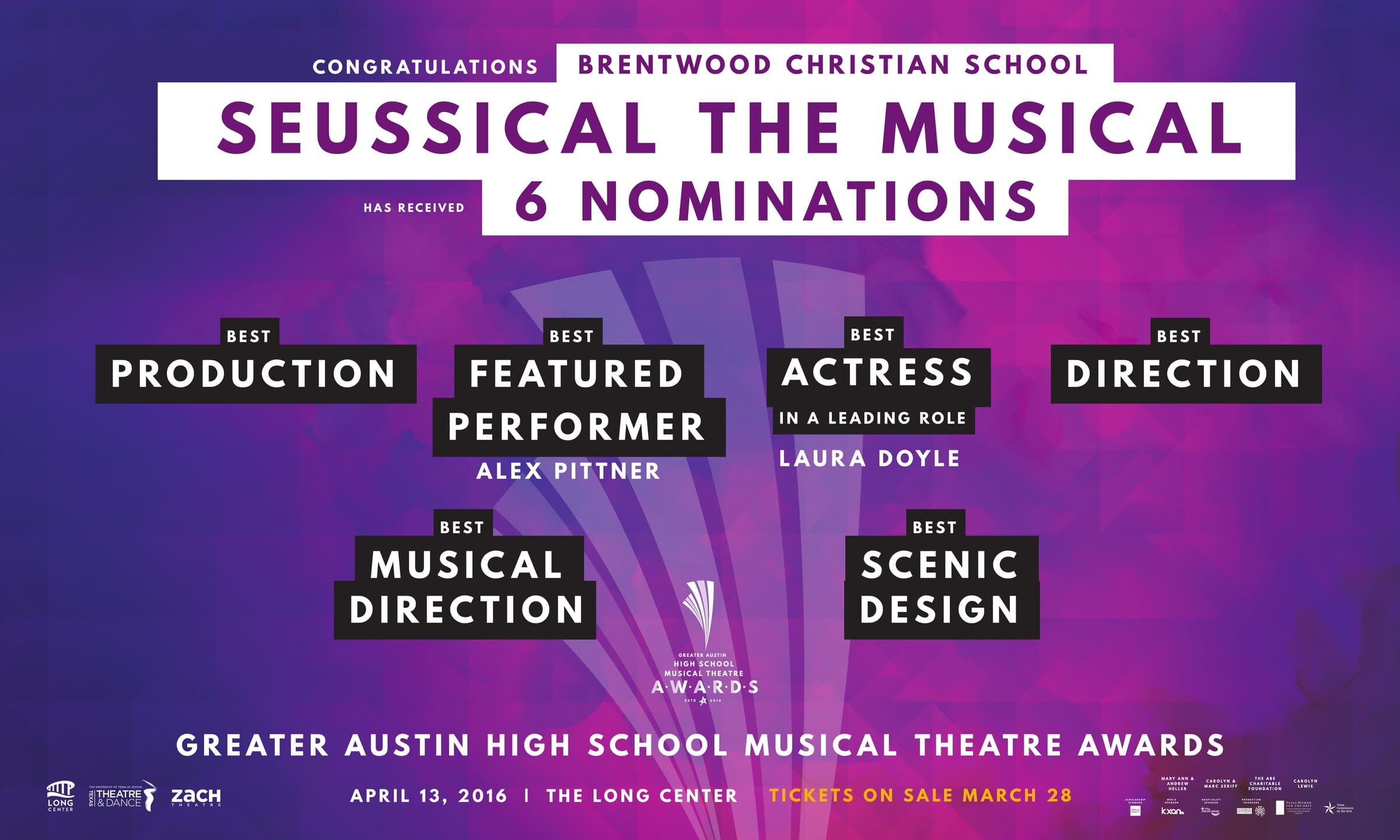
The nomination banners
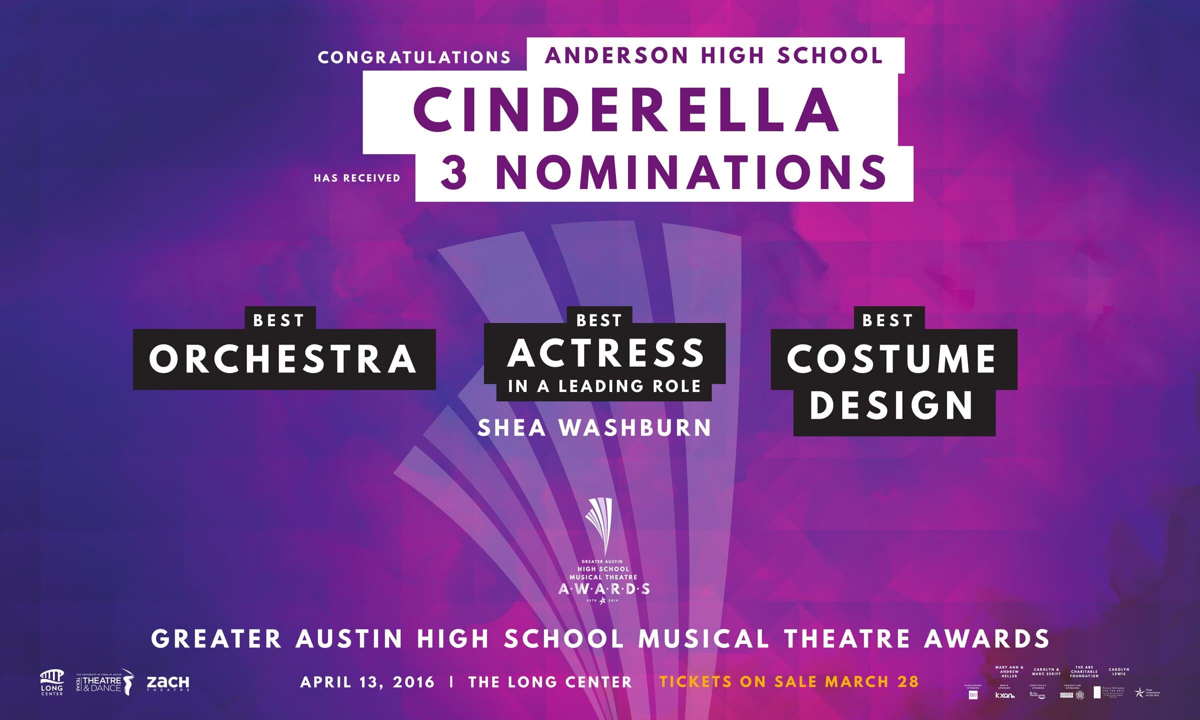
One per nominated production.
The nomination banners do the most work for the program emotionally. Every nominated production gets one (twenty-eight of them in 2016), addressed by name to the school and the show, with the specific categories called out in modular black-and-white cards across the band. Schools display them at home for weeks before the ceremony, which is how the program reaches the parents who never bought a ticket.
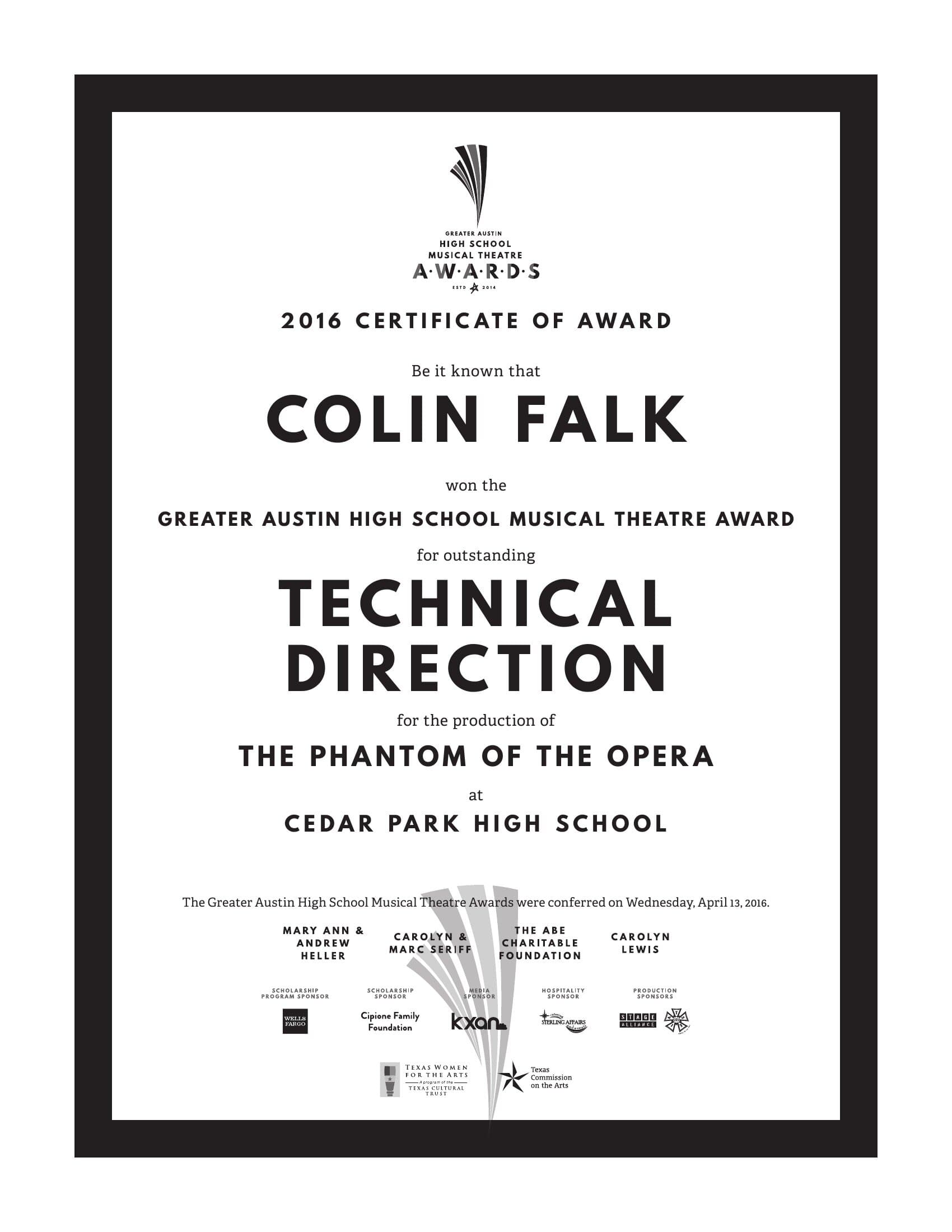
The certificate
Frame-ready. Name-customized.
Each winner left the ceremony with a certificate set in the same chunky display caps as the sign. Mark at the top, name in display, the production and school where the work was made, the program partners and sponsors at the bottom. The fanned beam mark reappears as a watermark behind the partner row to sign the piece. Print run was custom: every certificate had a name, a category, and a show.
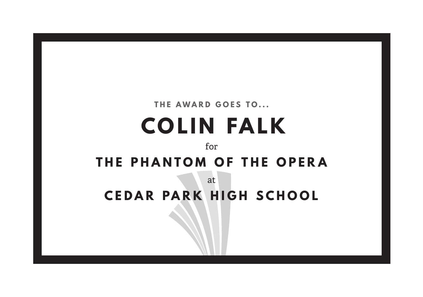
The envelope card
The thing the host opens.
The cards inside the envelopes that the host opens on stage. Designed to read at arm's length under stage lights, with enough air around each line that the host doesn't fumble the name with the whole room watching. The fanned beam reappears at the bottom right, faint, as a watermark.
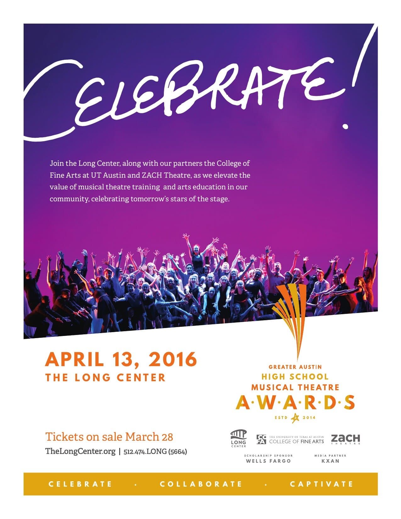
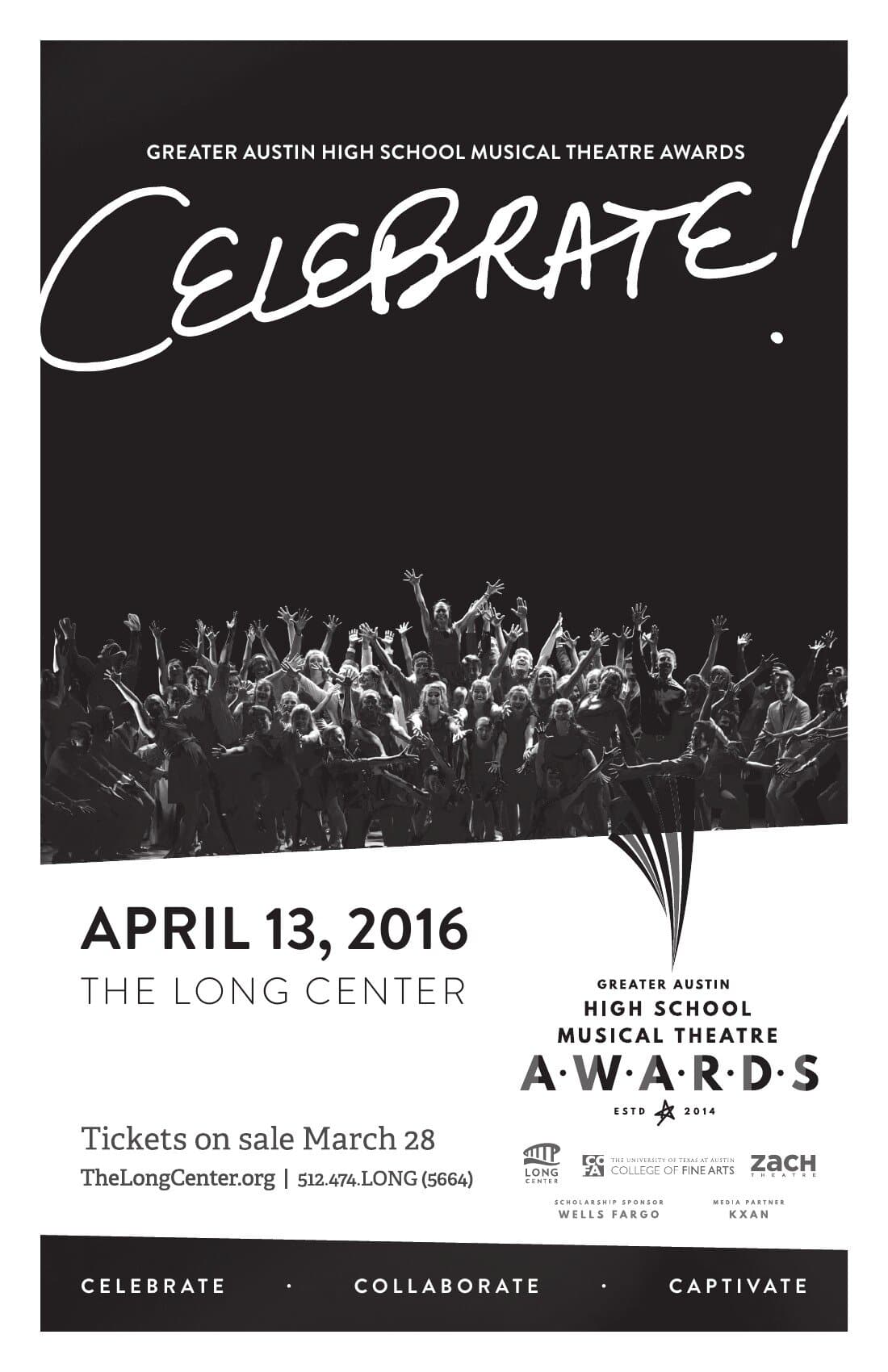
The lobby flyer & program ad
Celebrate!
The lobby flyer ran in the program book, the venue lobby, and inside school programs across the spring season. CELEBRATE! set in a hand-script display, a documentary photograph of the cast lit from behind, and the Long Center pillar callout (Celebrate · Collaborate · Captivate) running across the bottom. The black-and-white program ad was the same idea sized down for editorial spreads in school playbills and partner publications.
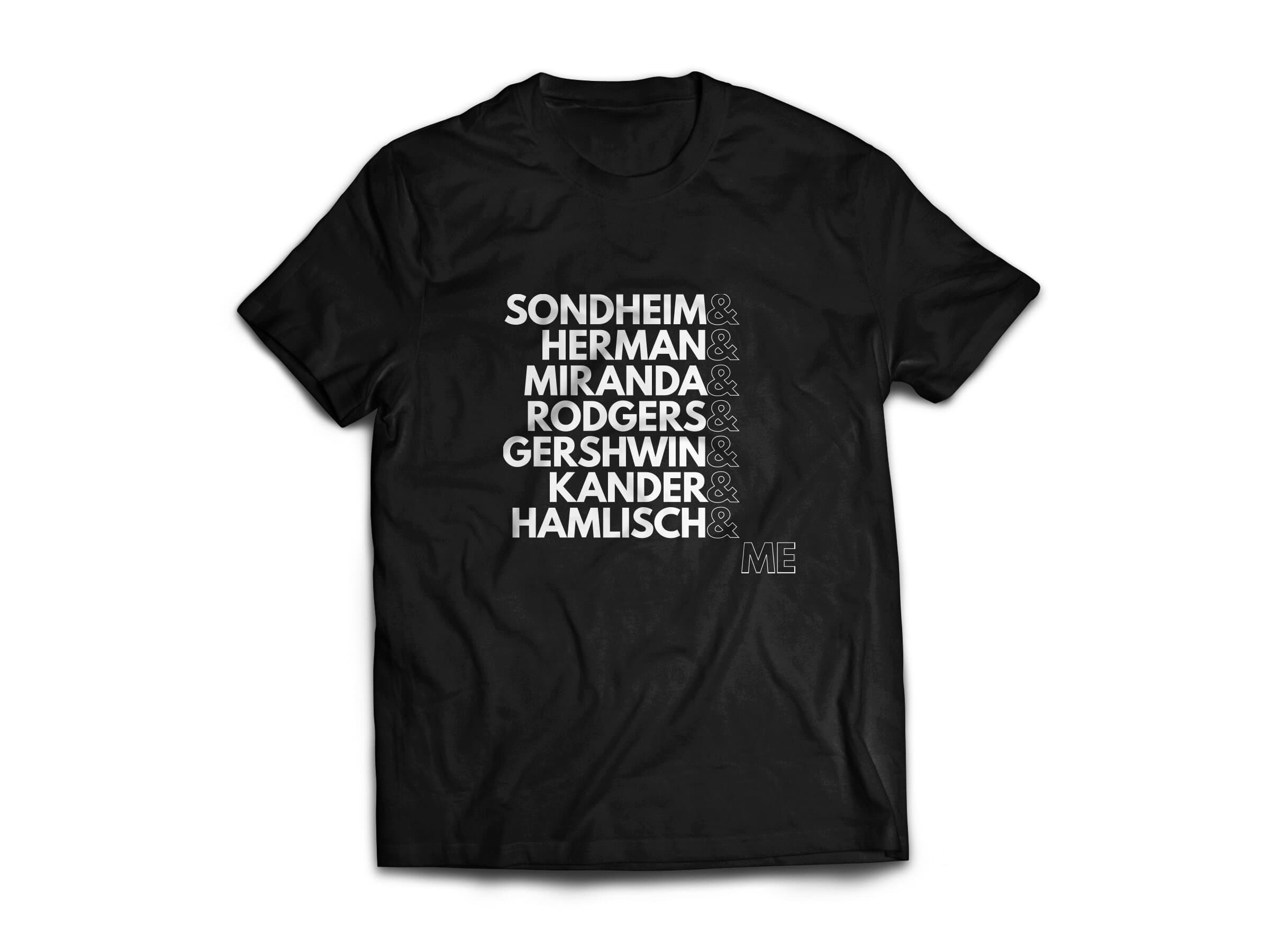
The t-shirt
Sondheim & Herman & Miranda & me.
The companion t-shirt names the lineage these students are training into and ends with the kid wearing the shirt. SONDHEIM & HERMAN & MIRANDA & RODGERS & GERSHWIN & KANDER & HAMLISCH & ME, with ME set in outlined caps to leave a hole that the kid steps into. The shirt sells outside the venue and at every adjudication night during the season.
The pieces that get remembered aren't the signs in the lobby. They're the banner that hangs in a high school cafeteria for two weeks. The certificate the kid takes home and frames. The shirt the freshmen show up wearing the next year. Brand systems for community programs travel through the audience long after the curtain comes down.
Closing
- The Long Center for the Performing Arts (Austin)
- Performing Arts
- Arts Education
- Awards Programs
- Lead Designer
- Editorial Direction
- Production
- Editorial Design
- Environmental Design
- Apparel
- Long Center education + outreach team
- GAHSMTA program lead
- Texas Theatre and Dance, ZACH Theatre, UT College of Fine Arts
Up next