Buttercream Bake Shop
A full identity for a small-town bakery, from badge to storefront to t-shirt voice
Buttercream is a bake shop on the corner of an actual small-town main street in Apex, North Carolina. The owners had the cake recipes, the lease, and a name. They needed everything else: the mark, the storefront identity, the t-shirts that the regulars would wear back in for free coffee, the voice that would let the brand sound like a bakery and not like a chain.
The work was a full identity, scoped at small-town scale. One pass. One designer. Everything had to be production-ready by opening day.
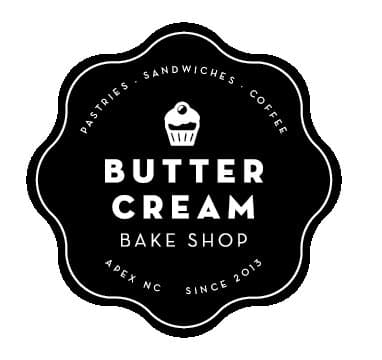
The mark
A bakery badge. Black on white. Built to scale down.
The primary mark is a black scalloped badge with a cupcake silhouette at the top, BUTTER CREAM set in two stacked lines of small caps, BAKE SHOP underneath, and a circumferential lockup that calls out PASTRIES · SANDWICHES · COFFEE around the top and APEX NC · SINCE 2013 around the bottom. It is intentionally legible at the size of a coat-pin, a window decal, and a roadside sign.
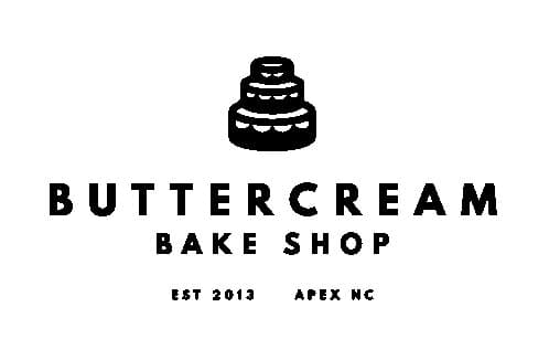
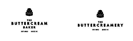
Sub-brand spurs
The Baker. The Buttercreamery.
Two extension marks for the directions the owners were thinking about: THE BUTTERCREAM BAKER for custom cake commissions, and THE BUTTERCREAMERY for a possible ice-cream-only spinoff. Same display caps, same mini cake icon, same EST 2013 / APEX NC anchor at the bottom. The brand stretches if it grows, and stays clearly the same family if it does.
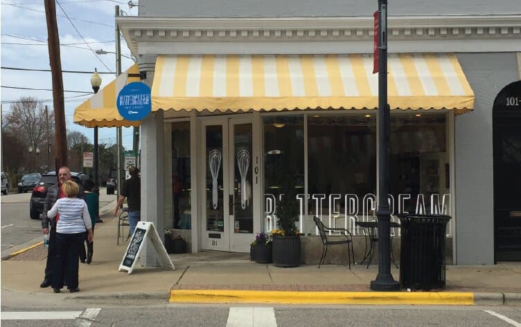
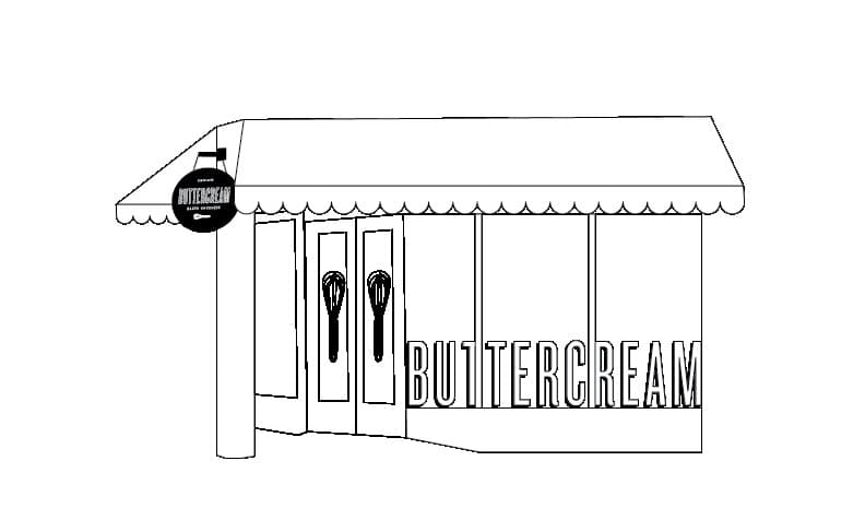
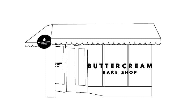
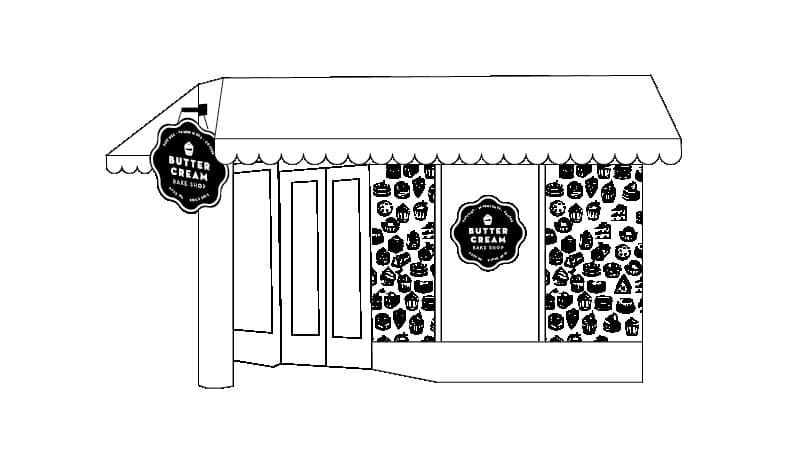
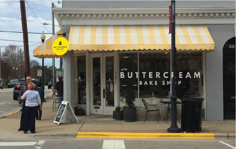
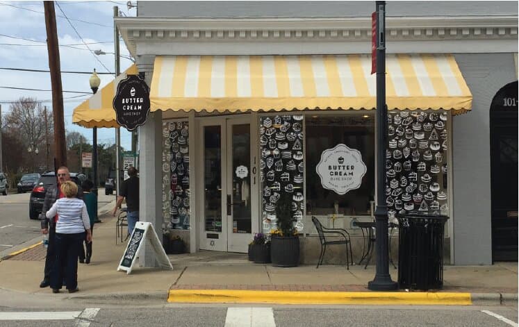
The storefront
Sketched it. Built it.
The storefront mockups got drawn three ways before anyone painted a wall. Plain wordmark on the front window. Cupcake-pattern wallpaper layered onto the side windows behind the badge. Final scheme: yellow-and-cream striped awning, BUTTERCREAM in white on the picture window, the round badge hanging from the awning bracket on a custom sign arm, the cupcake pattern wrapping the side windows so passers-by saw the personality before they saw the menu.
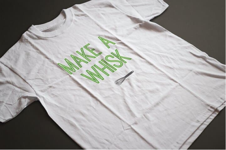
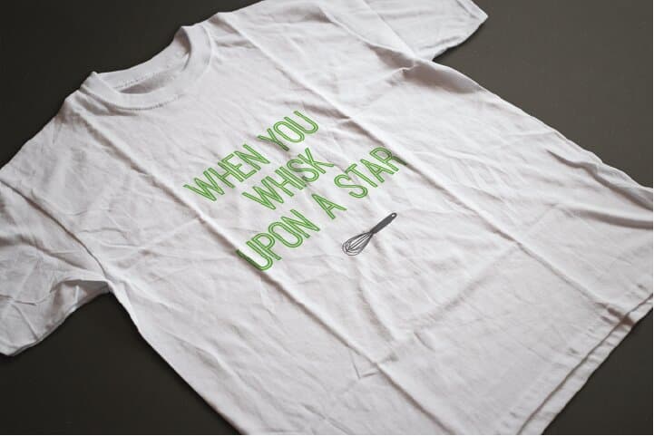
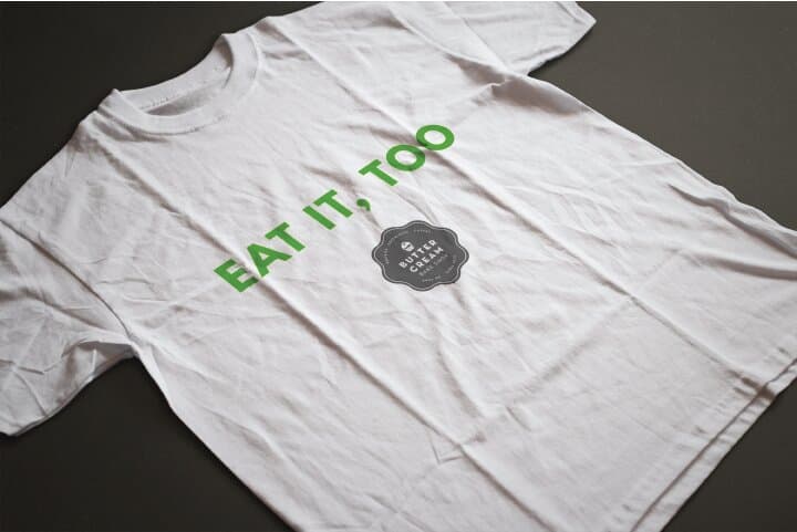
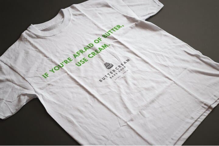
The voice
Whisk wordplay, worn casually.
The t-shirts gave the brand a place to be funny. The badge stays serious; the shirts get to riff. MAKE A WHISK. WHEN YOU WHISK UPON A STAR. EAT IT, TOO. IF YOU'RE AFRAID OF BUTTER, USE CREAM. The same green-on-white outline display lets every shirt read at glance from across the bakery floor, with the badge or whisk icon doing the punctuation.
A small-town bakery doesn't need a brand book. It needs a sign that hangs straight, a window that pulls people in, a mark that prints clean on a coffee sleeve, and a t-shirt that gives the regulars something to wear back in. Identity at this scale is a sequence of small decisions made well, in the right order, by the same hand.
Closing
- Buttercream Bake Shop, Apex NC
- Hospitality
- Food & Beverage
- Local Retail
- Lead Designer
- Brand Strategy
- Production
- Brand Identity
- Environmental Design
- Apparel
- The owners
Up next