Simplicity in a Moment of Creation
Embedding a copilot inside the DigitalOcean database create flow, where users were already going
The business wanted fewer clicks. What people actually needed was fewer decisions. Setting up a managed database on DigitalOcean means picking an engine, version, region, plan, storage size, availability tier, name, and project. Every choice costs money and affects performance. Cutting clicks without cutting decisions would solve nothing.
So we said: just tell us what you need, and we'll set it up for you.
Making that real without losing the legitimate complexity underneath was the work.
Where to put it
We put it inside the create flow.
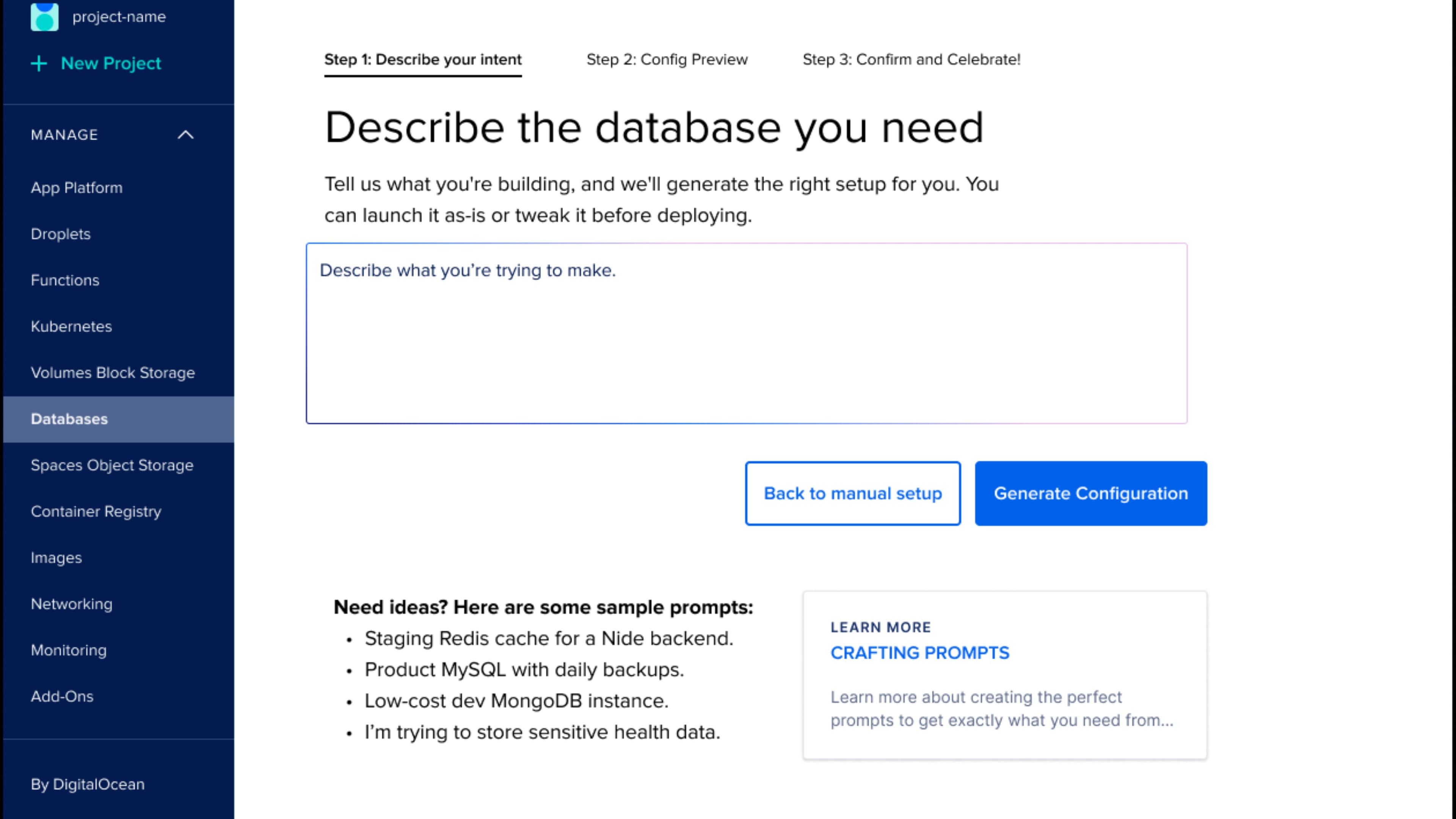
The first decision was where the copilot should live. The default in 2025 is to drop AI into a chat panel. We put it inside the create flow instead. Click Create Database and you see a prompt box on the left, manual configuration on the right, side by side. Type what you need or set it up by hand. Both work like the rest of the product. Neither feels like a side door.
Don't change what someone came to do just because a chat box is easier to build. People come to create a database, so that's where we met them. The copilot is a new way to drive the existing flow, sitting next to the manual way, one click between them.
Most teams borrowed the chat-box pattern from ChatGPT and put it everywhere. For production software it's usually wrong. A create flow has a shape: decisions, a result to check before committing, real consequences for errors. A form is where that lives. The copilot fills the form and waits.
Embedded just means the AI shows up where you were already headed. No new screen to learn. The copilot fills in the fields and lets you check it.
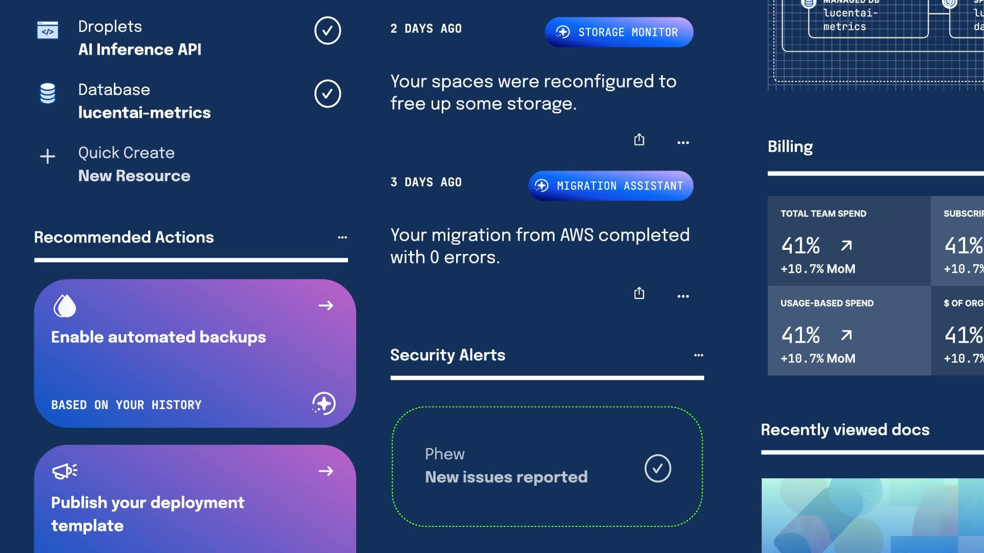
That placement decision is the whole point. The same pattern works for Kubernetes setup and Droplet provisioning now, because it meets people in the moment they're actually making something.
The starting point
What manual setup actually looked like.
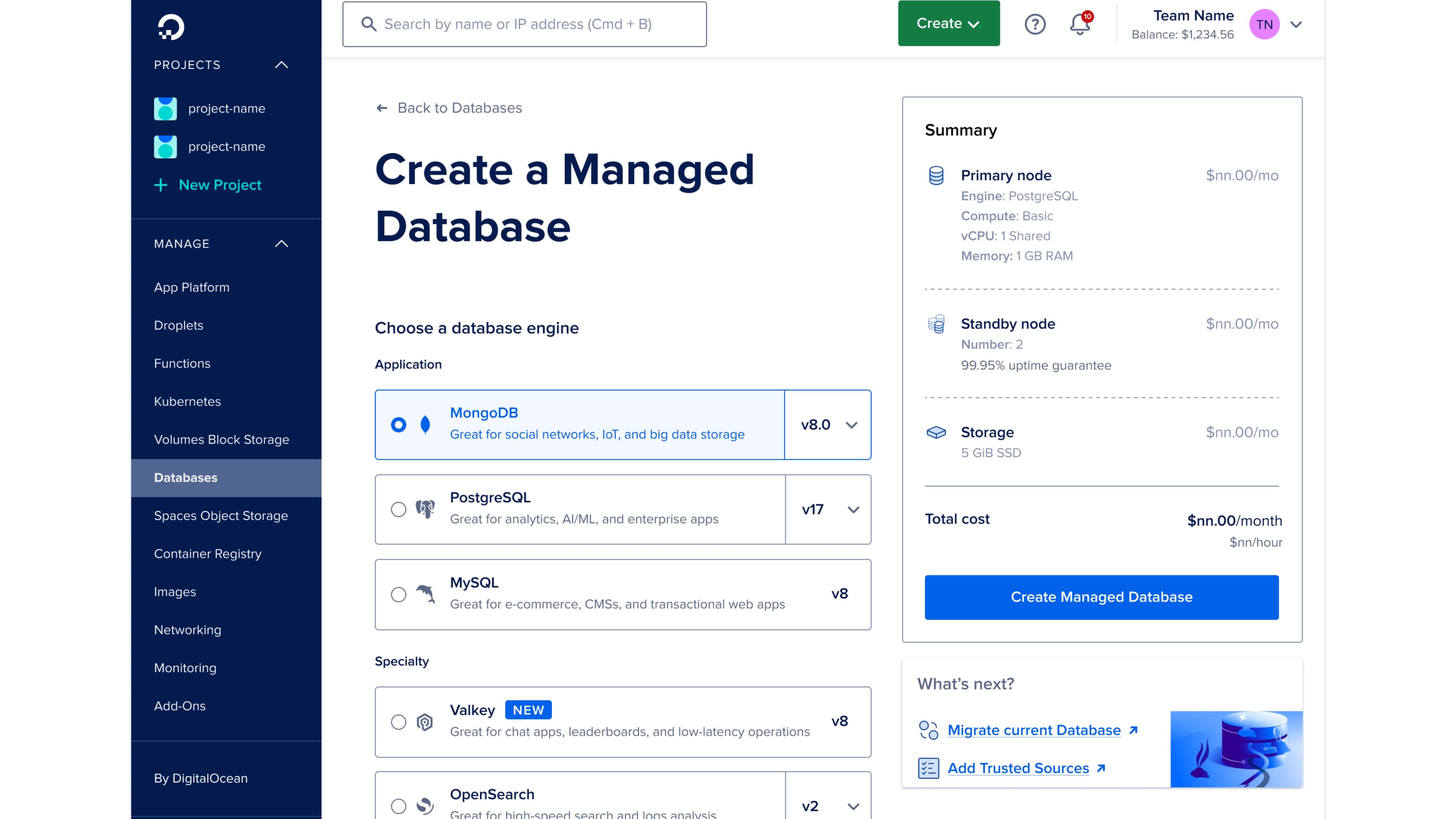
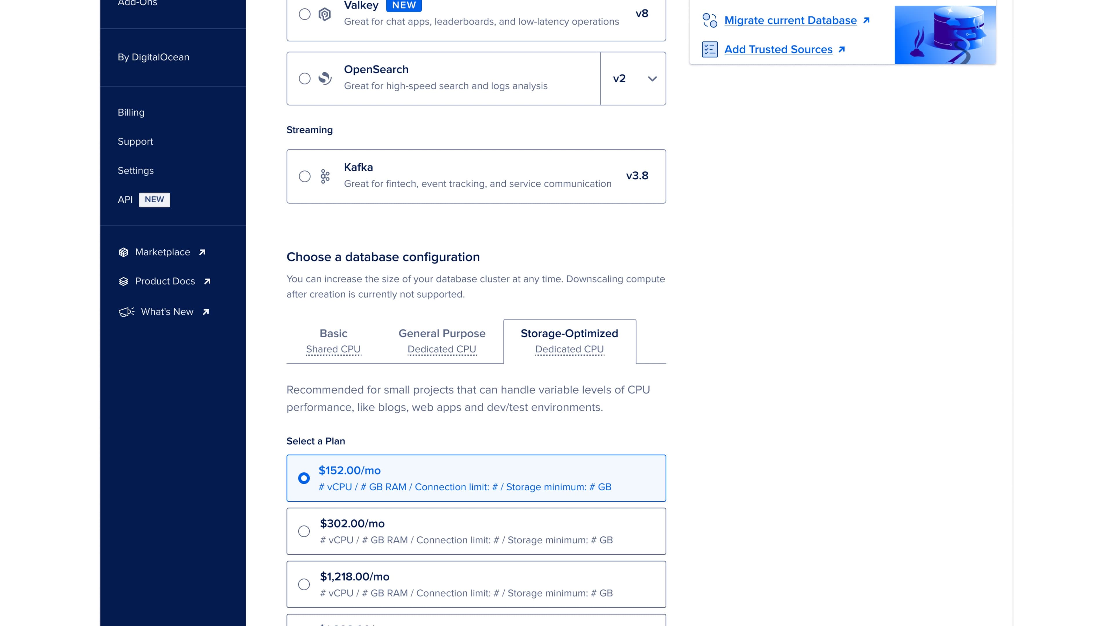
Before redesigning, I had the team walk through the manual flow. It asks for an engine picker, plan tiers running to thousands per month, storage values that only make sense if you already know cloud infrastructure, standby node options, datacenter region, VPC network, project, and name: twelve fields total, requiring cloud vocabulary most newer customers don't have. Every field is necessary, and every field is also where someone closes the tab.
The redesign
Three steps, in plain language.
The new flow is three steps and reads like a sentence. Describe what you want. Review what we configured. Confirm and create.
Step one is a single text box that asks you to describe what you need. We pre-load four sample prompts so the empty box isn't intimidating: a staging Redis cache, a production MySQL with backups, a low-cost dev MongoDB, a sensitive-health-data scenario. The samples are deliberately a little ambitious. They show you the copilot actually understands what you're describing, well beyond keyword matching.
The user types. The system parses. Step two opens up the result.
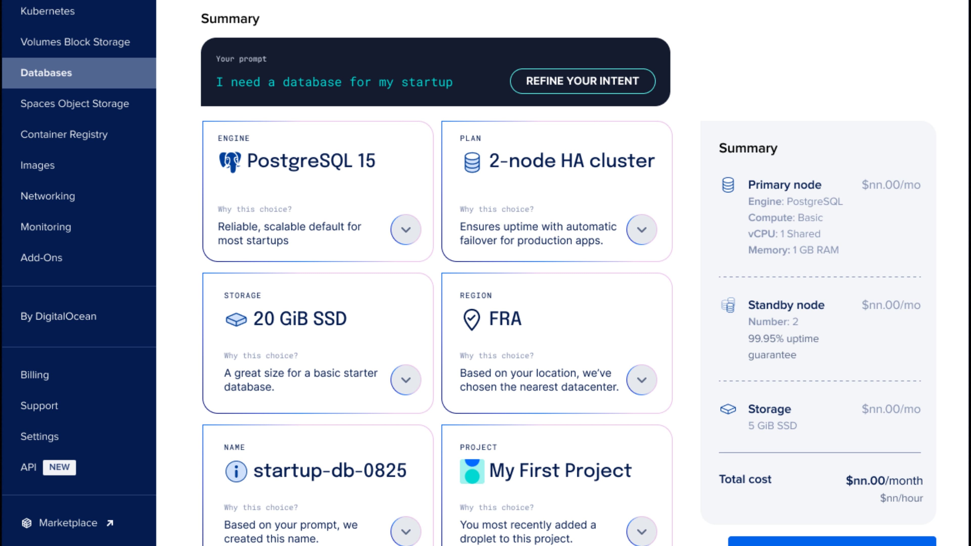
Step two is six summary cards in a grid, one per decision: engine, plan, storage, region, name, and project. Each card shows the choice the copilot made and a “Why this choice” link that explains it in plain terms, tied back to what you typed. It picks PostgreSQL because the prompt mentioned analytics, a two-node HA cluster because production was implied, and the Frankfurt region because your IP suggested EU traffic. You can accept any card or change it right there, no reload.
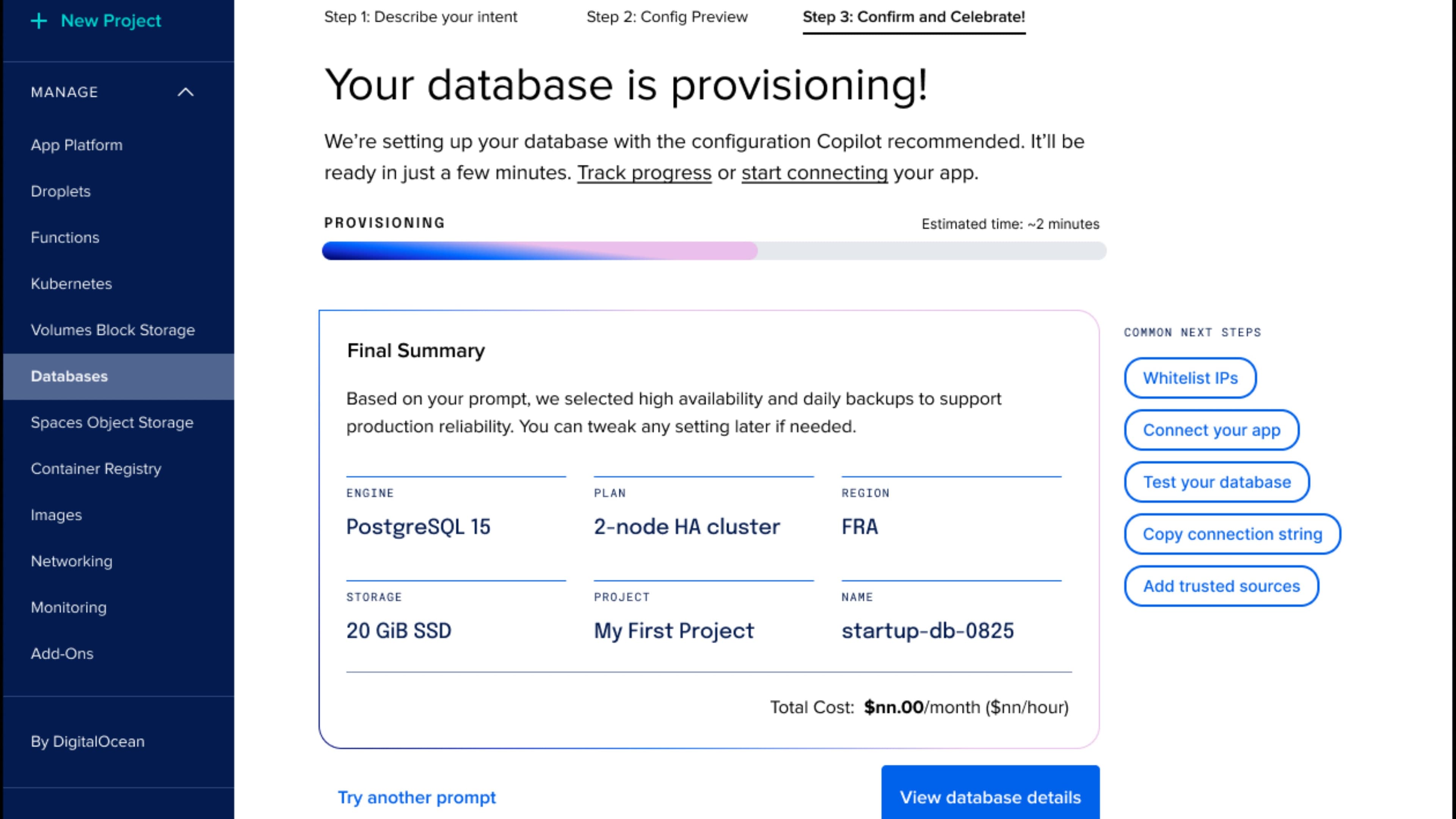
Step three is confirmation and creation. The provisioning screen shows a progress bar with a realistic estimate, plus a final summary the user can screenshot if they need to share it. The next-steps card on the right gives them the four things they're most likely to want immediately: whitelist IPs, connect their app, test, copy connection string.
For someone who knows what they want, the whole thing takes about thirty seconds. For someone less sure, the “Why this choice” explanations turn it into a little tutorial. And if you'd rather set everything by hand, the manual flow is one click away at any step.
The hard parts
Tone and control.
The two hardest parts were tone and control. Tone is how the AI sounds when it explains itself. We chose confident and brief, honest about what it inferred, with no hedging, no apologizing, and no "based on your input it seems like." You typed a sentence, and the system either got it or it didn't. Either way, it shows its work.
Control is harder. The user has to feel like they can intervene at any point, even when the copilot got it right. Three patterns solve this: inline editing on every card, a one-click rerun at the top of step two, and a one-click manual override at any time.
Inline edit was the biggest win. Each card is a real input with the copilot's choice pre-filled. Click engine, change to MySQL, the configuration recalculates instantly because the copilot knows what that change means. The user is never locked in. They get a working draft they can change immediately.
Rerun is for when the prompt was wrong. The user types "low-cost dev MongoDB," sees the config, realizes they need backups, and types again with that constraint. The whole thing reconfigures in about two seconds. Past prompt history stays visible to compare.
Manual override is the safety valve. At any step drop down to the twelve-field flow and configure by hand. The copilot's choices come along as starting values. Nothing is lost.
These three patterns give the user real control. The copilot does the heavy lifting. The user is in charge.
What it proved
AI doesn't have to take over the screen.
This is one of the first non-chat copilots DigitalOcean shipped. It's proof that AI can be useful without taking over the screen. It sits inside the create flow, visible when the user wants it and quiet when they don't.
The pattern transferred. Kubernetes setup is being redesigned with the same three steps. Droplet create is next. Each new flow takes less time because the control patterns, explanations, and manual fallback already exist.
What I'm proudest of is how it changed how the team thinks. The default question stopped being "should we add AI" and became "where would AI actually help without getting in the way." It's a much better question to be asking.
The copilot does real work. The user is still the one who clicked Create. We aimed for that.
The business asked for fewer clicks. We gave them a flow where you type one sentence and get a working database minutes later, with every choice editable and every choice explained.
Why
- DigitalOcean
- Cloud and Developer Tools
- AI
- Design Leadership
- Product Strategy
- Interaction Design
- Product Design
- UX Design
- Wireframing
- AI Experience Design
- AJ Zichella (Design)
- Soyun Park (Design)
- Kevin Carrillo (Engineering)
Up next