All the World's a Map
Charting Broadway's collaborative history
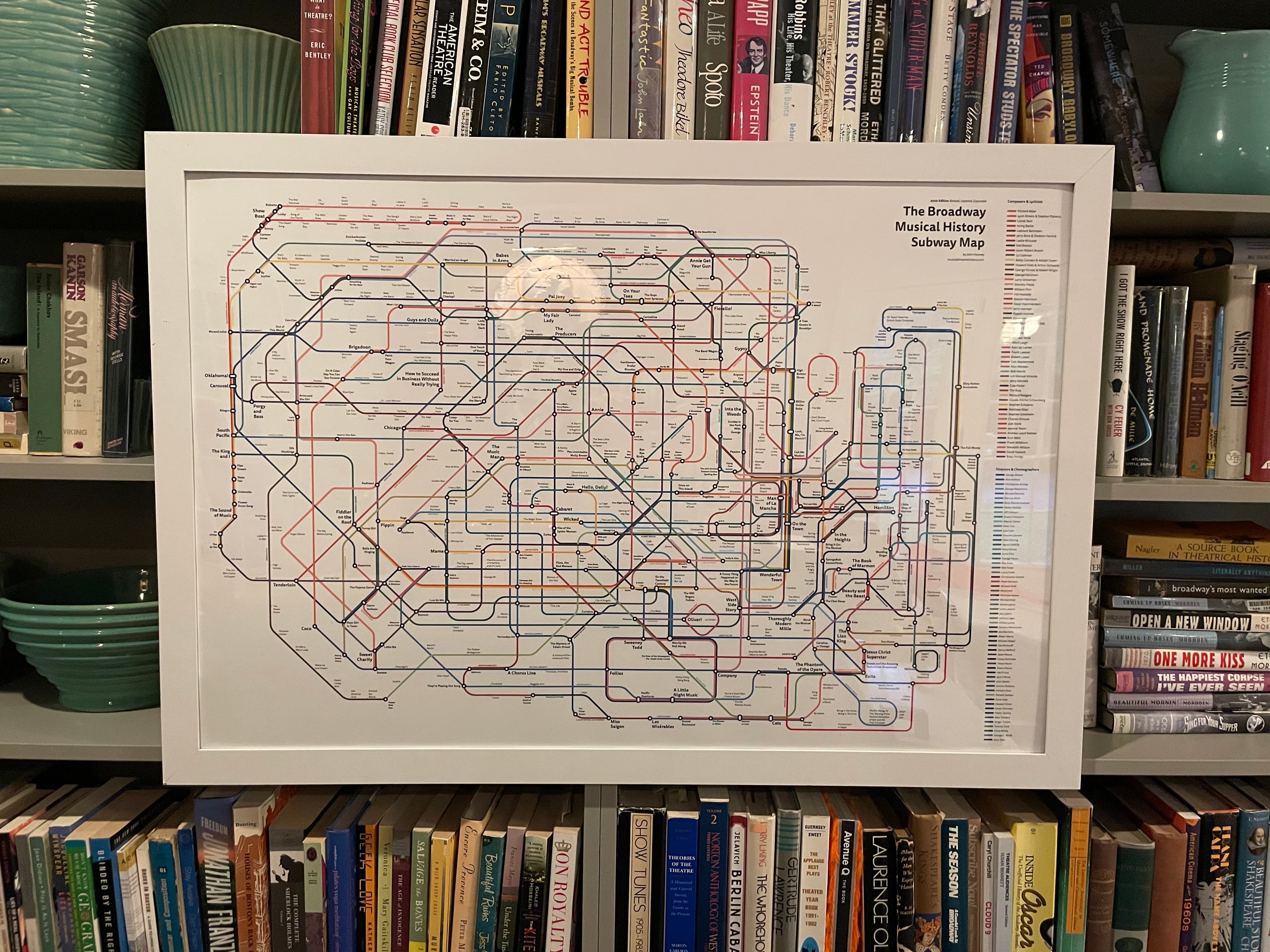
I started the Broadway Musical Theatre History Subway Map in 2008, in graduate school, when a Sondheim conversation kept turning into a hand-drawn diagram on the back of a napkin. The napkin is long gone. The map is still being drawn.
The standard story of Broadway is told as a list of shows, in order, with no clear way to see how the same composer keeps showing up next to the same lyricist next to the same director, decade after decade. The collaborations are the story. The shows are the stops along the way.
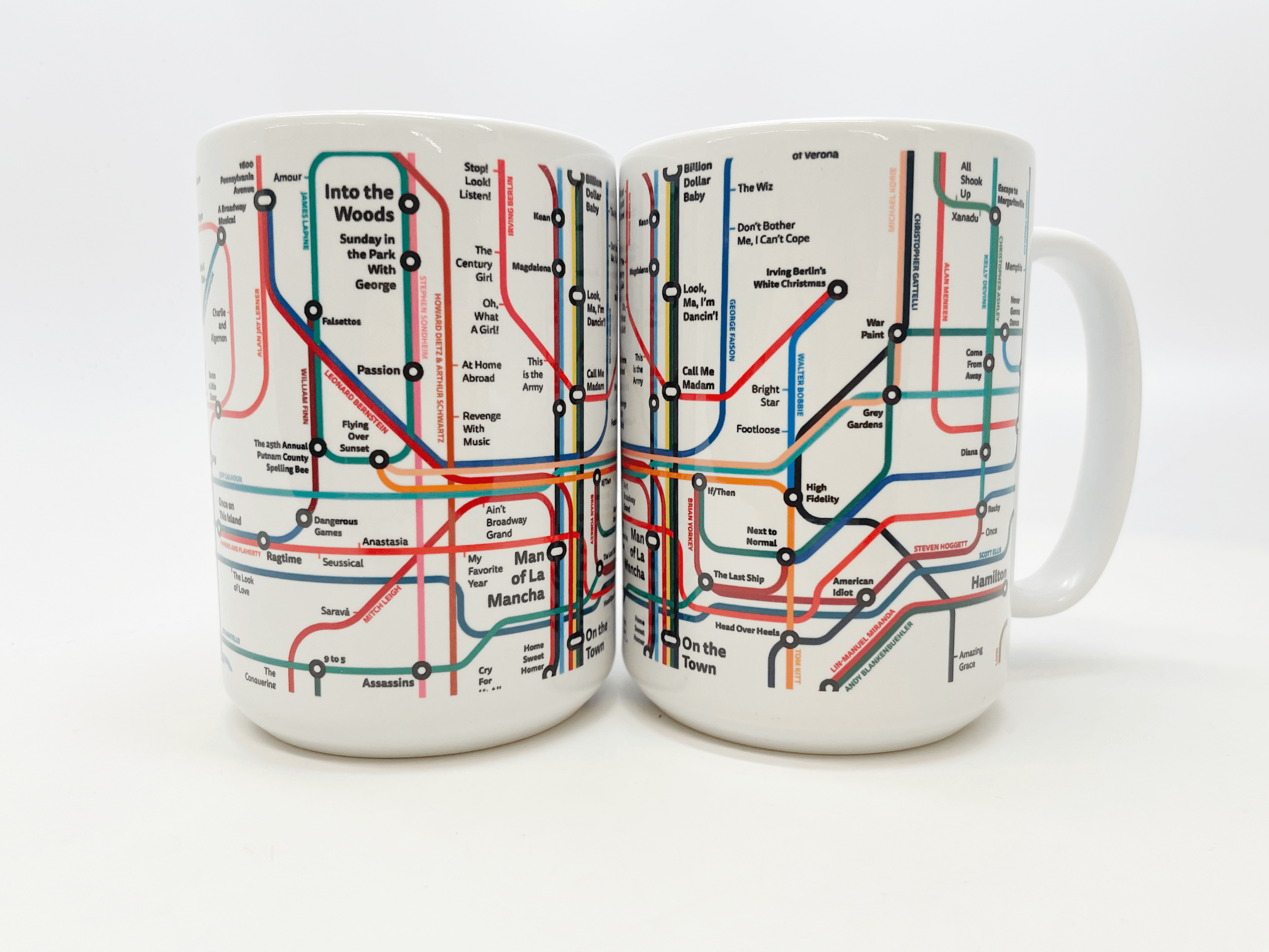
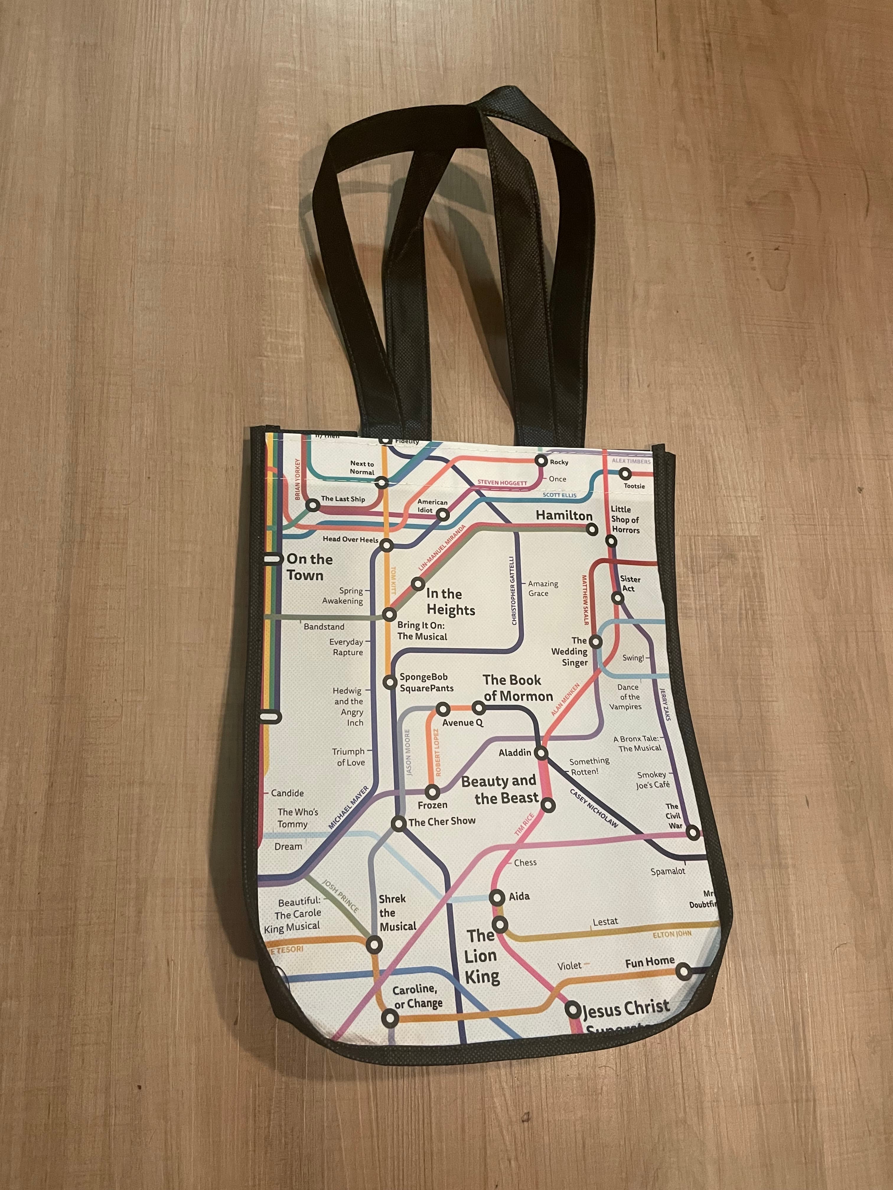
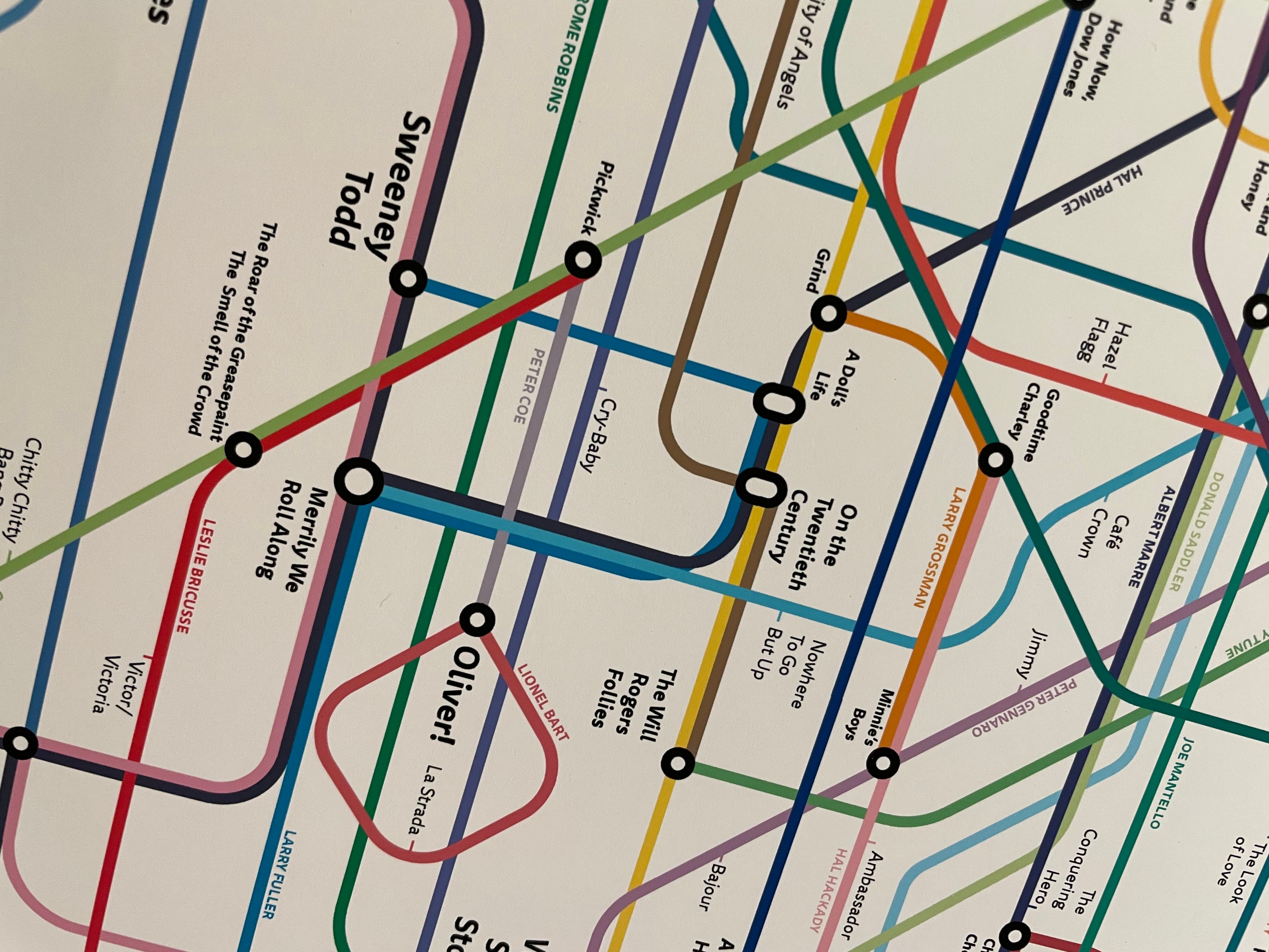
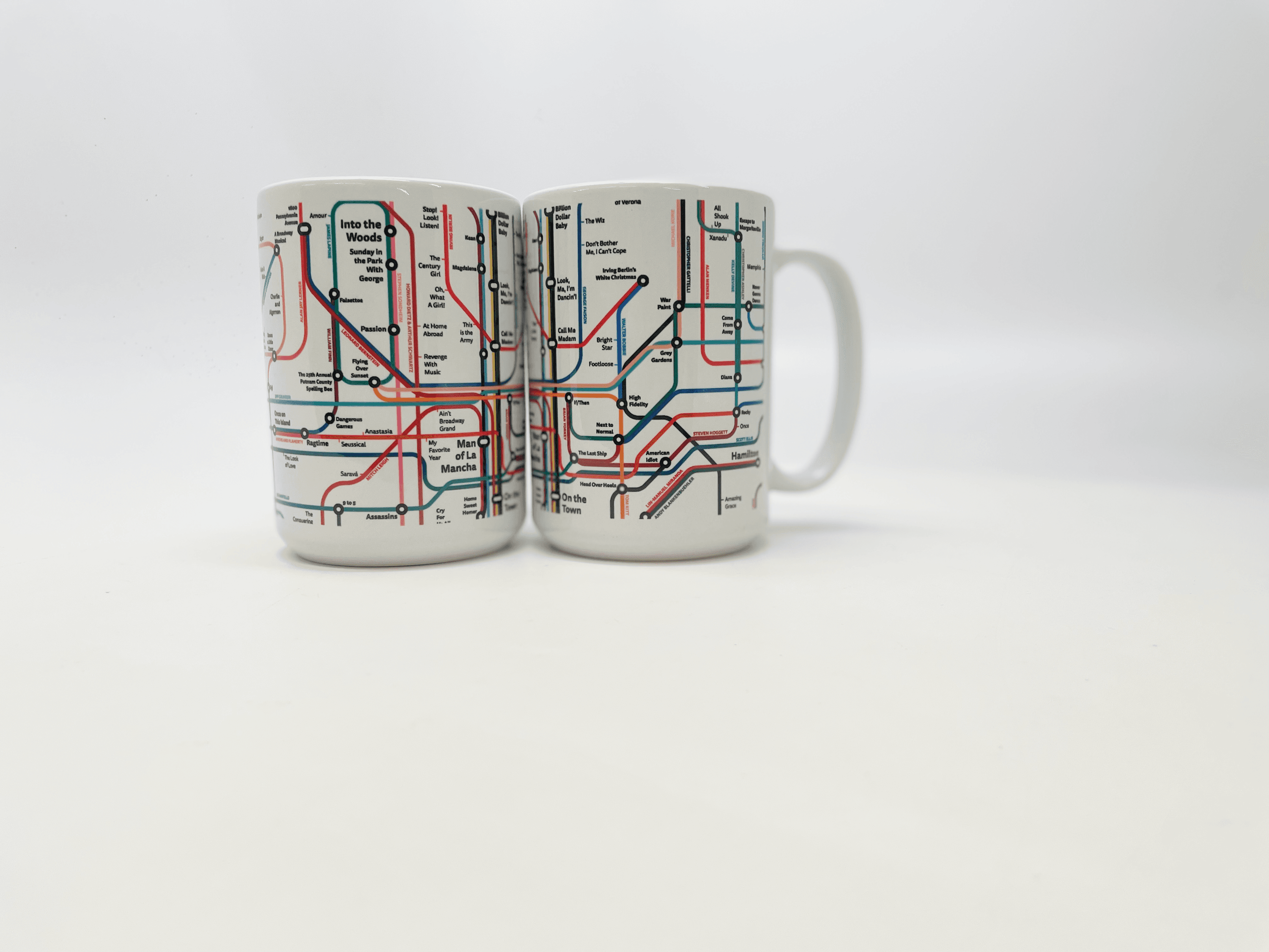
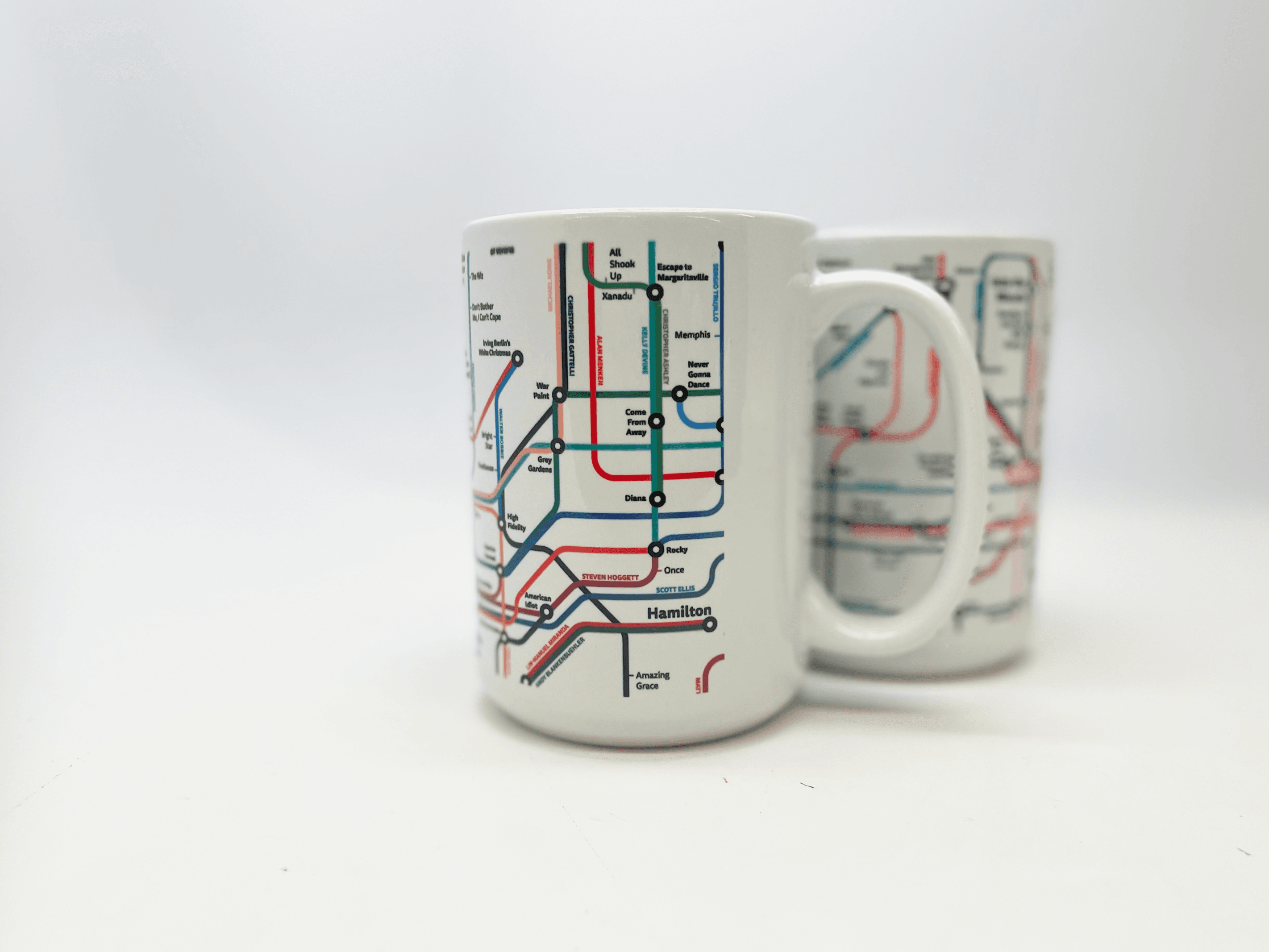
So I drew it as a transit map. Each line is a person: a composer, a librettist, a director, a choreographer. Stops are the productions they worked on. Where lines intersect, you see the collaborations that produced the canon.
The map has been updated every year since. It hangs in classrooms, lives behind the counter at the New York Public Library for the Performing Arts gift shop, and has been quietly turning into the central artifact of a longer body of work I've been calling Musical Theatre History.
Where it came from
A subway map for a network.
Harry Beck's London Underground map, drawn in 1933, is the standard against which every transit graphic gets measured. Beck's insight was that geography was the wrong axis. What riders needed was the topology: which lines connect to which lines, where can I get off, what's next.
Broadway works the same way. The geography is irrelevant. The topology, who worked with whom, is everything. A network has been there the whole time, hiding in plain sight on the inside cover of every Playbill.
Who reads it
Teachers, students, fans.
Theatre teachers use it to anchor a syllabus. Cast members hang it backstage and trace their show's lineage. Long-time fans send me corrections, additions, photos of their kids holding it up to a wall, small and serious, finding the show they already love.
"A masterpiece. A treasure for theatre lovers."
Customer review, NYPL gift shop
Where it lives
On the wall. On the syllabus.
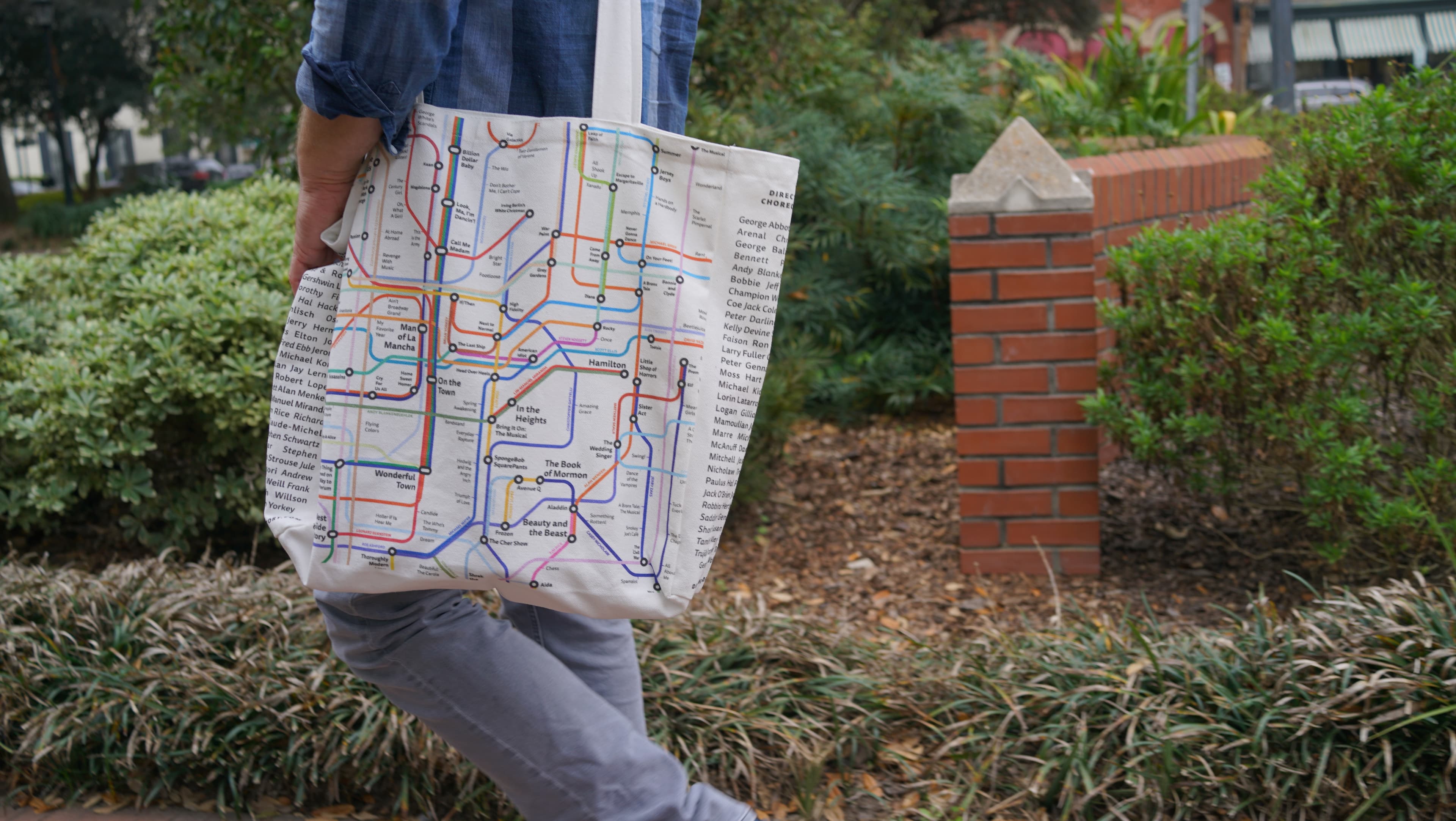
Sold continuously through the New York Public Library for the Performing Arts gift shop since 2014.
Adopted in classrooms across the country. Several universities use it as the spine of an introductory musical theatre survey course.
Updated yearly. The 2008 edition is on a wall somewhere; the 2024 one hangs next to it in some homes.
The companion site, musicaltheatrehistory.com, picks up where the print can't: searchable database, deeper biographical pages, links to recordings.
Information design works when it gives a reader a question they didn't know they had. People stand in front of this map and start asking, "wait, did Bernstein really work with that team?" Then they go look it up. The map is doing its job.
Takeaways
- Self-initiated
- Arts and Education
- Retail
- Designer
- Illustrator
- Researcher
- Graphic Design
- Illustration
- Information Design
- The New York Public Library for the Performing Arts
Up next