Kinfolk Syrup Co.
A small-batch fruit-syrup brand for the bartender who wants the whole story on the label
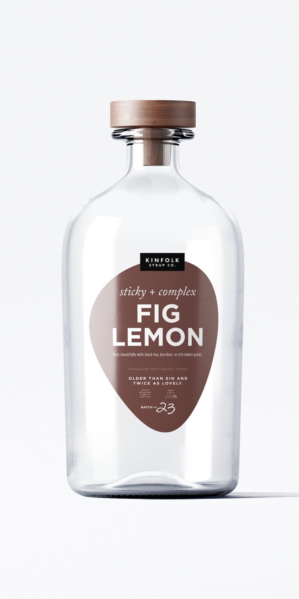
Kinfolk is a small-batch syrup company in Austin. It launched with four flavors (Fig Lemon, Pear Cardamom, Blackberry Sage, Strawberry Peppercorn) in clear apothecary glass with a wooden cap. People buy them as gifts and use them behind the bar, usually the same kind of buyer either way: someone who reads the label before they buy.
The label has to stand out on a crowded shelf and say what's in the bottle. Each one is a teardrop in the flavor's color, with the wordmark on a tag at the top, the flavor name in big caps below it, a serving suggestion in the middle, and a short line about the flavor at the bottom.
The original direction
It started with old family photos.
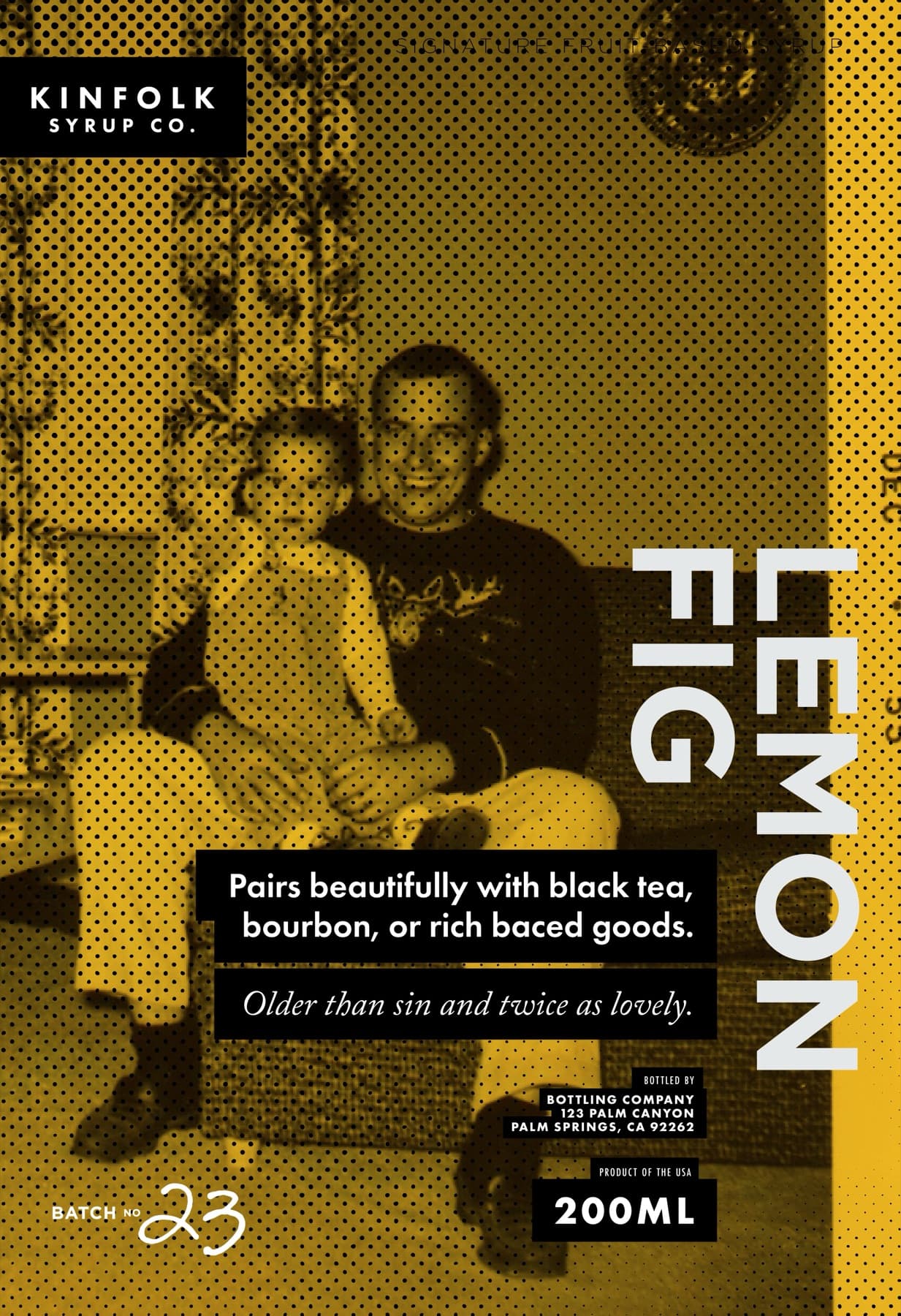
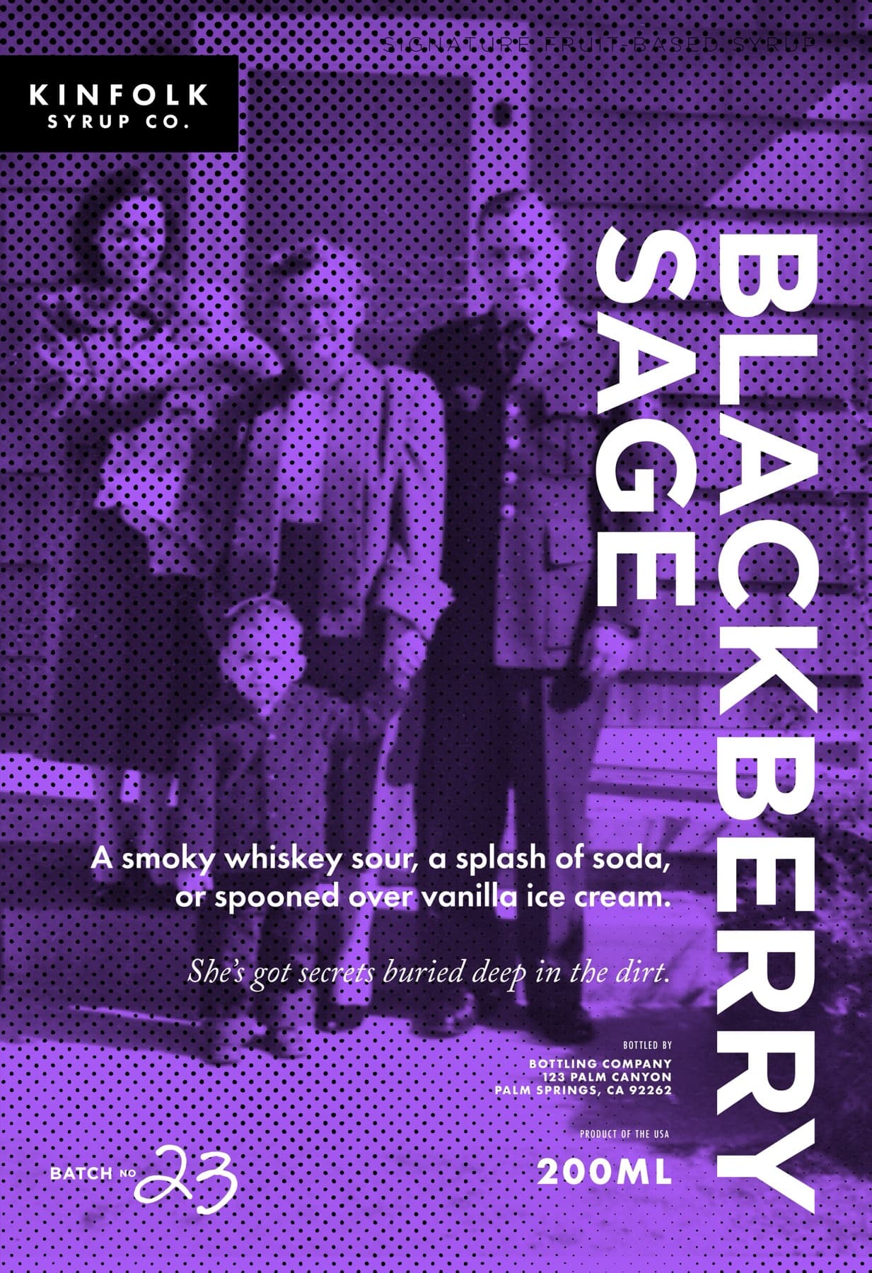
Kinfolk means family, so the brand story started there. I went digging and landed in a box of old family photographs, and the depth they carry is instant. You see an old family photo and you feel the joy and the love in it before you know a single name in the frame. The first posters put the syrup right on top of that feeling: a family photo halftoned and washed in the flavor's color, the name running big down the side. That warmth is where the whole brand came from. The clean shelf labels that followed are the same idea, distilled.
The label system
The shape stays the same. Every flavor gets its own color and its own voice.
The label shape is fixed. The color and the voice are tuned to the syrup. Fig Lemon is fig-brown with "Older than sin and twice as lovely." Pear Cardamom is a calm bone with "She's got secrets buried deep in the dirt." Blackberry Sage is a deep wine and carries the same line as the pear. Strawberry Peppercorn is a hot dusty pink with "She's got a sweet kiss and a mean backhand." The label tells you what's in the bottle and how to think about it before you taste it.
On the bottle
Clear glass, wooden cap.
The label sits on a clear apothecary bottle with a wooden screw cap. I like that the teardrop looks a little like the syrup itself, one fat bead of color dropped in from the top. The same bottle is used across the whole line, so the only thing that changes from flavor to flavor is the label.
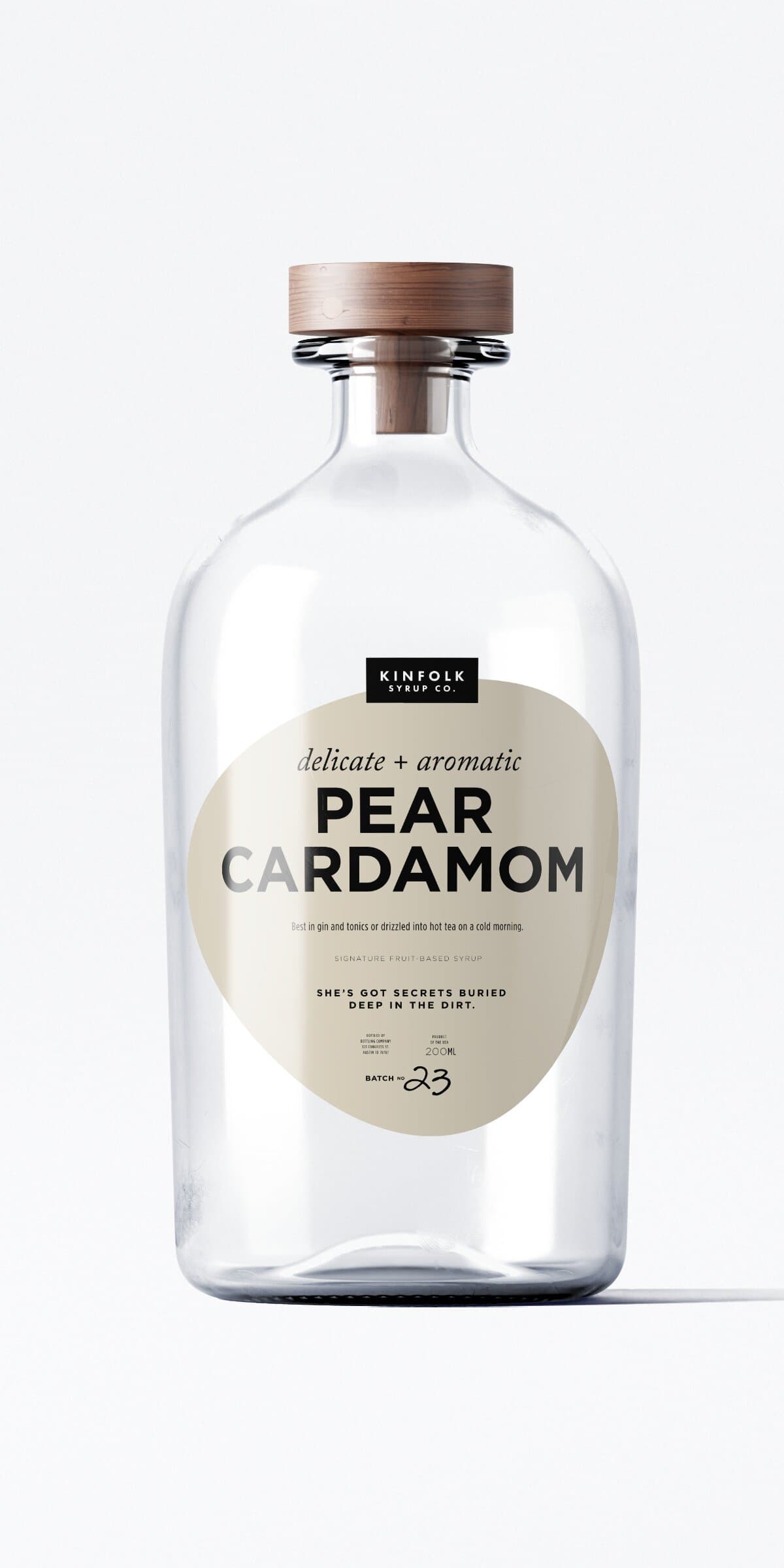
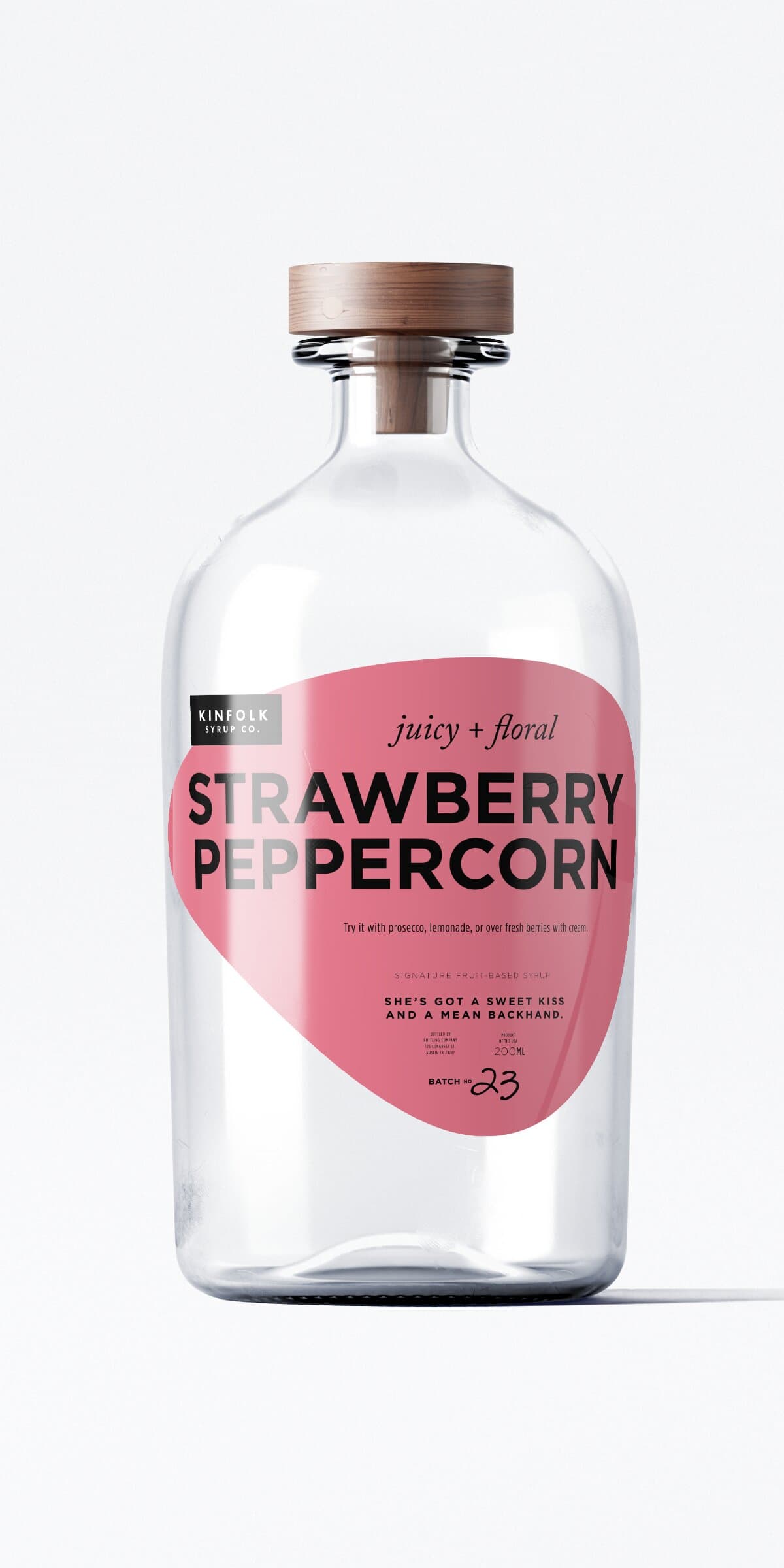
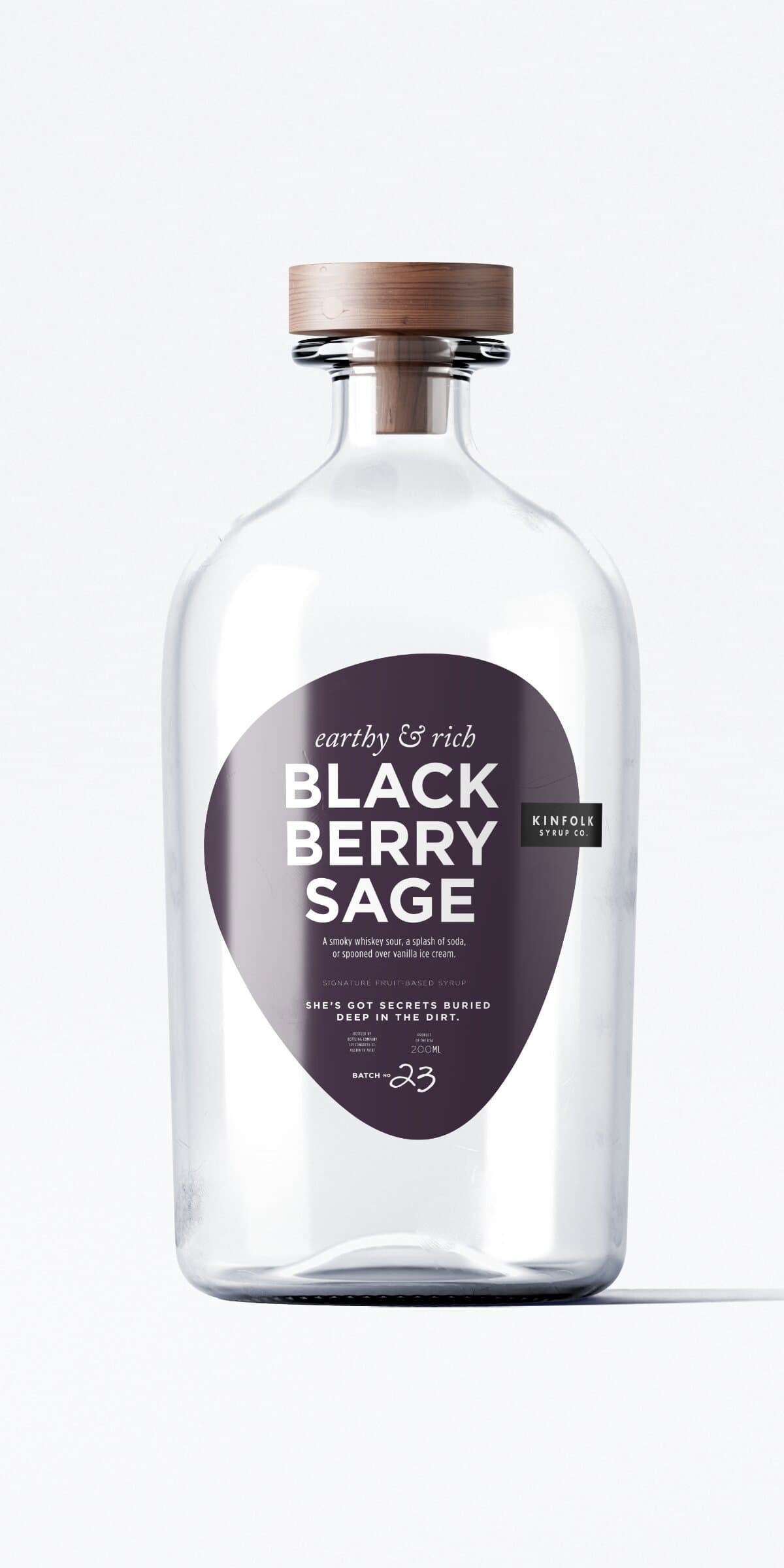
The label had to catch someone's eye on a shelf and still be worth reading once they got it home. The color and the teardrop handle the first part. The little line at the bottom is the part I had the most fun with, and it's usually the thing people quote back to me.
Closing
- Kinfolk Syrup Co. (Austin)
- CPG
- Food & Beverage
- Specialty Goods
- Lead Designer
- Brand Strategy
- Copy
- Brand Identity
- Packaging
- Editorial Voice
- The makers
Up next