Joanna Czech
Luxury Reimagined
Joanna Czech is one of those names that gets passed quietly between people who know what they're talking about. The clientele is small on purpose. The treatment list is shorter than her reputation would suggest. The waitlist has held the same length for fifteen years, because there are only so many hours in a day and only her two hands. For fifty minutes she gives one face her whole attention, and it leaves changed, a little reluctant to go.
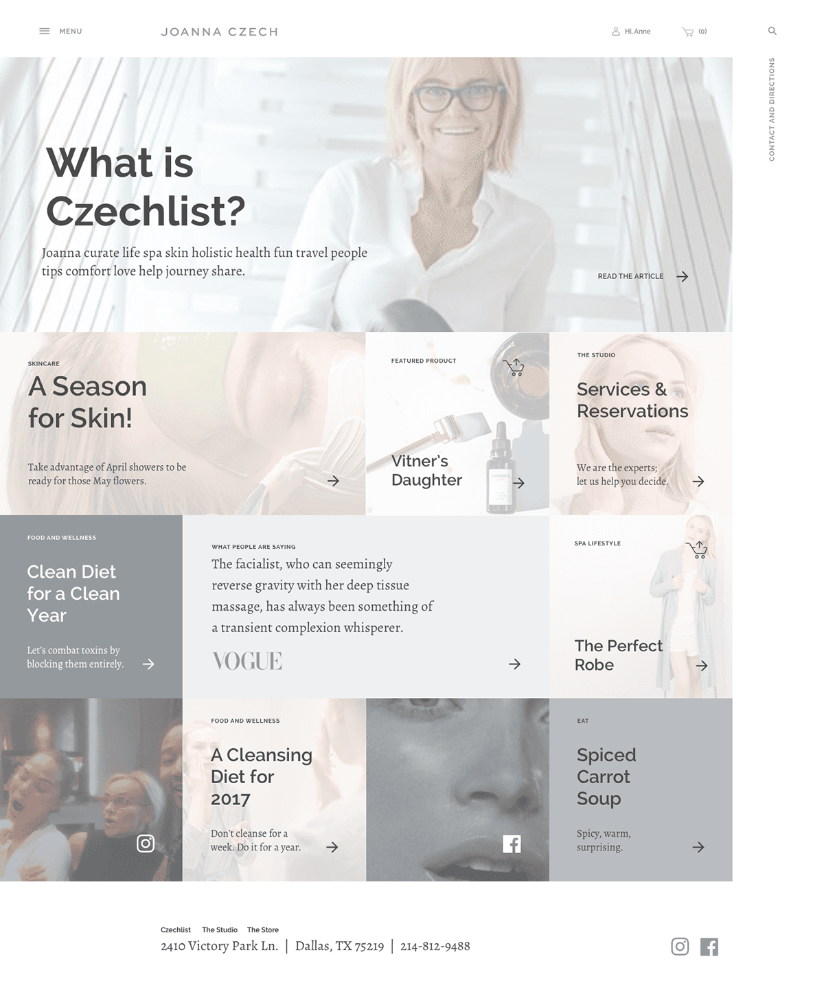
Her e-commerce was the part of the business that didn't match. Grayscale layout. Stock product photography. Prices listed flat next to a checkout button. The site sold the inventory and said nothing about why anyone was buying it. On a good day it read like aspirin. The room she walks into hums; this one just sat there, holding its breath.
I came in to rebuild the storefront and the surrounding brand language together. Once the site started speaking the way Joanna spoke about skincare, the rest of the system fell into line behind it.
The work ran for three years. By the time it ended, annual revenue had moved from roughly $300K to $5M, and the brand had a digital presence that finally matched the room it walks into.
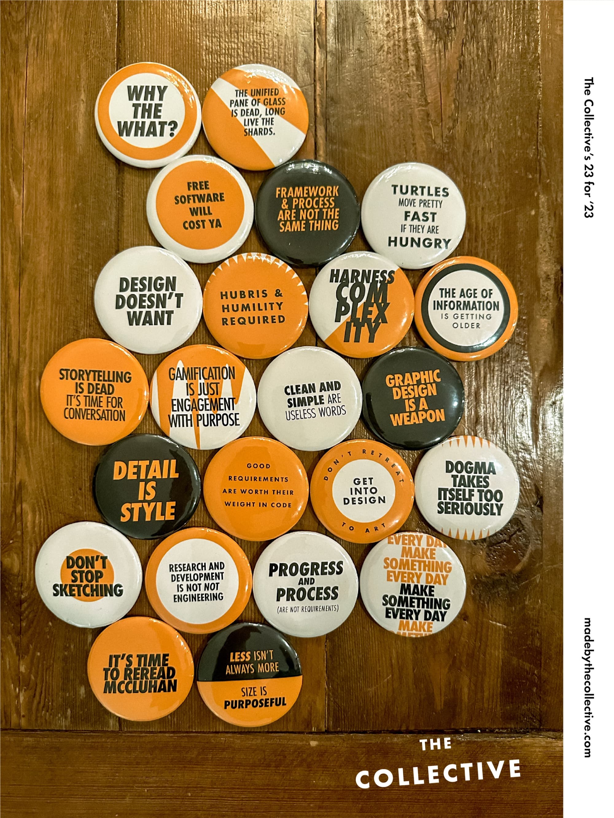
Identity
Point. Line. Plane.
Three drawing primitives, applied across every layer of the brand. Photography keeps to a single point of focus. Typography sits on a clear line. Layouts breathe across a quiet plane. Once the vocabulary was named, every decision past it got faster.
Point
Line
Plane
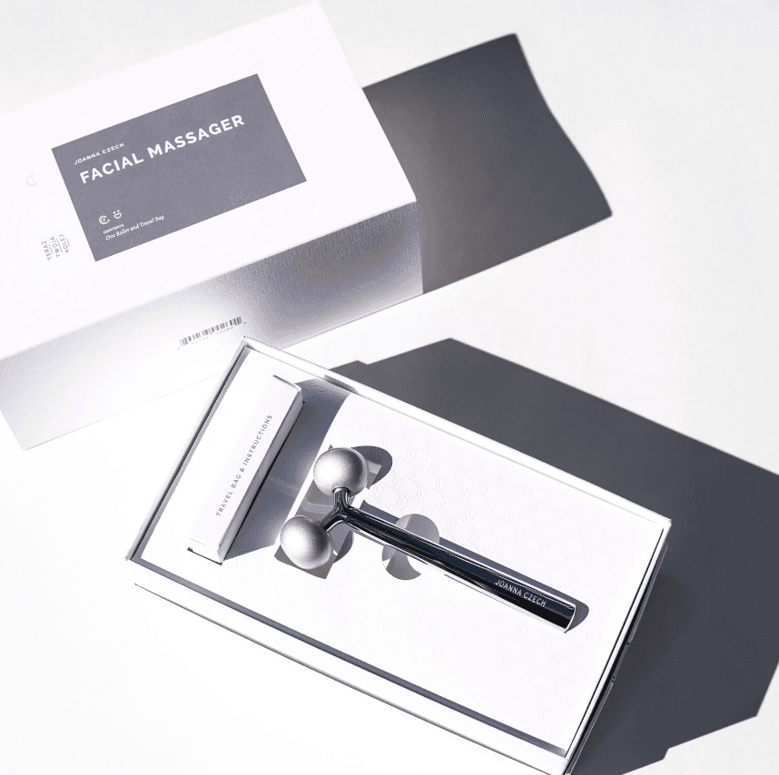
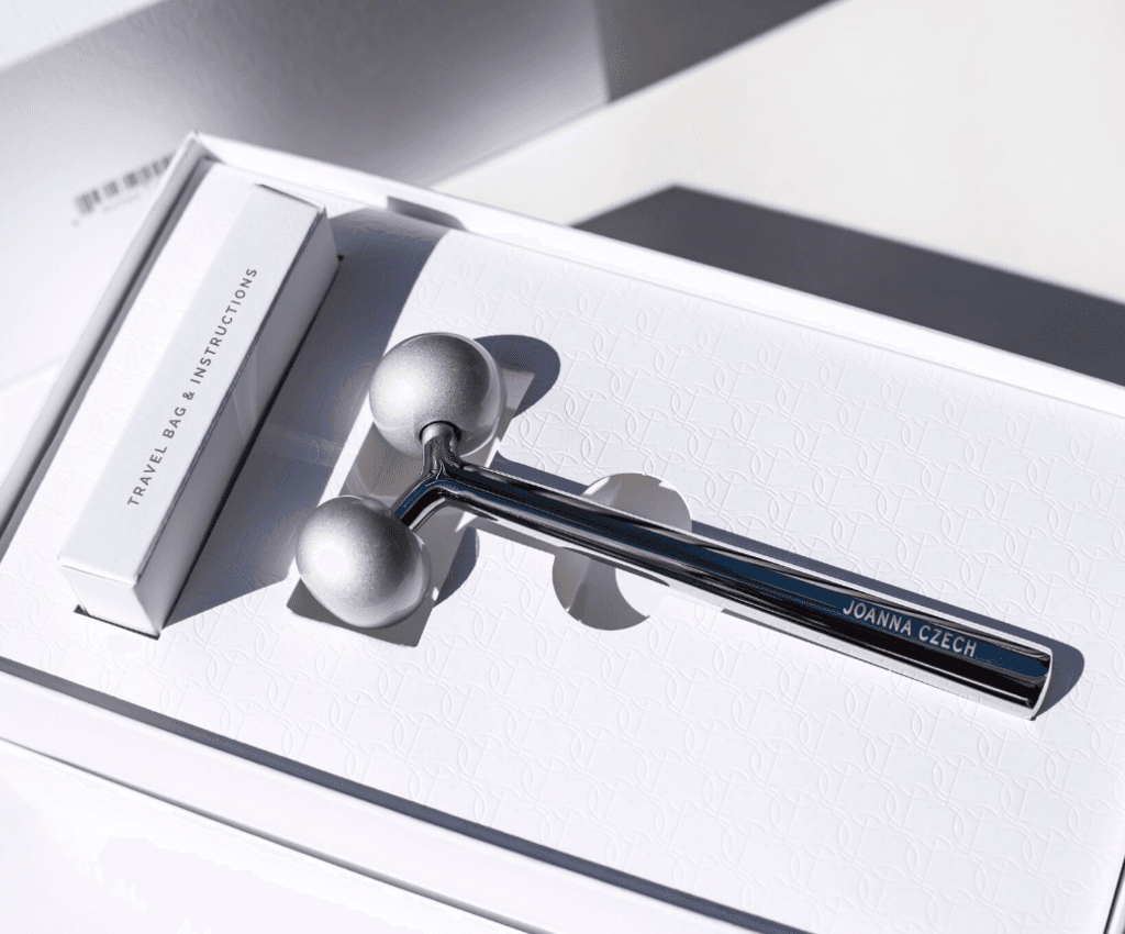
The premier product
The Facial Massager, packaged for retail.
The Joanna Czech Facial Massager is the studio's flagship object: a single piece of polished steel with a precise tolerance and a feel that earns its price point in the hand. The packaging had to do the same work as the product. Luxury at retail, no shorthand, nothing decorative.
A white outer box. Restrained type. The Joanna Czech mark held quietly at the foot. Inside, the roller sits on a black-and-white striped tray the way a watch sits on its cushion (insolent, certain, glad to be looked at). Open the box and the object is the moment; the packaging has the manners to step back. The same point-line-plane vocabulary the website runs on, applied to an object you hold in your hand.
Outcome
From $300K to $5M in three years.
Year one finished at roughly 3× revenue. The redesigned product pages were the single largest factor.
Year two the site rebuilt itself around editorial: long-form pages with photography, no banner sales. Repeat purchase rate moved up.
Year three was the steady state. The framework held. Joanna's team ran most updates without us.
The site stopped being marketing for the salon. It became the brand.
"We rebuilt the storefront and the brand caught up. Suddenly the site was the marketing. Every page sold the next."
Storefront
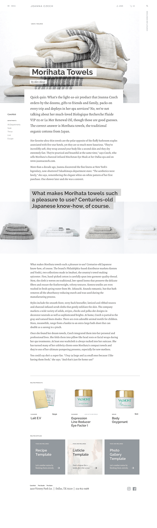
Editorial as Commerce
The product pages got rewritten by a former magazine editor we brought on. Joanna sat with her for the first round and dictated the way she actually talks about each product. Once that voice was on the page, conversion stopped being a problem we had to design around.
Product photography moved off white packshots and into ritual: hands, light, surface, skin.
Copy was first-person where the product warranted it. Recommendations from Joanna read in Joanna's voice.
Two paths through the catalog: discover (browse) and routine (build). The routine builder turned individual products into morning and evening sets a customer could check out in two clicks.
Every product page told a story before it sold one. The story was usually true and usually short.
Mobile
Phone first. For real.
Beauty buyers are on their phones. We designed every page that way: cropping for portrait first, scaling up to desktop after. Most pages on the site never get viewed on a 1440px display, so we stopped optimizing for one.
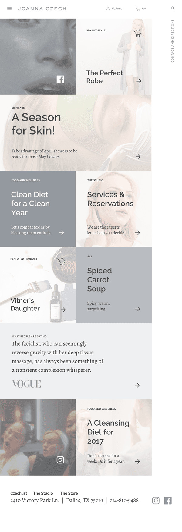
Touch targets sized for a thumb. Forms that fit on one screen.
Photography cropped for the phone first. Letterboxing on tall screens disappeared.
Performance budget under 1.5 seconds to interactive on LTE. The team held it.
The cart was rewritten so most checkouts finished without a keyboard.
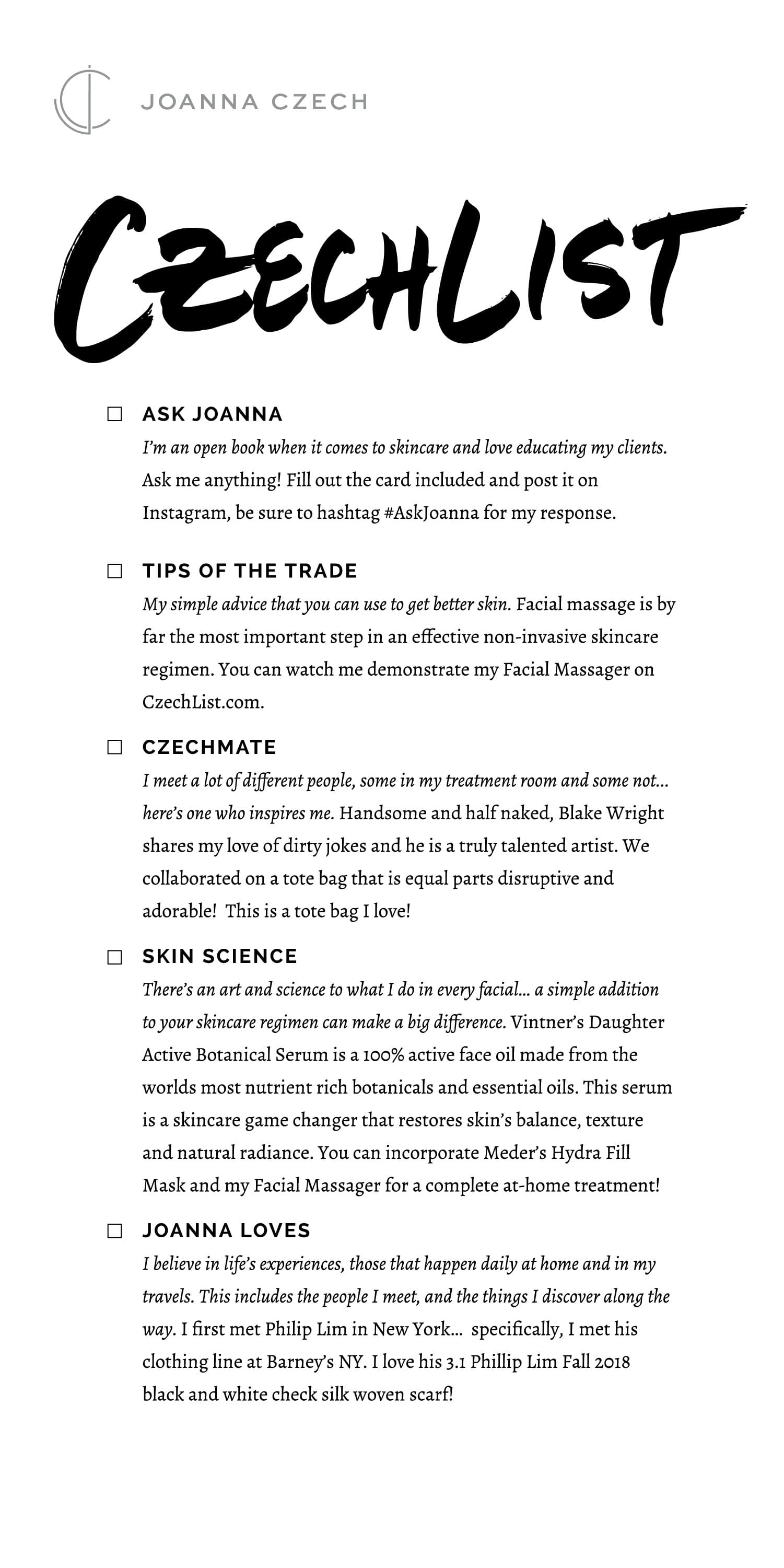
CzechList
The editorial sub-brand.
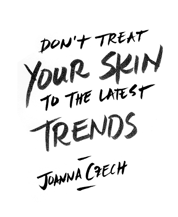
The retail site sold product. CzechList sold Joanna. It is the editorial sub-brand we launched alongside the storefront, five sections that let her speak in her own voice on her own terms. Skin Science, Tips of the Trade, Czech Mate, Joanna Loves, and Ask Joanna. Each one is a different register: clinical, instructional, profile, recommendation, dialogue. The hand-drawn "Ask Joanna" brush mark gave the conversation series an actual handwriting in a brand otherwise built on the C-monogram and tracked caps.

The brand was always there in person. The job was to write it down, draw it, and let the site say it back. Once the website started sounding like Joanna, the business got out of its own way.
Takeaways
- Joanna Czech
- Beauty
- Lifestyle
- Ecommerce
- Creative Direction
- Design Production
- Content Strategy
- Project Management
- Process Consultation
- UX/UI Design
- Product Strategy
- Content Strategy
- Joanna Czech (Founder)
- Anne Howrey (Project Manager)
- Efstathios Maroulis (Development Lead)
Up next