Seashell UX
An AI-forward control panel shell, rebuilt from a lost prototype
Open the prototype
Live at seashell-ux.vercel.app. Click around. Every page in this case study is interactive in the prototype, including the variants and the accessibility modes below.
This started as a redesign of a major cloud platform's control panel. I was prototyping the new shell (the navigation, the home, the inline AI assist) coding it up in a working build that I'd quietly shared with a few collaborators. I was getting ready to present.
I never got to. The team got cut, the prototype went with us, and the thing I'd been building for months evaporated overnight. The link in my history was the only thing left of it. So I rebuilt the shell from the link, scrubbed the company-specific bits down to a generic "Acme Corp," and put it back online as a self-contained UX experiment.
The thesis is simple. Cloud control panels still ask the user to decide everything. Seashell starts the morning with the four things actually on your plate, marks the three the agent can finish on its own, and asks you to handle the one that needs you. The AI is in the navigation, not in a chat window. Every list view has a panel that explains what's worth your attention.
Designed in Figma. Built with Claude Code (a different agent at the original company; same idea). Desktop-first demo right now; mobile is in progress.
Why this matters
The shell was the bottleneck.
The control panel was the daily surface for the overwhelming majority of customers. The left rail had grown for years by accretion: organized around how the company shipped products, not how a user did work. Customers said the same thing in research, in the Ideas Portal, and in support: it makes me click six times for a simple task; I miss updates unless I check email; I waste time hunting for things I need every day. The typing was on the wall. Competing platforms were already moving toward outcome-based, intent-driven navigation. Sitting still meant getting passed.
The shell could not scale. Adding a new product meant adding a new entry. There was no end state, only a longer list.
It was static where users had grown to expect tailored. Netflix, Heroku, Linear: customers compared us to surfaces that adapt to them.
It was company-shaped, not user-shaped. The information architecture mirrored the org chart and rotated whenever the org chart rotated.
It blocked the next thing. Every team launching new product had to negotiate for horizontal space inside someone else's navigation.
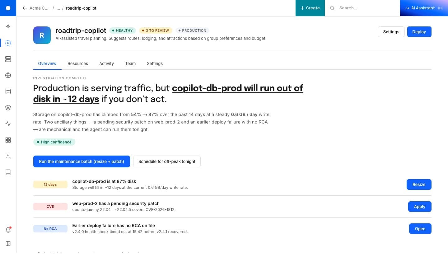
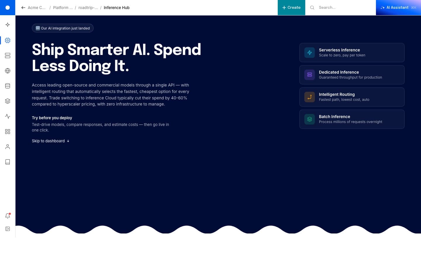
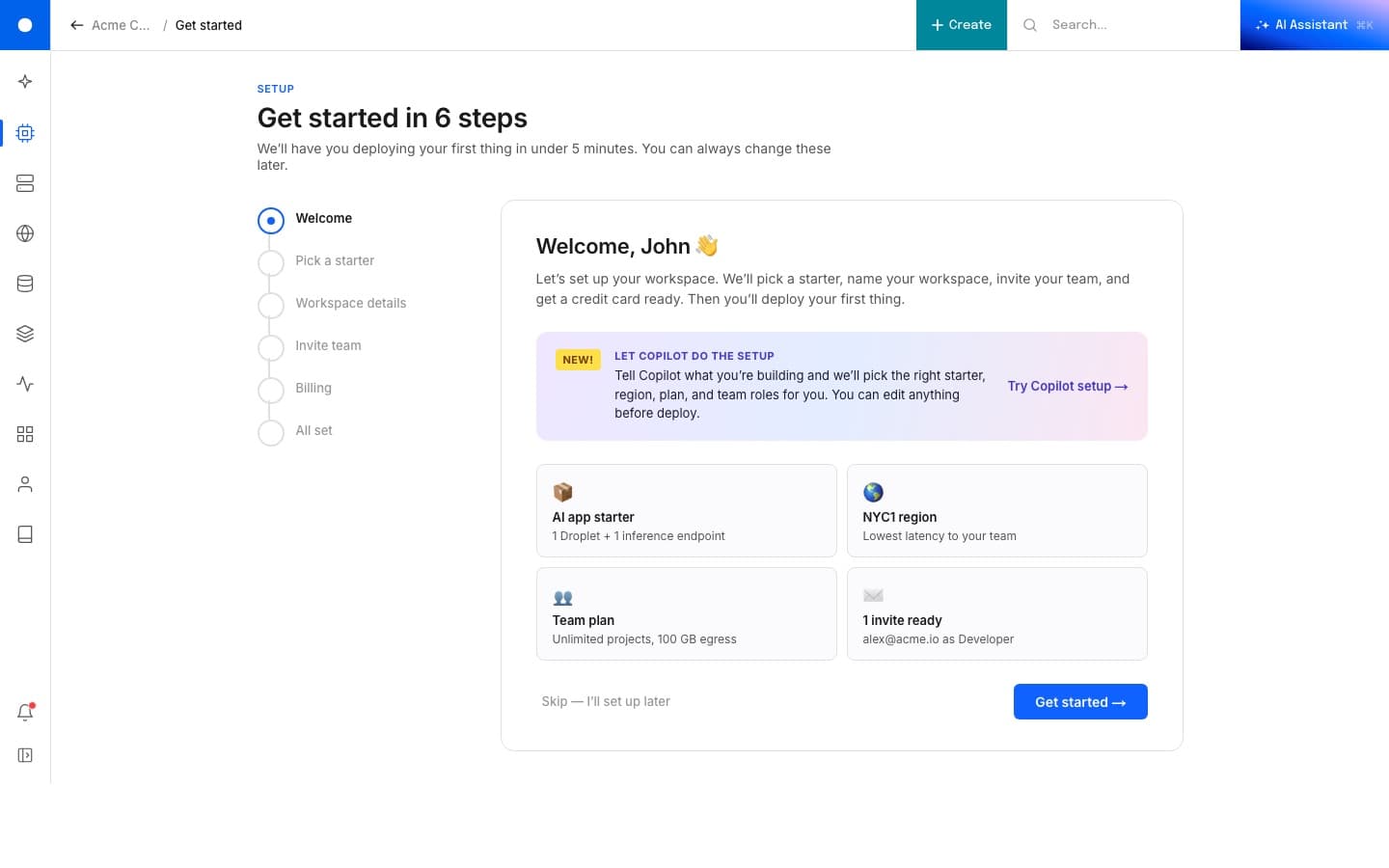
The home
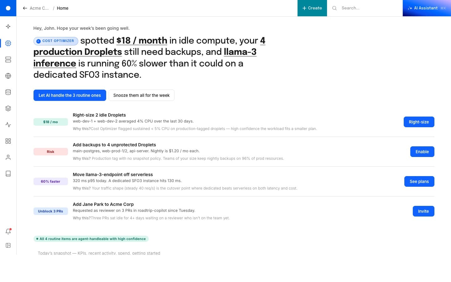
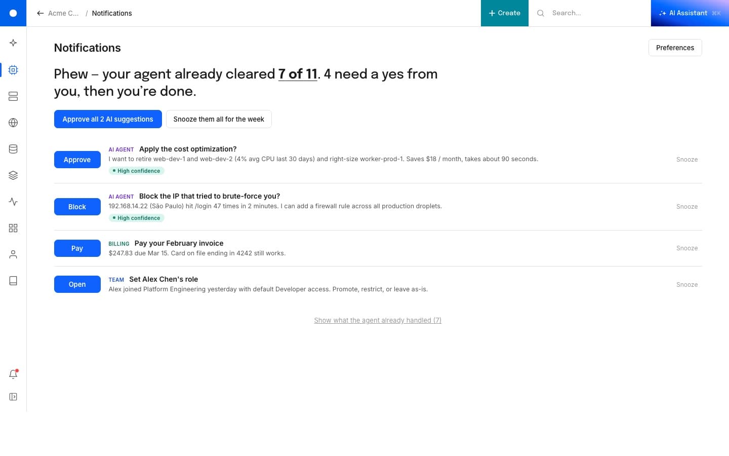
Four things, three agents.
The home greets you with the week's prioritized work. Each row is a real task with a confidence chip on the left (savings, risk, performance, blocker) and a single primary action on the right. Three are routine and the agent can run them. One needs a human. A "Let AI handle the routine ones" button on top kicks off the easy ones in a single click.
The shell
Variants you can poke at.
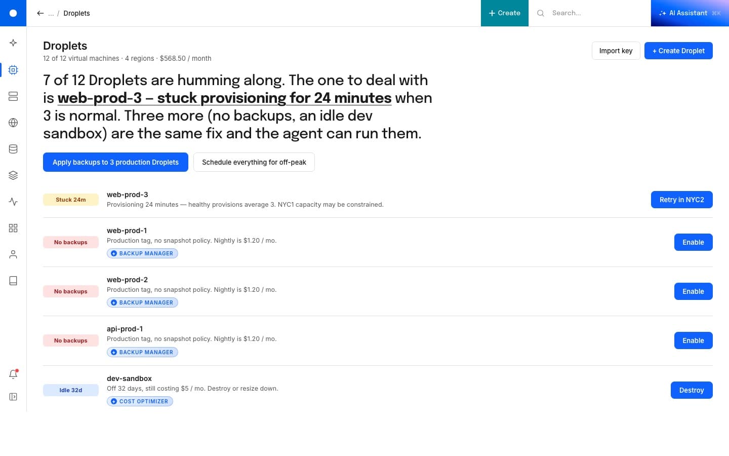
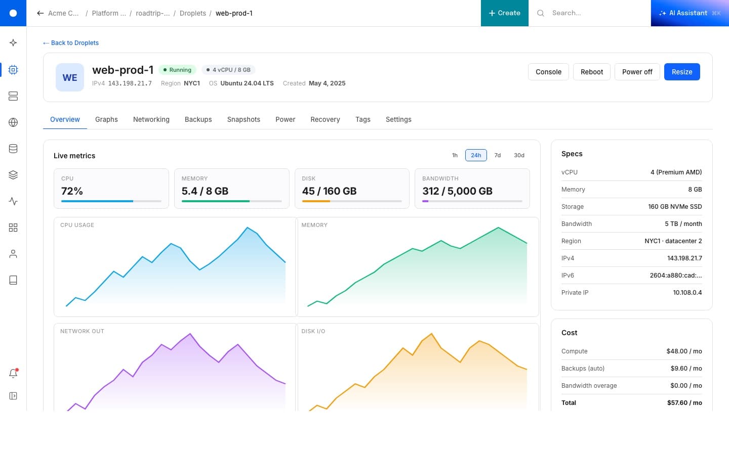
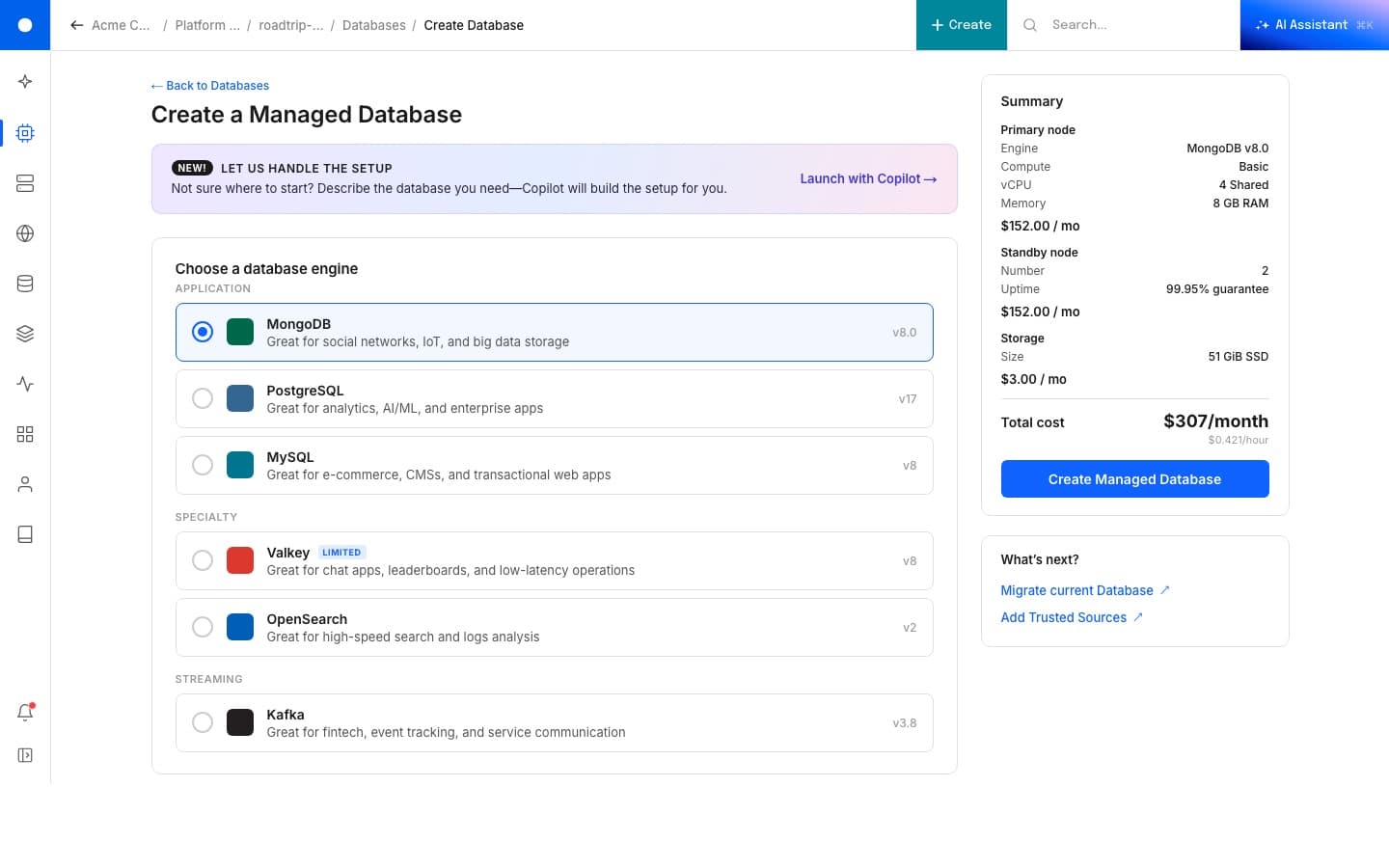
The live link is a UX/UI demo, not a finished product. Click around. The same shell handles a list of resources, a single resource detail, a creation flow, an onboarding, modals at two sizes, and a notifications drawer, all on the same nav and the same component vocabulary.
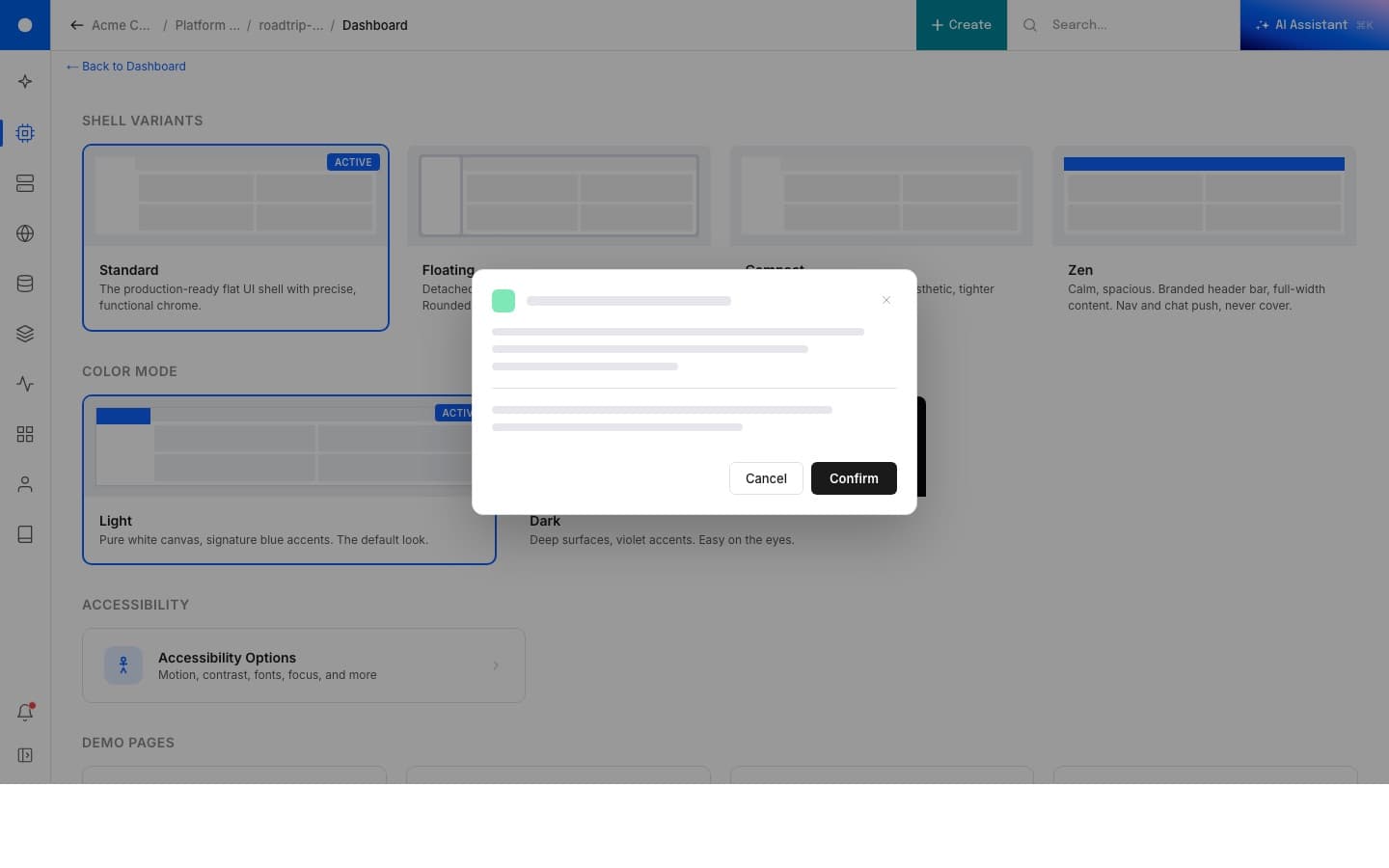
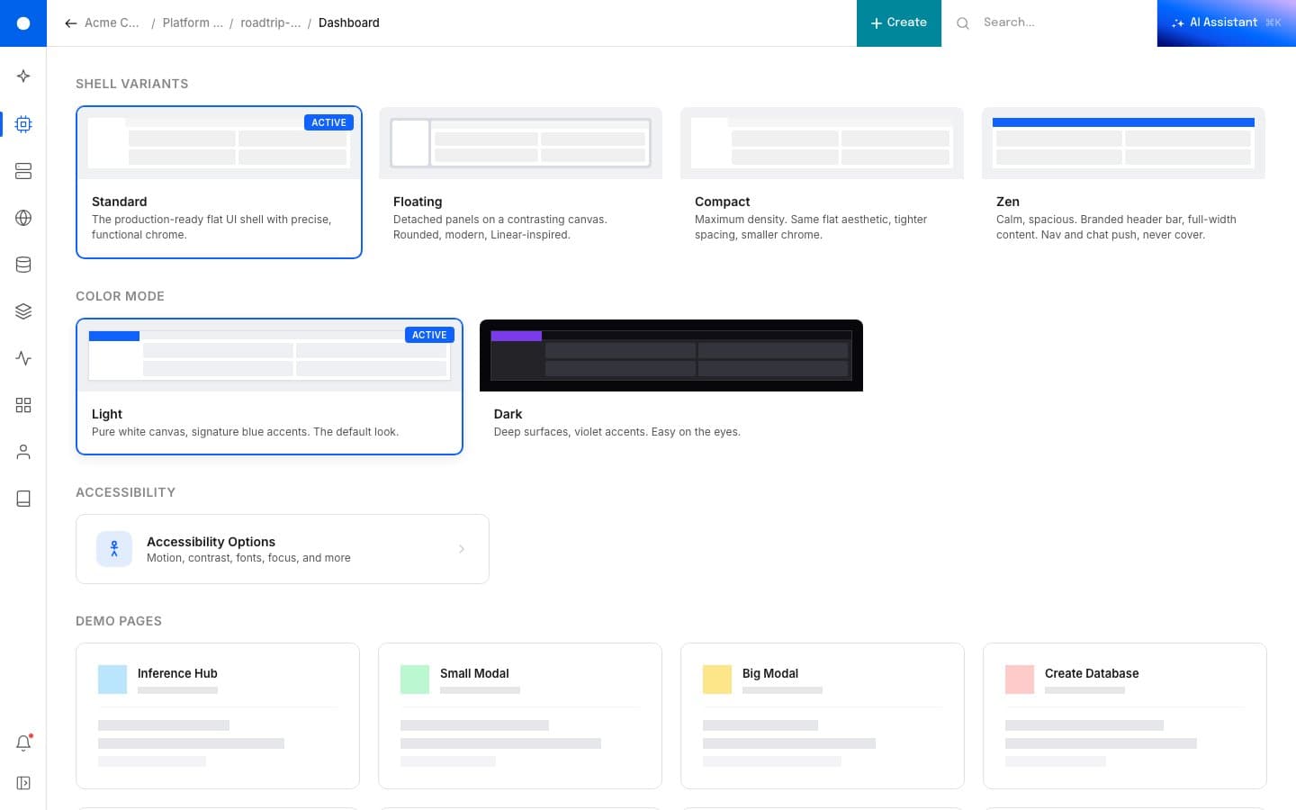
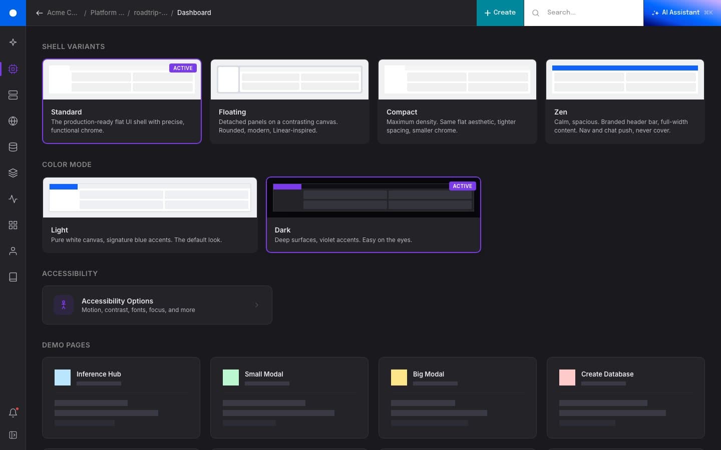
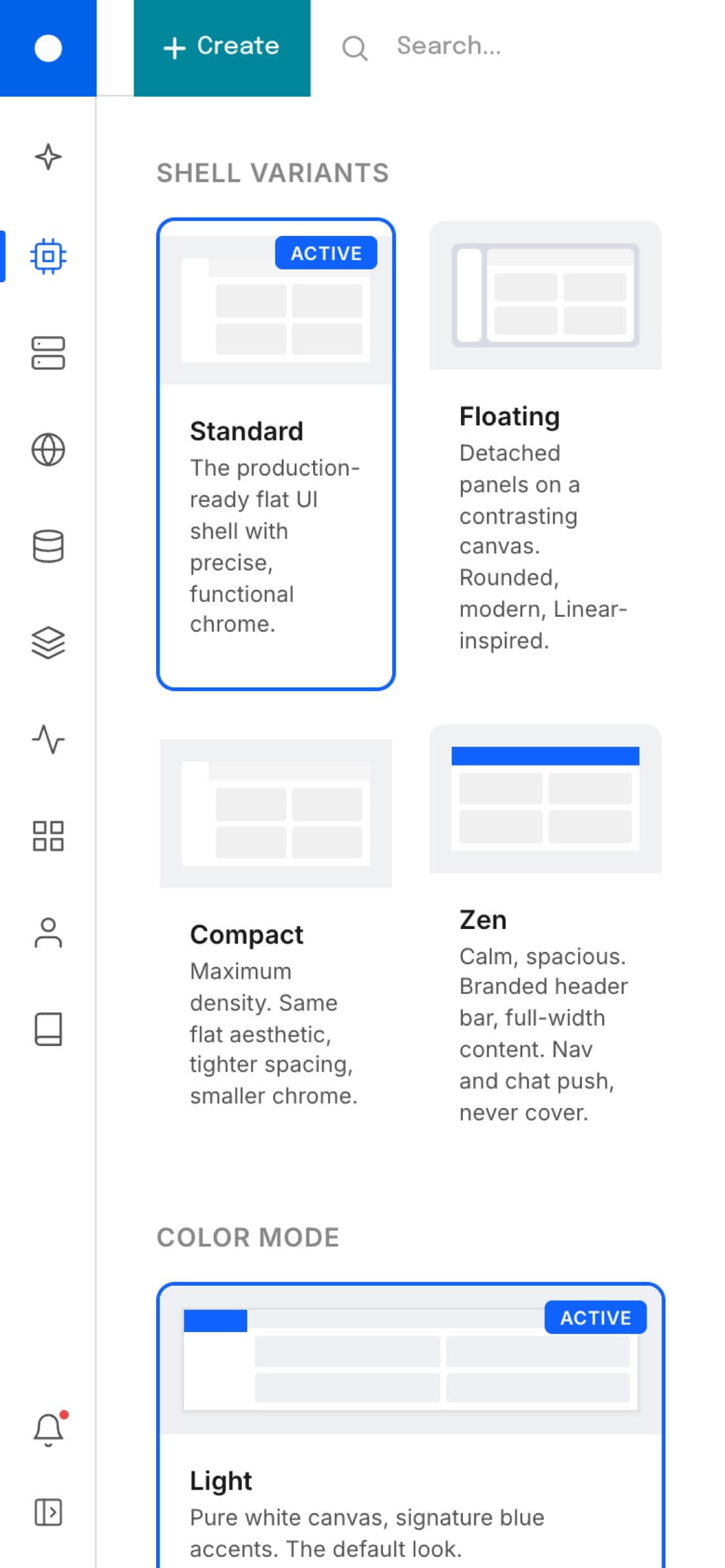
Four shell variants
Same components, four rooms.
The shell is a vocabulary, not a layout. Standard is the production-ready flat UI with precise functional chrome. Floating detaches the panels onto a contrasting canvas with rounded, Linear-inspired edges. Compact pushes density up while keeping the flat aesthetic. Zen calms everything down, branded header bar, full-width content, nav and chat that push instead of cover. Same components, same logic, different rooms.

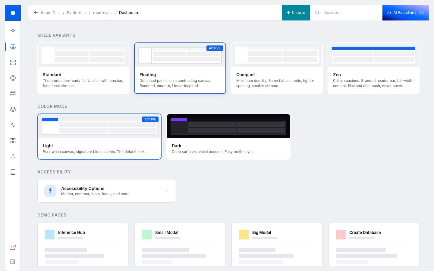
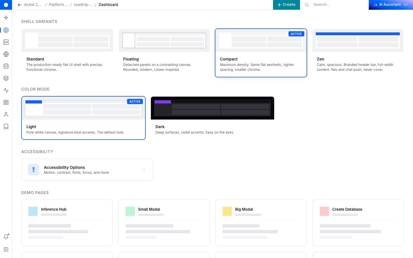
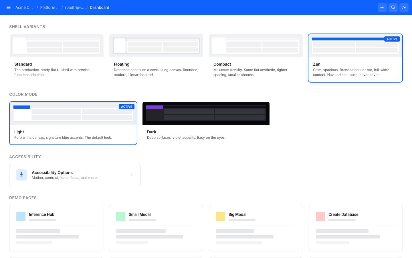
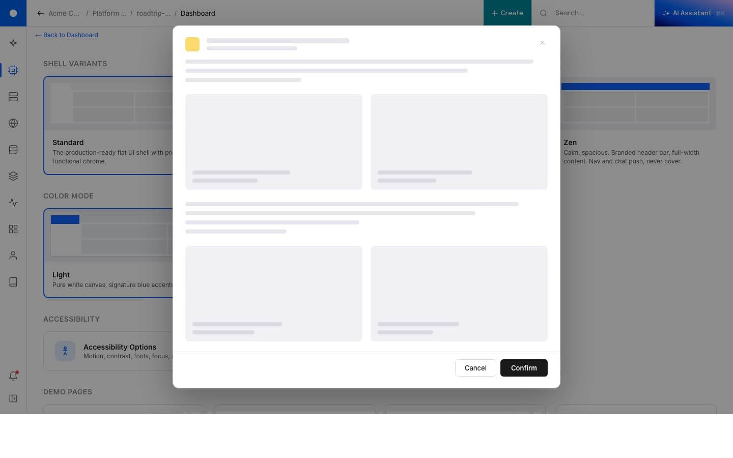
Color modes
Light and dark, built in.
Light is the default: pure white canvas, signature blue accents, the look that lands first. Dark trades to deep surfaces with violet accents, easier on the eyes for the focused-work and AI-inference flows where developers spend hours. Both compose with any of the four shell variants.
Accessibility
Built in, not bolted on.
A control panel is where developers spend hours every day. The accessibility surface is part of the product, not an audit checkbox at the end. Reduce motion, high contrast, dyslexia-friendly typeface (OpenDyslexic), large text, enhanced focus indicators, underlined links. Each one toggles in place from a single panel, persists across the session, and composes with whichever variant and color mode the user already chose.
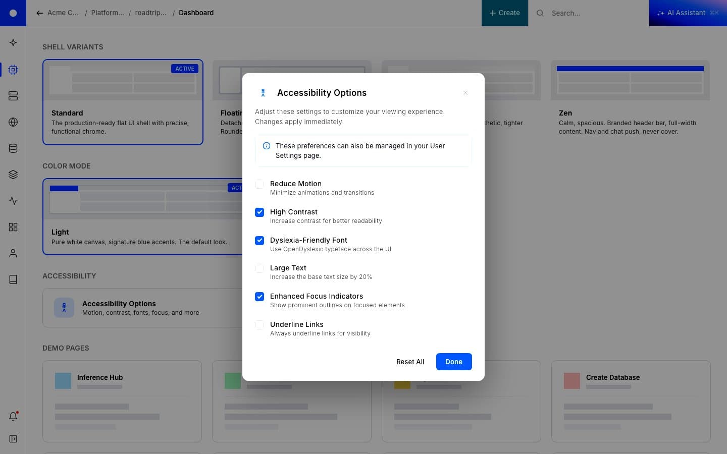
High Contrast is the most visible. Borders thicken, the active state on every card and toggle gets a heavier ring, and the chrome stops disappearing into the canvas. The same rules apply across the whole shell, in either color mode.
The plan underneath
Five phases, one destination.
The prototype is the destination. The production plan was always a phased path to it, designed so users could learn the new shell in pieces instead of one disorienting jump. The discipline behind the rebuild is the same one I'd been writing for the company: ship the smallest visible win first, keep the structure familiar, then layer in the contextual logic once trust is in place.
Phase 1. Stop the bleed. Collapse the legacy left rail. Reclaim the horizontal real estate the next phases need to live in. One to two engineering weeks, no behavior change.
Phase 1.5. Clean the top hat. Replace the cluttered top bar with a single global prompt: search resources, run commands, ask a question. The whole platform suddenly has one entry point.
Phase 2. Reduction with context. Trim the menus down and reorganize them around outcomes. Deeper hover states explain what each item does before a user commits to clicking.
Phase 3. Light, dark, and contextual. Introduce dark mode and a workspace-aware nav. The user's project decides what surfaces matter; the menu reshapes around it.
Phase 4. Modular shell. The components ship as a system. New product teams compose into the shell instead of negotiating for space inside it. The end state is a shell that knows how to grow.
The first run
Onboarding as welcome.
Onboarding is its own page in the demo. Same nav, same shell, simpler content. The first thing a new user does sets the tone for everything that comes after, so the same pattern that handles the prioritized home for an existing user handles the welcome for a new one. One component vocabulary, two emotional contexts.
Mobile
Still cooking.
Right now the demo is desktop-first. Mobile is in the queue. The shell collapses to a single column with the AI assistant available at the top of the page rather than the corner of it; the prioritized list reads as a stack rather than a table.
Status
Live at seashell-ux.vercel.app. A few control-panel-specific bits still need to be lifted out before this is fully generic. Mobile cuts after that.
Most lost work stays lost. This one came back because the link survived. There's a lesson in there about backing things up. There's a more interesting one about how much of a design lives in your head, ready to be rebuilt the moment you have a quiet weekend and the right toolchain.
Why