Essay · 6 min read
Rules for Self-Service Schtuff
Six things I tell every team building anything that asks a user to set themselves up
Most software that calls itself self-service is, in practice, self-blame. The tool puts a complicated job in front of a user, gives them a half-instruction and a Save button, and when they get it wrong, it shrugs and tells them to file a support ticket. That isn't self-service software. It's a quiz the user didn't sign up for.
I have been designing real self-service experiences for a long time, mostly in places where the consequences of a wrong answer are real: hiring software at IBM, cloud infrastructure at DigitalOcean, onboarding flows where the user has fifteen minutes of patience and you don't get a second try. Across all of it, the same six rules keep showing up. Some of them are obvious, none of them are easy, and the projects where I've done them well are projects users actually finished without help.
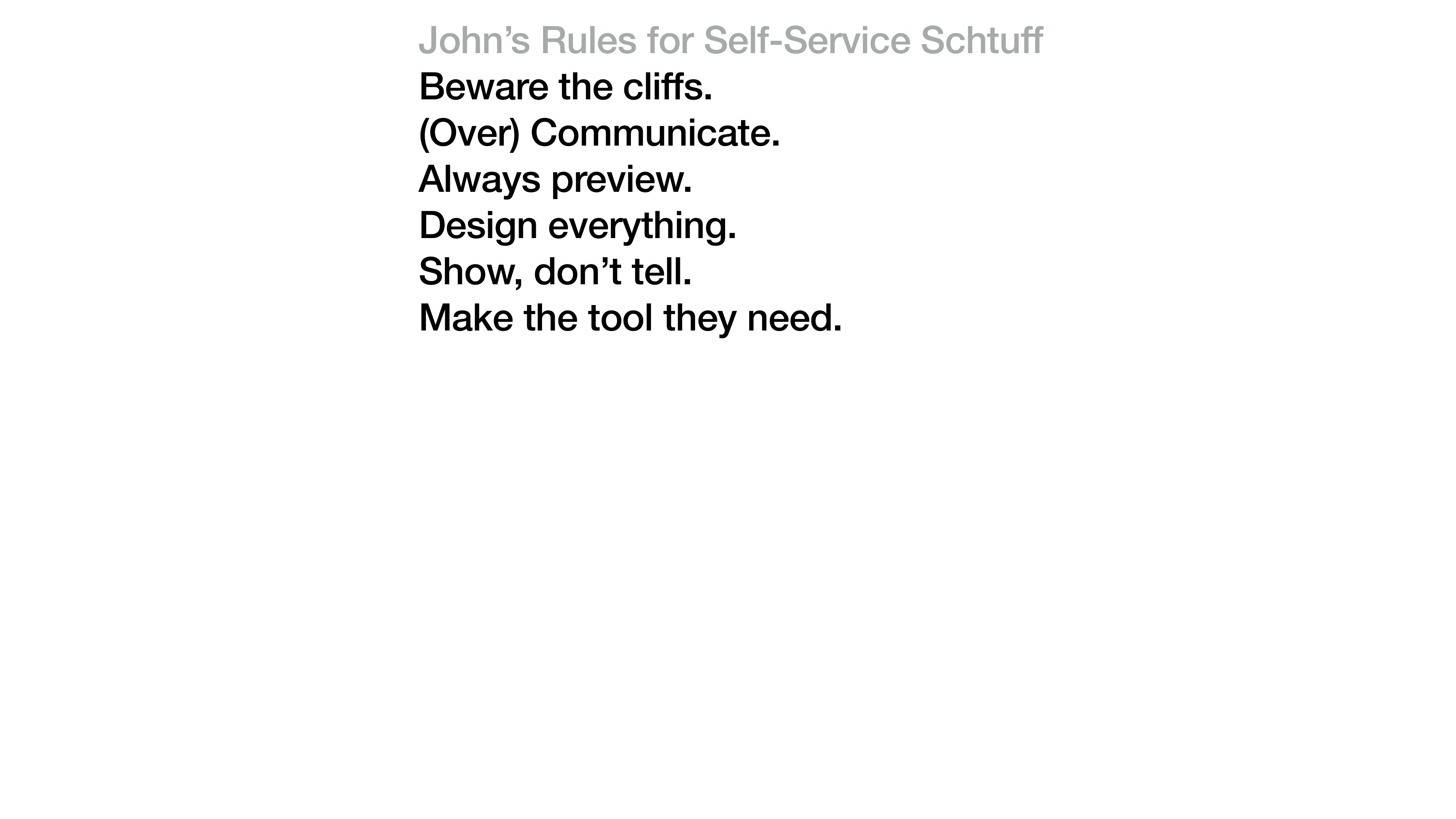
The list, in the form I keep on a sticky on my desk. I've added to it over the years and crossed things off, but these six have earned their permanent spot.
Beware the cliffs.
Cliffs are the moments where a user can fall out of the experience and not get back. A confirm button on a destructive action with no undo. A wizard that resets when you hit Back. A configuration save that silently fails when a field is empty. The user doesn't see the cliff until they're falling off it, and once they fall, they don't try the product again.
The Watson Candidate Assistant getting-started flow had a cliff in its first version. If you skipped a step and tried to come back to it later, the form silently lost half your inputs. We fixed it by making every step idempotent and saving on every keystroke. That sounds like an engineering decision; it was a design decision. The shape of the interaction had to change before any code did.
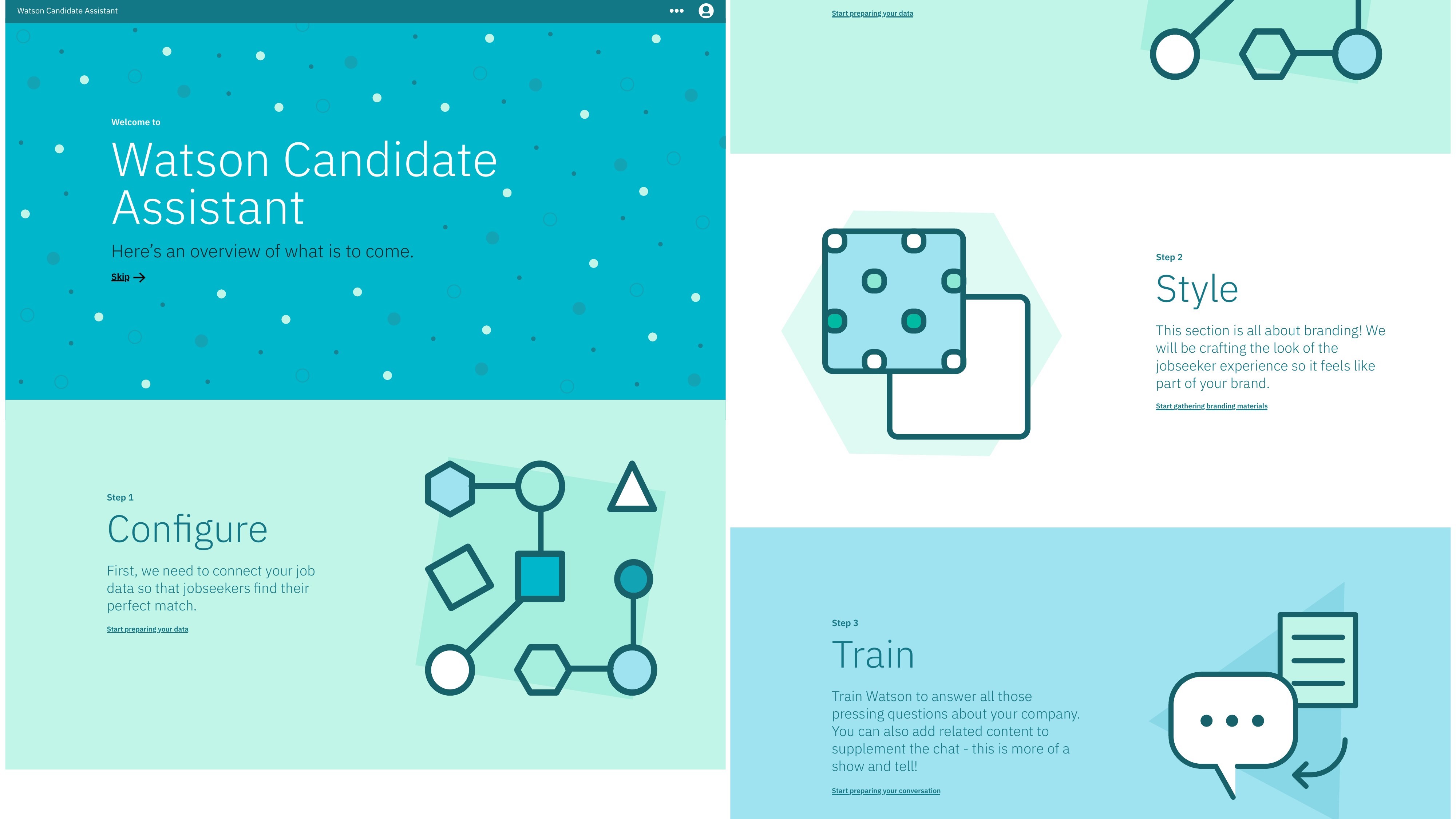
The Watson Candidate Assistant administrator setup. The Configure-Style-Train metaphor is itself a cliff-prevention move. Each step is recoverable, each decision is reversible, and the structure carries the user even when they leave and come back.
See IBM Watson Talent Admin →(Over) Communicate.
The opposite of confidence is mystery. If your product is doing something on the user's behalf, tell them what it's doing. If a step takes more than two seconds, show progress. If something is going to take a long time, set the expectation up front.
I once watched a user wait forty-three seconds in front of a blank screen because the team had decided a loading spinner was “clutter.” They closed the tab. The team had succeeded at not adding clutter and had also failed at building a product the user could finish.
Communication is what lets a user trust the tool well enough to keep going. Skipping it makes the user feel alone, which is the opposite of self-service.
Always preview.
If a user is configuring something, show them what it's going to look like. A favicon picker without a preview is just a file upload. A welcome message editor without a preview is just a textarea. A theme color choice without a preview is a guess.
This is one of those things that is obvious in hindsight and routinely missed in the first version of every tool I've ever shipped. Preview is the antidote to the chasm between “what I configured” and “what my user is going to see.” Close the chasm. Don't make people imagine.
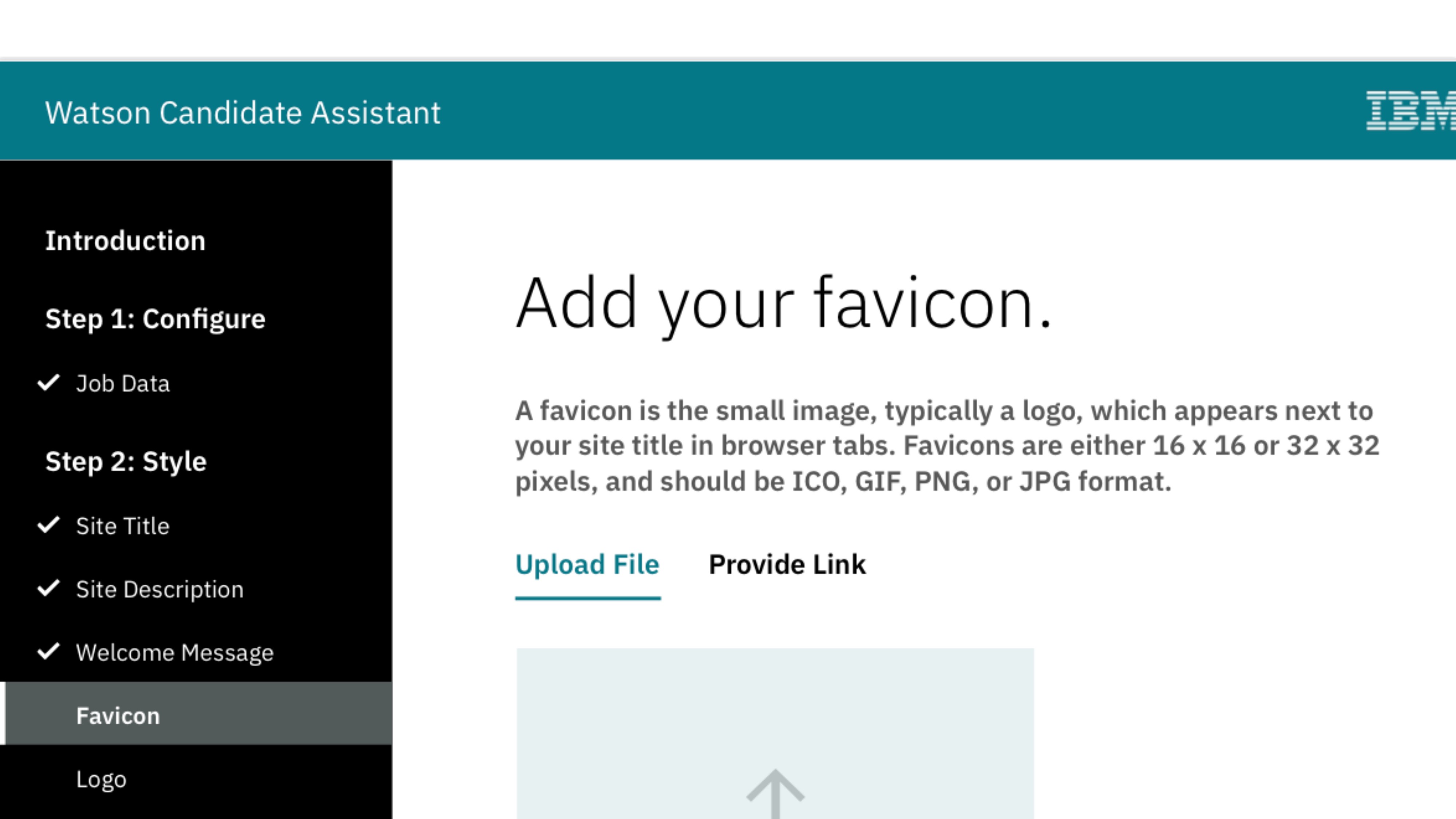
A favicon step from the Watson Talent admin. The progress checklist on the left is doing two jobs: navigation and a built-in preview of where you are in the larger flow. You can leave and come back. The system remembers.
See IBM Watson Talent Admin →Design everything.
A self-service tool has more surfaces than a feature. Confirmation emails. Loading states. Empty states. Error messages. The thing you see if you refresh the page mid-step. The screen you land on after you publish. Each of those surfaces is part of the experience, and if a designer hasn't touched it, the user is going to know.
The fastest way to spot a self-service tool that wasn't designed end-to-end is to count the modal dialogs that say “Are you sure?” in default browser typography. Every one of those is a place where the team handed the user off to the framework and stopped paying attention. Pick those up. They count.
Show, don't tell.
Microcopy explaining a feature is fine. Microcopy that's there because the design is confusing is the design admitting it failed. If you find yourself writing a tooltip to explain why something works the way it does, the interaction needs another pass. Either the surface should reveal itself, or the labeling should make the function obvious. Help text is for genuine edge cases.
The DigitalOcean onboarding work I led leaned hard on this. We replaced a wall of explainer copy on the welcome screen with a single moving illustration and three word prompts. The conversion rate on the next step went up. The time to first action went down. The product hadn't changed; the show-versus-tell ratio had.
The first screen of the new onboarding. The whole thing is one decision and one button. The illustration is doing the explaining the copy used to.
See DO Onboarding →Make the tool they need.
This is the rule the others are all in service of. A self-service experience is a tool. The user has come to it with a job to do. Build the tool that does that job, in the shape of the job, with the language the user already uses to describe it.
Too many self-service flows are organized around the team that built them. Engineering owns the configuration tab. Marketing owns the content tab. Support owns the diagnostics tab. The user doesn't care about that organization. They came to do one thing. The work of design is to organize the surface around the user's job. The org chart is the team's problem to solve, not the user's.
The most important thing I learned shipping the Watson Talent admin was that the product worked when the navigation matched the user's mental model and stopped working the moment we tried to be clever. Configure, Customize, Analyze, Get Help. Four verbs, in the order users actually used them. Everything else was inside.
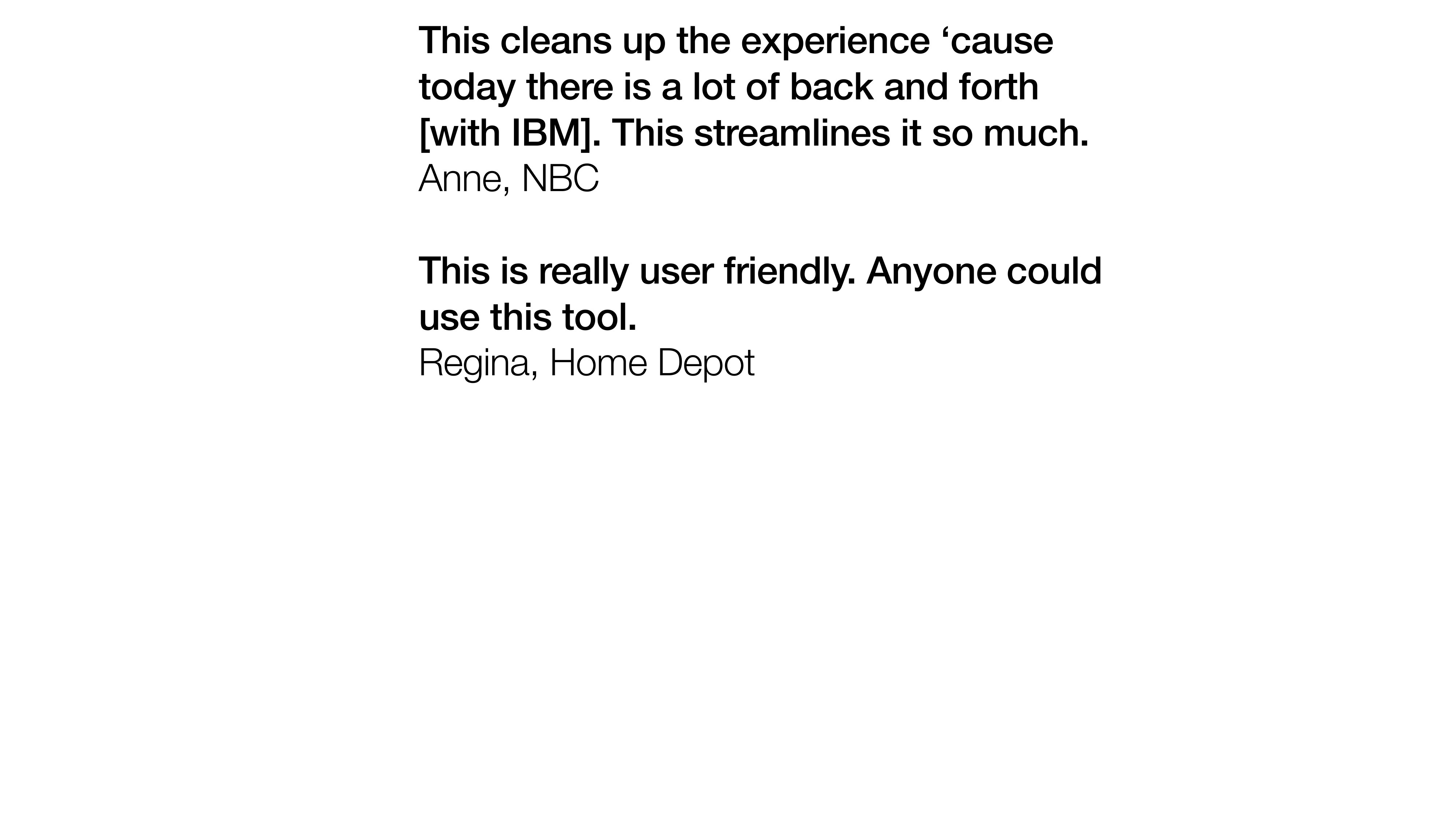
Two of the customer responses we got after the rebuild. “Anyone could use this tool” is the highest praise self-service software can get. It means the design did its job and got out of the way.
See IBM Watson Talent Admin →Self-service done well is invisible. The user shows up, does the thing they came to do, and leaves. They don't post about it. They don't complain. They don't even tell their colleague how good it was, because there's nothing to tell. It just worked.
If a user can't get through your tool without filing a ticket, you didn't ship self-service. You shipped homework.